
inspiration
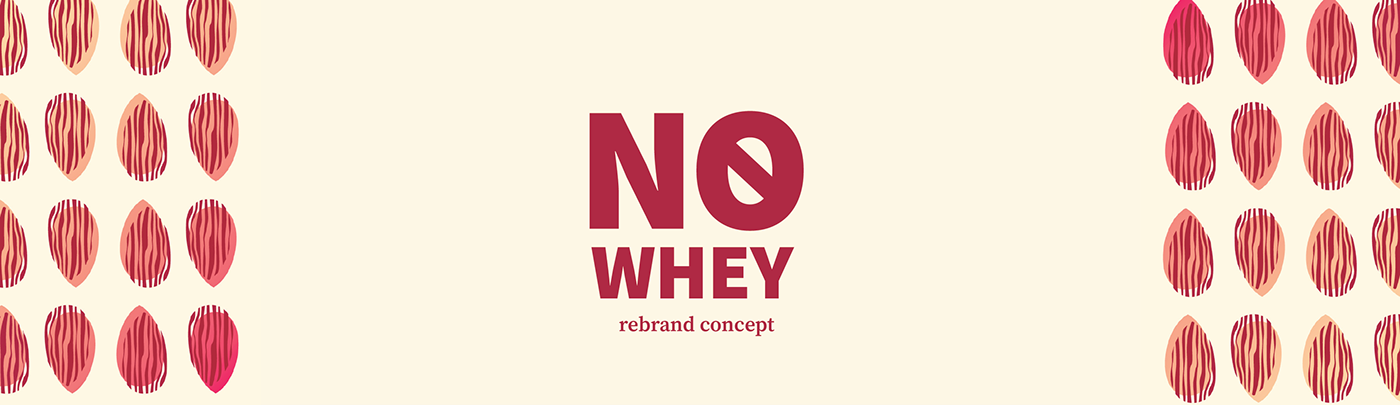
No Whey is an existing chocolate brand that I have a personal connection to. They focus on making allergy friendly, vegan, and gluten free chocolates. In this rebrand, I wanted to emphasize what is in their food instead of what’s not.

the result
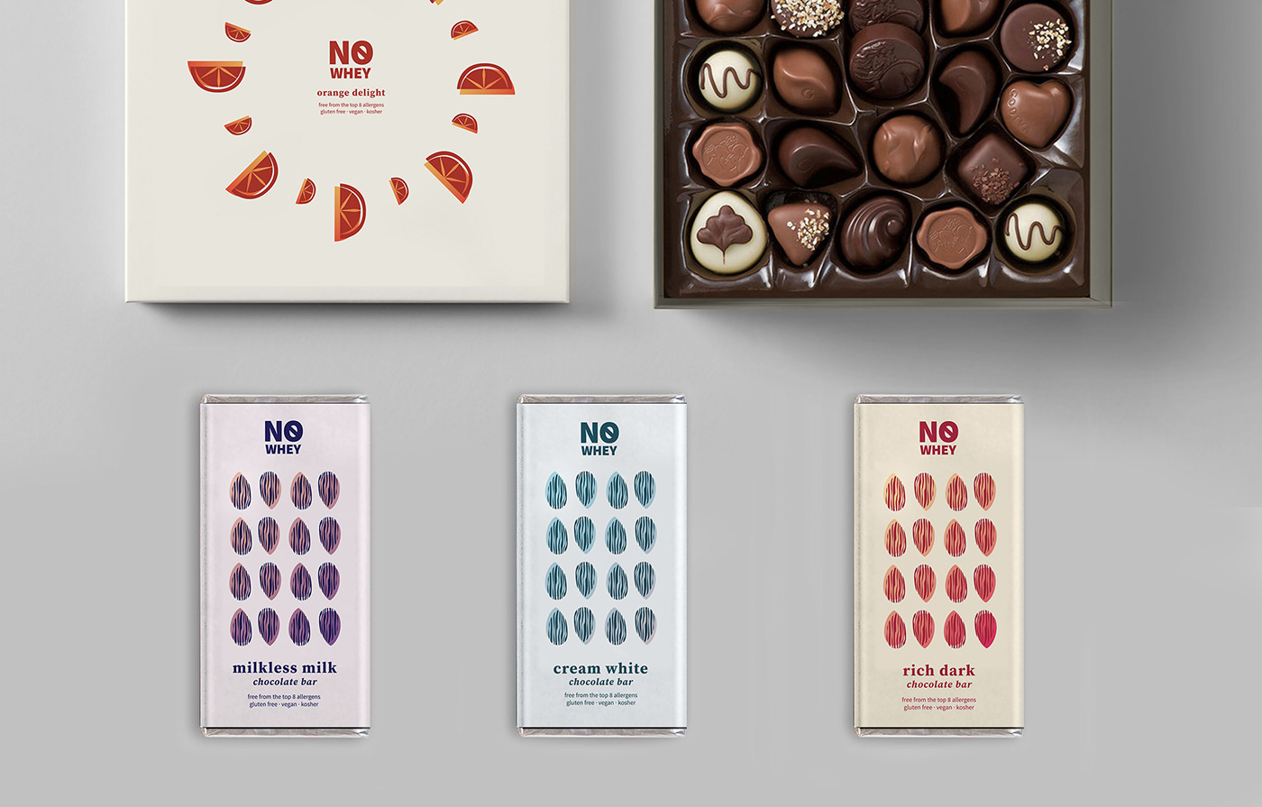
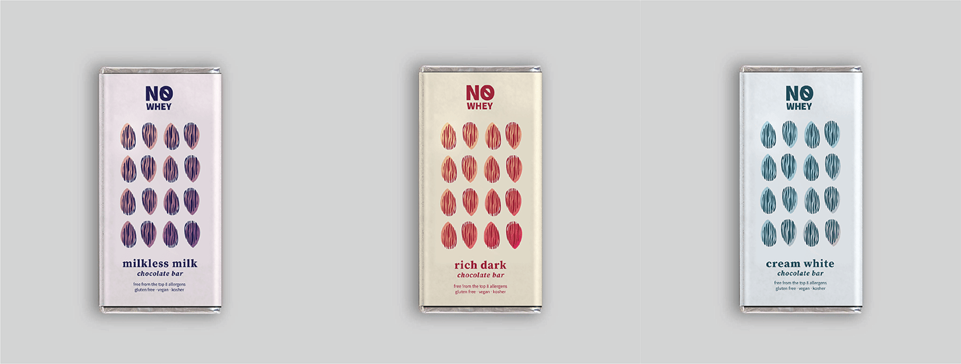
I created cacao bean illustrations on the chocolate bars, colored to match the flavors. The dash through “No Whey” subtly draws attention to the “free from” aspect of the brand. The core demographic is young adults, with older adults and kids being a close second, similar to Whole Foods or Trader Joe’s.

process
I made the first version of this project a couple years ago. (top row) I returned to it recently because I felt the designs didn’t speak to the right audience. So I created the current version. (process in bottom row) The biggest challenge was creating a cohesive visual style.

typography
I used Source Serif and Source Sans for this brand system. I wanted a modern serif to bring a bit of refinement to the brand, as well as having a sans serif to bring it all together. Source Serif and Sans are a perfect match! Source Serif mainly appears in larger text (i.e. flavor names) and Source Sans appears in smaller, body-weight text.

illustrations
The illustration style is minimal but colorful, with a combination of subtle gradients and flat colors. Abstract versions of cocoa beans and flavors of chocolate are the subjects. The style appeals to adults as well as children.


final graphics


