
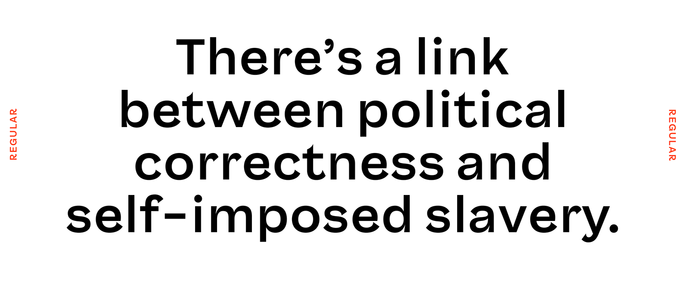
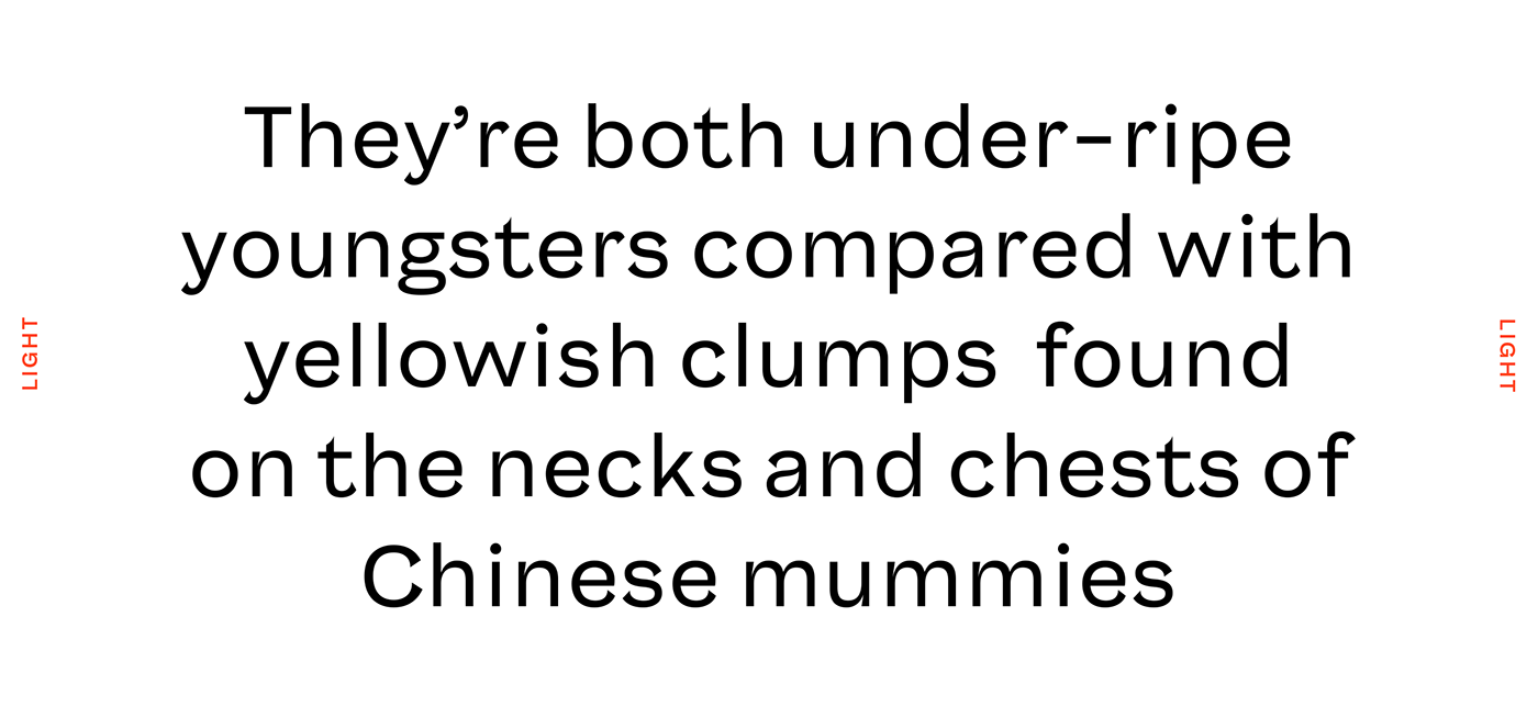
Saiga is a grotesk typeface with exaggerated curves on the terminals. The shapes get more extreme in bolder weights and in the heavy style some terminals actually ovelap with the letter. This sharp shape is repeated in places where a curve meets a straight stem creating an ink trap -like shape. The sharp shapes are contrasted with easy flowing low tension curves. The combination of round and extremely sharp shapes gives Saiga a fresh distinct look in a crowded genre.
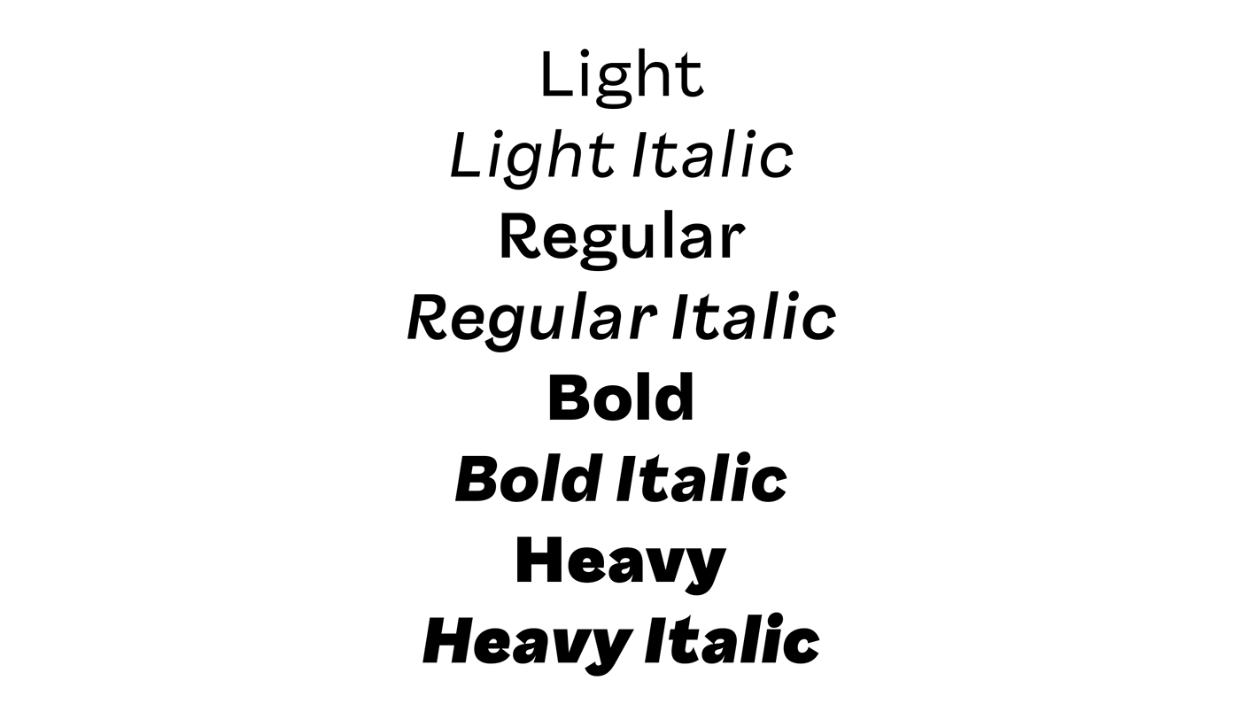
Version 0.5 has eight styles in total; Light, Regular, Bold and Heavy with matching italics. All styles have basic characters, lining-, old style-, and tabular figures, fractions, punctuation marks, symbols and Latin Extended language support.
Get Saiga from FutureFonts


Thanks for looking!
You can follow my work at
Portfolio website at
Saiga is a work in progress. You can buy beta releases from
FutureFonts
FutureFonts
With each release the price will go up but if you've already bough a license, all updates are free. You only pay once.


