Hey folks. Here, I'm gonna explain how I made this can design...


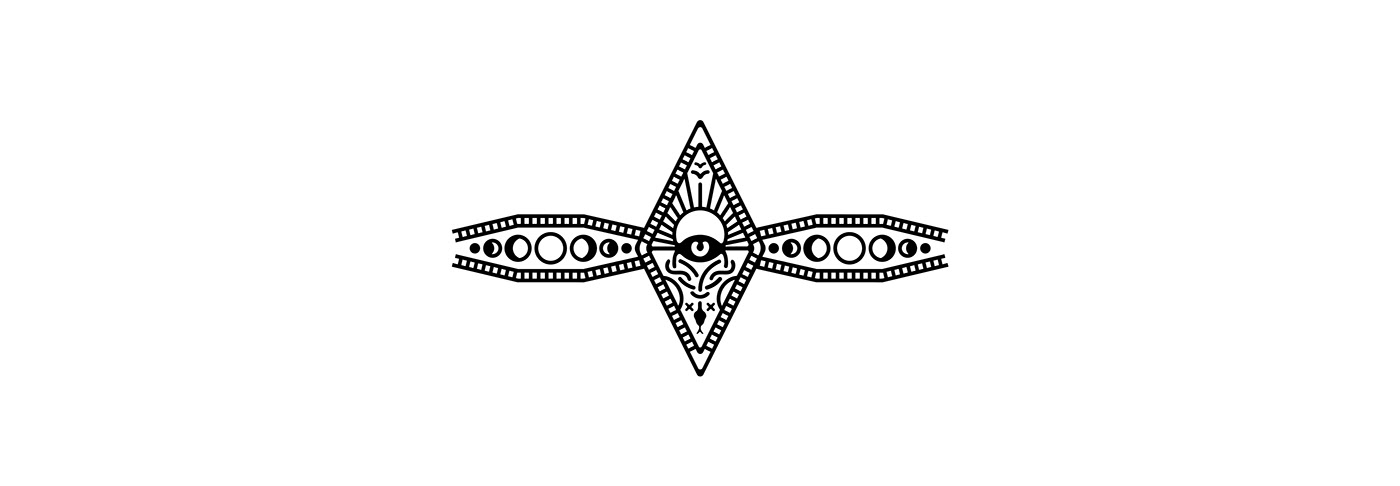
From the get-go, I knew I wanted to make something that represents the metaphysical. So I started off with an eye intersected by two circles. It's meant to convey that the same eye can see different versions of reality.

One side I made into what is considered "good," or "heaven," so here I've rotated some lines to look like sunbeams.

And then the other side is "bad," or "hell," so I tried my best at making a slithering snake, which didn't work out too well, so I just stuck with a more knot-looking snake gripping the edges of the ring.
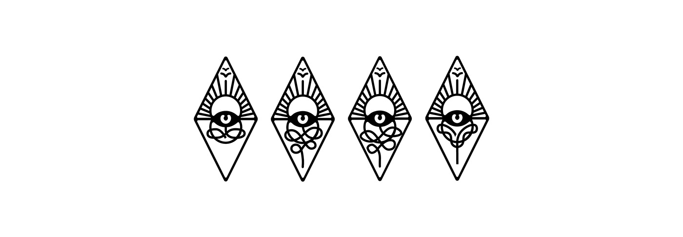
Made it more neat and gave it the effect of looping around the ring.
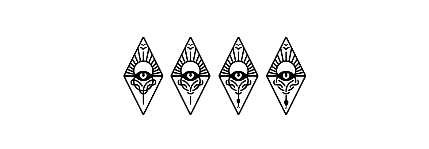


This would work really well as a stand alone logo, but in the context of a can it looks like more needs to be filled in. I added circles and borders to give it some girth.
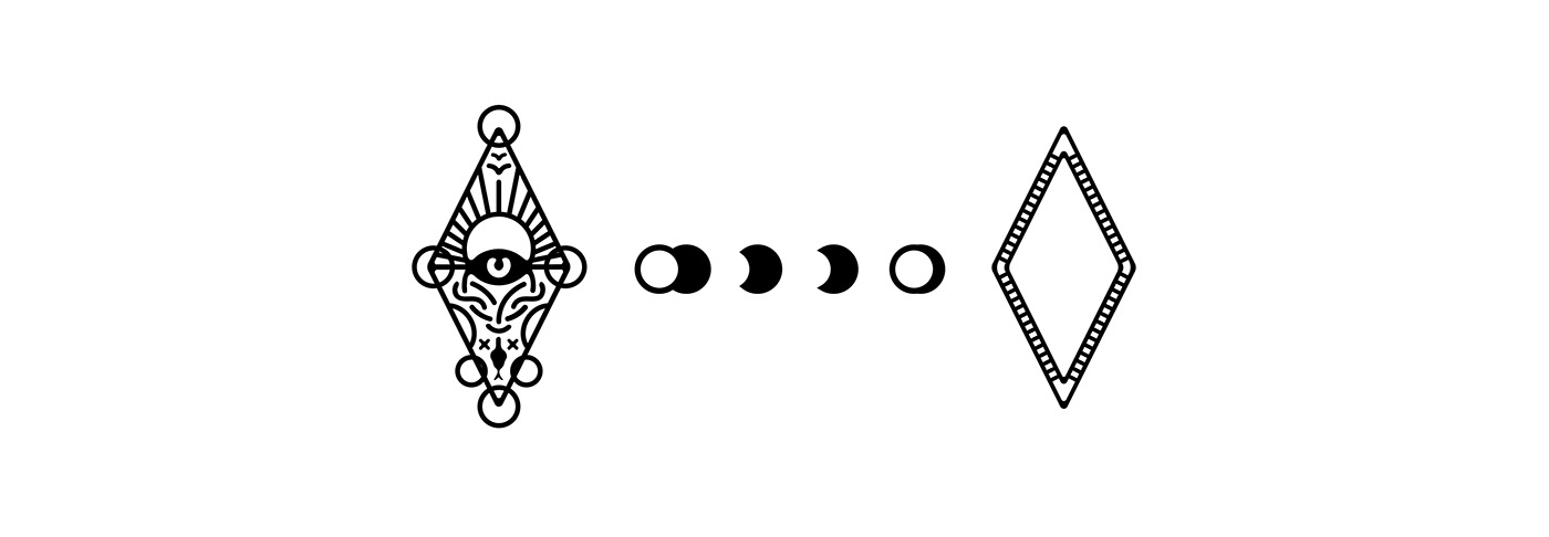
Let's get some moon action up in here.


It made the design too vertically stretched out, where in order to fit it on the can I had to make it too small to appreciate, so set the moon phases on the sides with the same border as the diamond.
I like to mess around with symbols a lot. I used one to fill in more blank space.
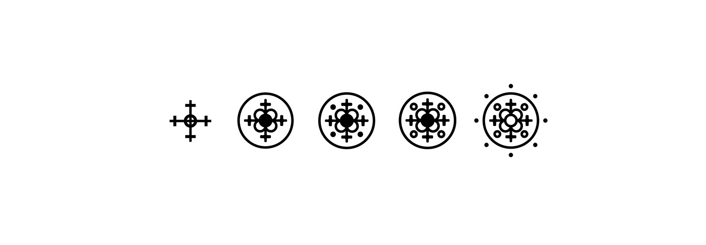
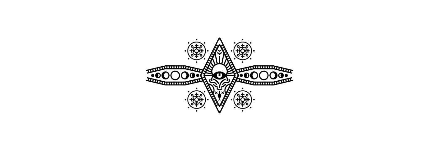
Put in a square for an organized look.