
For this project, I was tasked with re-branding my hometown of Waltham, Massachusetts. As one of the oldest communities in Massachusetts, Waltham is known for its industrial history and cultural diversity, which are attributes I wanted to convey in its new identity.
I began by researching its rich history and honing in on the watch factory that had been such a huge part of the city’s identity for decades, and thought that this source of industry could reflect the modern-day commerce that Waltham is known for while also touch-
ing its diverse past.
I began by researching its rich history and honing in on the watch factory that had been such a huge part of the city’s identity for decades, and thought that this source of industry could reflect the modern-day commerce that Waltham is known for while also touch-
ing its diverse past.
Waltham’s rebrand needs to represent all of its many facets. Its brand identity needs to be reflective of its industrial past, express its modern, youthful nature, as well as evoke sense of community. That is why I chose a slab serif type choice that is indicative of Waltham’s classic industrial history, but as a modern rendition in order to seamlessly merge the past and present, making sure both tradition and futurity are expressed.


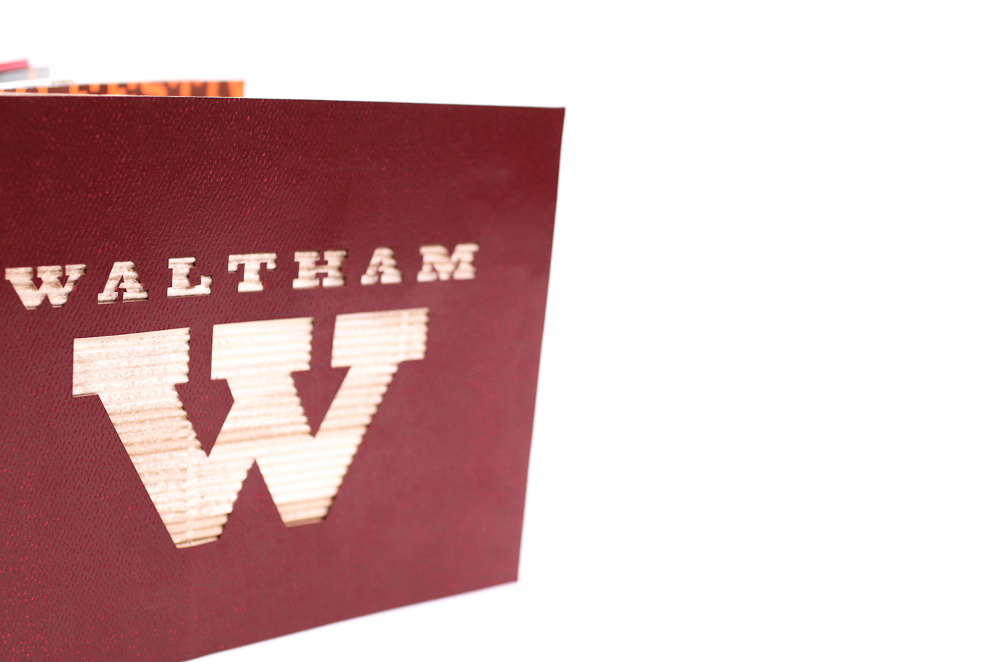

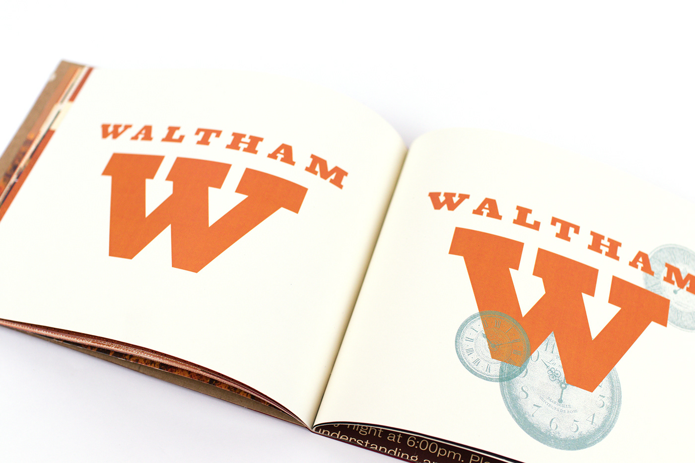


Although Waltham is known as “Watch City,” this idea can be taken further into the city’s identity. This concept of “Watch Us,” implies Waltham is taking steps to improve, progress in industry, and is constantly reaching for excellence in all areas for the whole world to see. This phrasing can be applied as an advertising campaign to boost city morale and pride, but also encourage more people to want to move there.