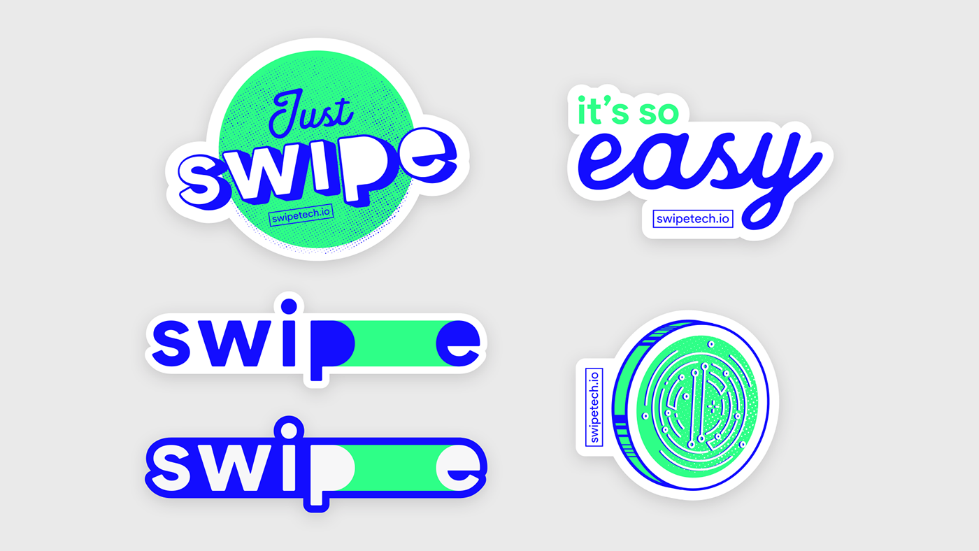
O grande desafio no rebrand da marca Swipe, foi deixá-la mais marcante e moderna sem perder características importantes da antiga marca. Buscando traduzir o nome da empresa através do conceito de facilidade de transferência, chegamos em uma estética visual minimalista. A marca é comporta somente de um logotipo nas cores já utilizadas pela empresa, afim de não descaracterizar a identidade já consolidada, a tipografia foi alterada afim de ser mais friendly, porém mantemos uma proximidade estética, ajustamos o kerning (entre letras) para causar mais conforto visual, além de ajudar na aplicabilidade da marca. No logo podemos ver que a letra final “E” se encontra mais afastada e com uma tarja verde neon à ligando a letra “P”, desta forma passamos a ideia de movimento, “deslizando” a letra “E”. Foram criados stickers para deixar a identidade mais jovem e moderna, também uma forma divertidade de chamar atenção para a marca, podendo serem utilizadas na própria comunicação e abrindo espaço para futuras ilustrações para a landing page. A ideia foi posicionar a marca como fornecedora de facilidade para o dia-a-dia, tanto para seus clientes intermediários (prestadores de serviço) quanto para o cliente final (consumidores).
The great challenge in rebrand of the brand Swipe, was to make it more striking and modern without losing important characteristics of the old brand. Seeking to translate the name of the company through the concept of transferability, we arrive at a visual aesthetic minimalist. The brand is only a logo in the colors already used by the company, in order not to de-characterize the already consolidated identity, the typography has been modified in order to be more friendly, but we maintain an aesthetic proximity, we adjust the kerning (between letters) to cause more visual comfort, as well as help in the applicability of the brand. In the next step, we can see that the final letter "E" is further away and with a neon green stripe on the letter "P", we move the idea of "sliding" the letter "E". Stickers have been created to make the identity more youthful and modern, as well as an amusing way of drawing attention to the brand, which can be used in the communication itself and making room for future illustrations for the landing page. The idea was to position the brand as a day-to-day supply provider, both for its intermediate customers (service providers) and for the final customer (consumers).