
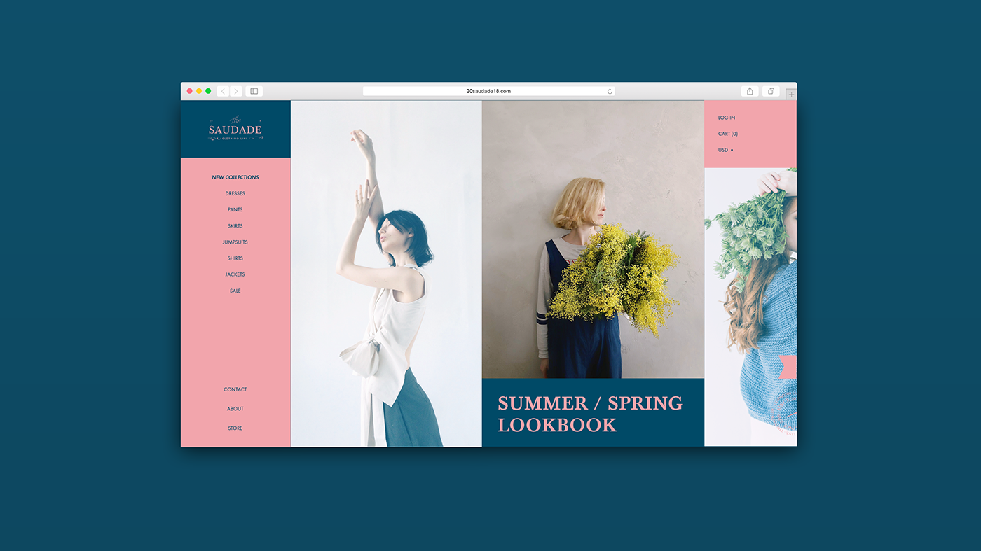
The Saudade
- personal project
Saudade /ˌsaʊˈdɑːdə/; is a nostalgic longing to be near again to something or someone that is distant, or that has been loved and then lost; "the love that remains". The Saudade stands for a state of feeling that someone are far away from their lover and they miss the smell and the fabric of their lover's clothes. For the brand new on the tailoring clothes as our main source of concept and inspiration.
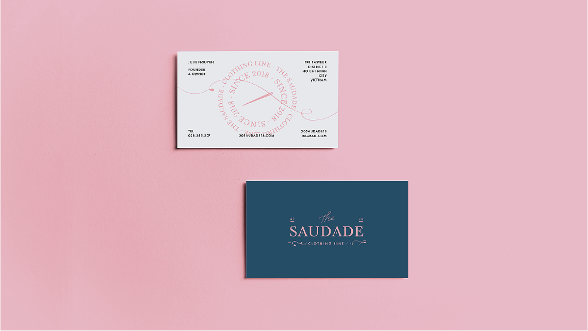
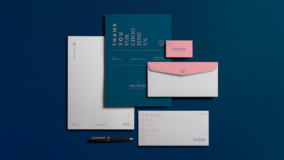
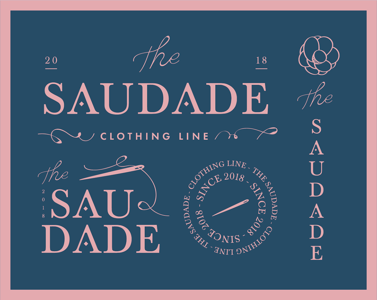
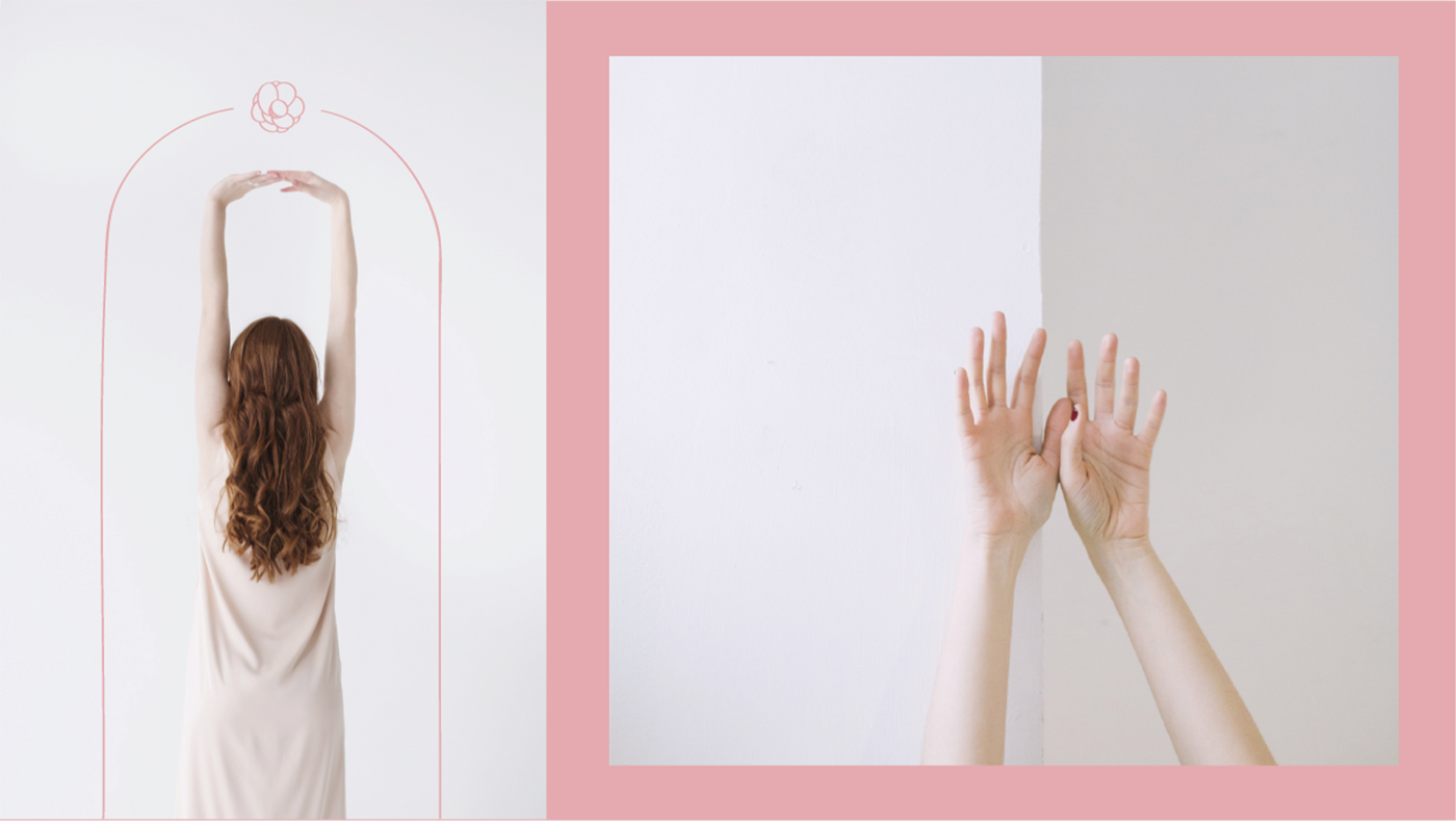
By using a very old typefaces - Baskerville - that feels elegant, elongated and minimal. Inspired by the lost identity of tailor - a needle, we developed a simple yet elegant wordmark and visual identity, which incorporates clean typography and an abstract, petal lines, appealing to a contemporary, design-savvy customer base. Unique forms that arch around lines and bold strikes that frame assets create an interesting graphic dimension to the brand. The secondary element is a needle, thread and thea amplexicaulis flower. A tonal color palette was developed to refer to the love (pink) and mysterious (dark blue), creating a brand that is truly connected to every individual emotion.
By using a very old typefaces - Baskerville - that feels elegant, elongated and minimal. Inspired by the lost identity of tailor - a needle, we developed a simple yet elegant wordmark and visual identity, which incorporates clean typography and an abstract, petal lines, appealing to a contemporary, design-savvy customer base. Unique forms that arch around lines and bold strikes that frame assets create an interesting graphic dimension to the brand. The secondary element is a needle, thread and thea amplexicaulis flower. A tonal color palette was developed to refer to the love (pink) and mysterious (dark blue), creating a brand that is truly connected to every individual emotion.
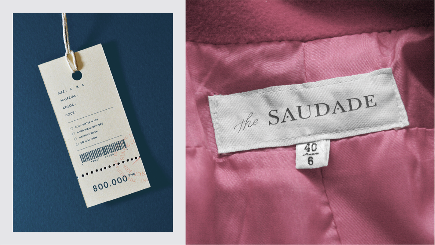
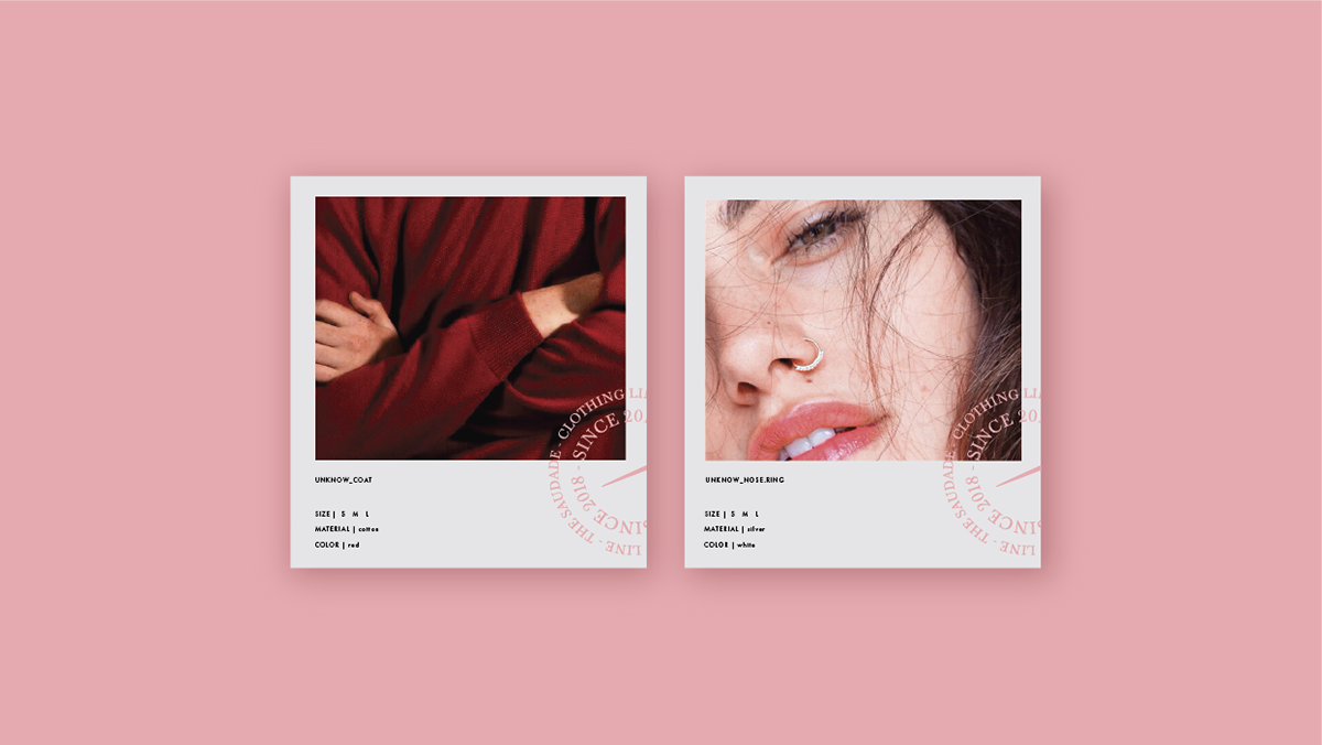
Product images are for illustrative purposes only
Photos Credit
photos-public-domain.com
Daria Shevtsova
Phoebe Tonkin
Pixabay
Christian Dior Boutique
Daria Shevtsova
Phoebe Tonkin
Pixabay
Christian Dior Boutique


I hope the scrolling felt as good for you as it did for me.
I love your appreciations and comments.
I love your appreciations and comments.
