For this project, we were tasked with redesigning a tea company's branding. After deciding to rebrand the company Numi, I dived into researching.
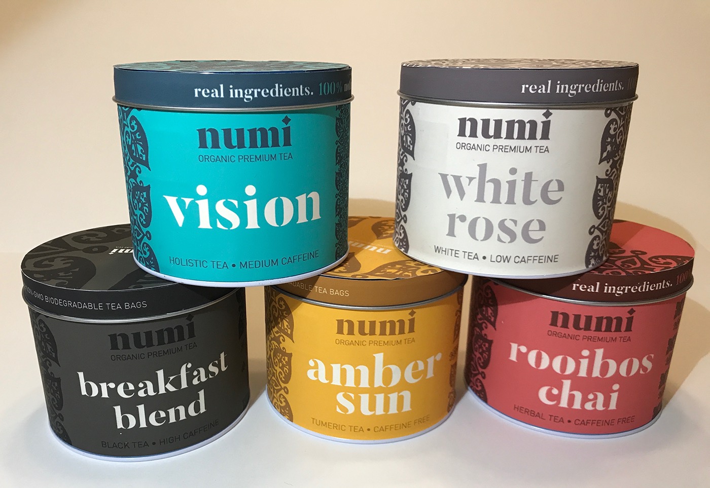
The company is named after a Middle Eastern drink made with lime, and its founders are a brother and a sister that dreamed of creating a tea that was made from completely organic, farm-sourced ingredients from worldwide farms. They pride themselves in Fair Labor Practices and constant investments in the communities they have farms in as well as eco-friendly packaging.
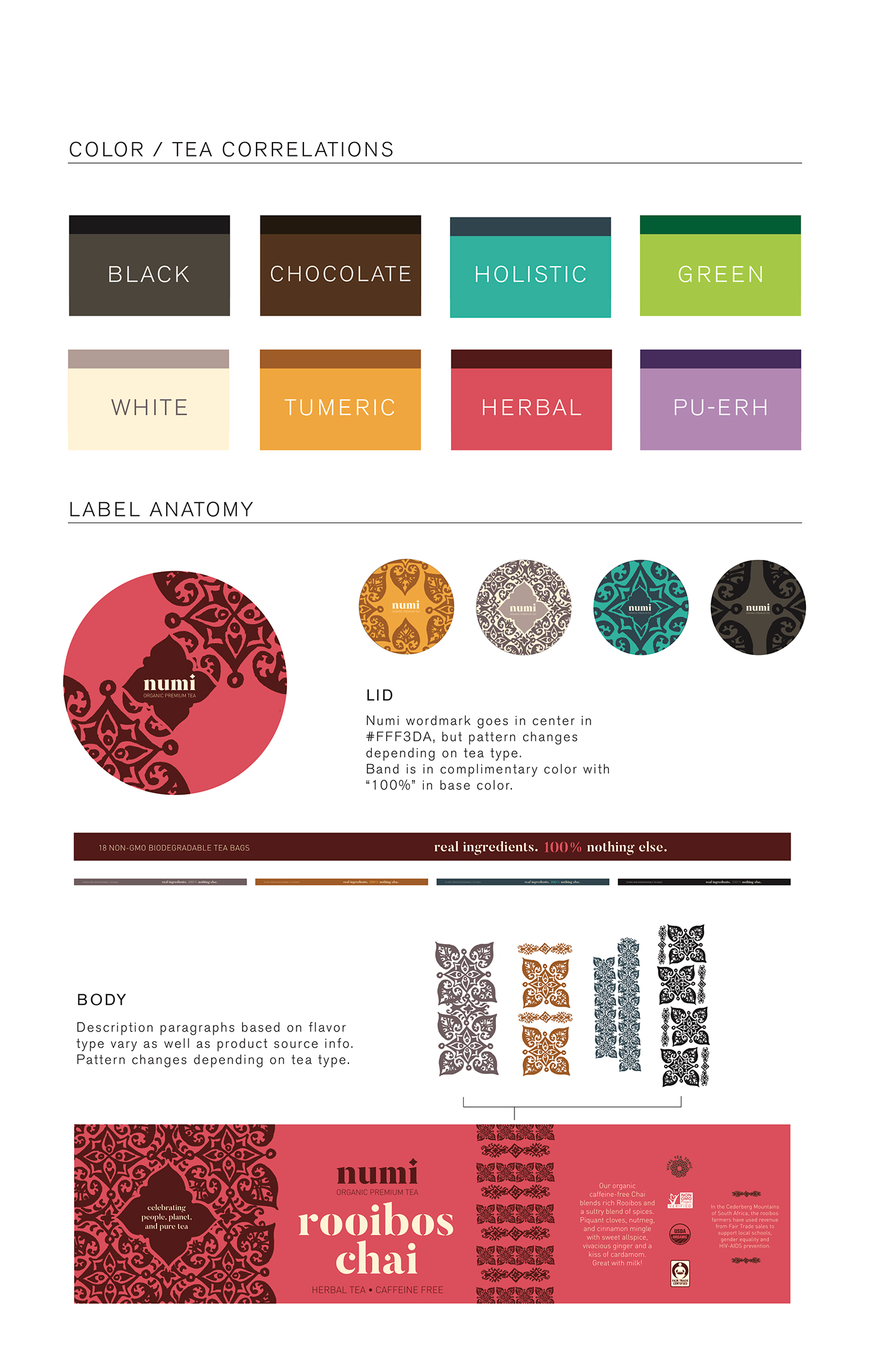
I researched classic Middle Eastern patterns and drew an iteration which is used consistently throughout the packaging to hone in on the company's roots, but is used in a variety of ways to reflect the diversity of ingredients and countries the company uses and is sourced from. The tin packaging used from recycled materials would create a reusable container for customers who are environmentally conscious. Colors of each package resemble a certain type of tea, because Numi creates eight different types. The quick identification of tea type by color helps customers easily select their favorite types of tea or try new ones, creating a helpful shelf presence.
Because such a staple of the Numi brand is their organic ingredients and fair trade job opportunities as well as all their efforts to support the communities they purchase ingredients from, I knew that those elements had to be highlighted and communicated, so I kept their USDA Organic and Fair Trade Certified stickers as well as including a blurb from their website about the works the company does to support the specific community that tea's ingredients were sourced from.