
BRIEF
A system for the overall change in the signage for 'Namma Metro' in Bengaluru. The motive for doing so was to make way-finding easier and also be sensitive to the diversity of people using facility and therefore being inclusive in terms of language, age, culture etc. The key was to merge the cultural identity of Bengaluru with that of a modern transport facility in an ever-growing urban jungle.
FOCUS
In a growing city like Bengaluru, it was important that the design be dynamic and adaptable. It was important to me to create a modular design structure that could be applied to upcoming stations as well.
After a few case studies, I created a 'format' where a single square (of given dimensions), works as one unit. These units holding information like, Platform Number, Directional Arrows and Station Names etc., can be clubbed together to make a sign- as required.
To reduce the ‘information noise’ that is inevitable in multilingual city like Bengaluru, I relied on usage of symbols for the information board. These boards were field- tested before being integrated in the final outcome.
I also felt the need to create a new system of identification in order to reduce the 'information- noise' we often have to deal with and create a more effective way- finding experience. Instead of identifying the station with the location, I gave each station a number to go along with the station name, making it easier to plan for the station. This reduced the problem of needing to translate a station's name in three different languages. You could simply place the number of station in question to indicate the last stop and therefore, the direction.
I adapted the existing visual language of the metro to a more modern setting. Contemporary patterns and graphics were created from the existing logo. Symbols were tweaked to incorporate a sense of the space.

Scale Mockup

Existing Signage

Proposed Signage

Colour Palette
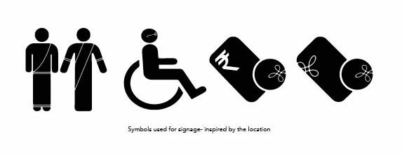
Symbols adapted for the space

Directional Signage

Directional Signage

Variations created using a modular layout

Informational Signage
Map
I created a pocket size, fold-out map to be used as a give-away at the metro stations. The size of the full map was A4, but folded thrice, could easily fit in a wallet.
I chose to do a schematic map as they are easier to understand and feel more urban as well. The back of the map, other than providing a numbered key for each station in three languages- English, Hindi and Kannada, also demonstrates a fun way to chart your journey and calculate one’s fare.

Map listing out the stations

Back of the map, folded to fit inside your pocket.


I created a fun way to calculate one’s fare that could be included in the give-away. This had two purposes; first, the entire fare chart was far too extensive to be included in a small give-away and secondly, it was important for me to provide fare information that spread across all stations, not just one, especially since the purpose of a give-away was that it travelled with the passenger. Thus, I created a simple algorithm to calculate one’s fare, to and from any station in the metro system.


