For a Data Visualisation course, we were asked to take on personal projects under the umbrella of finance that called for ‘self-advocacy’ through visualisations. We were encouraged to realise these 'visualisations' in a variety of media- from digital to textile.
I chose to take on the mammoth task of looking into my personal finances and hopefully, trying to change my behaviour for the better using the data I had gathered over a couple of weeks.
Aim: Optimise spending using thesis past data as knowledge to advise future decisions for more satisfactory results.
Problem: Unhappy with financial decisions and unable to save for wishlist items.
After collecting data on my personal spending for over two weeks, I created rudimentary visualisations to track my spending.

Pie chart tracking data for a week
I decided that in order to create a truly powerful visualisation that would affect change in my behaviour I needed something that would seamlessly integrate into my lifestyle and become effortless in my decision making process.
I needed something that would affect me in the spur of the moment, while making decisions, unlike a 2D infographic that I would inevitably become numb towards.
I decided to make a personalised wallet that would help me make satisfying spending decisions.
I created a foldout wallet that would easily fit into my pockets. It features two pockets- one for monthly necessities like groceries, WiFi etc. and the other for my weekly budget.
The first prototype also featured a colour wheel that tells you the status of your accounts with colours ranging from green for saving to red for a large deficit- so you 'see' the status of your accounts when you open your wallet.
The inside flap also features a small infographic that visualises one's spending from the previous month. It tells you the relative amount of money spent on decisions that translate into emotions ranging from regret to indulgence. It also tells you the main items under these categories, forcing you to reconsider your purchase and therefore make smarter decisions.
Other features include a secret pocket for weekly savings and pockets for a cards and an ID.
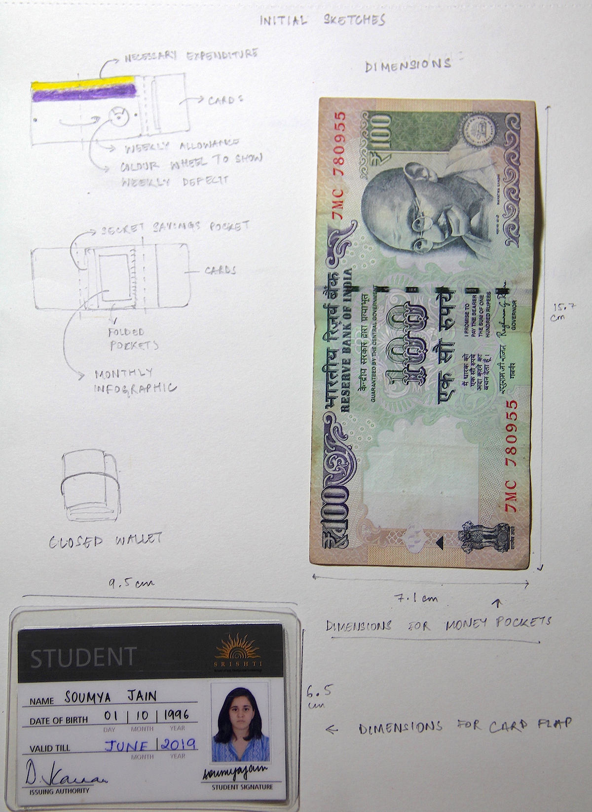
Visualising the wallet

Mockup of infographic along with key for emotions that correlate to the relative amount of money spent under them

First Prototype
Feedback from my guide made me question the seamlessness of my features- the colour wheel felt awkward and out of place.
I decided to scrap the colour wheel and instead change the colour of the two flaps, pink to indicate deficit and green to indicate being within weekly budget/ savings. The state of my accounts dictated which flap was on top.
I realised that by doing this, a single glance at my wallet could affect my decision and therefore was more impactful. It also integrated very well with my design.

Sketched depicting changes in the prototype

Final Product

Both the prototypes made with foam paper
