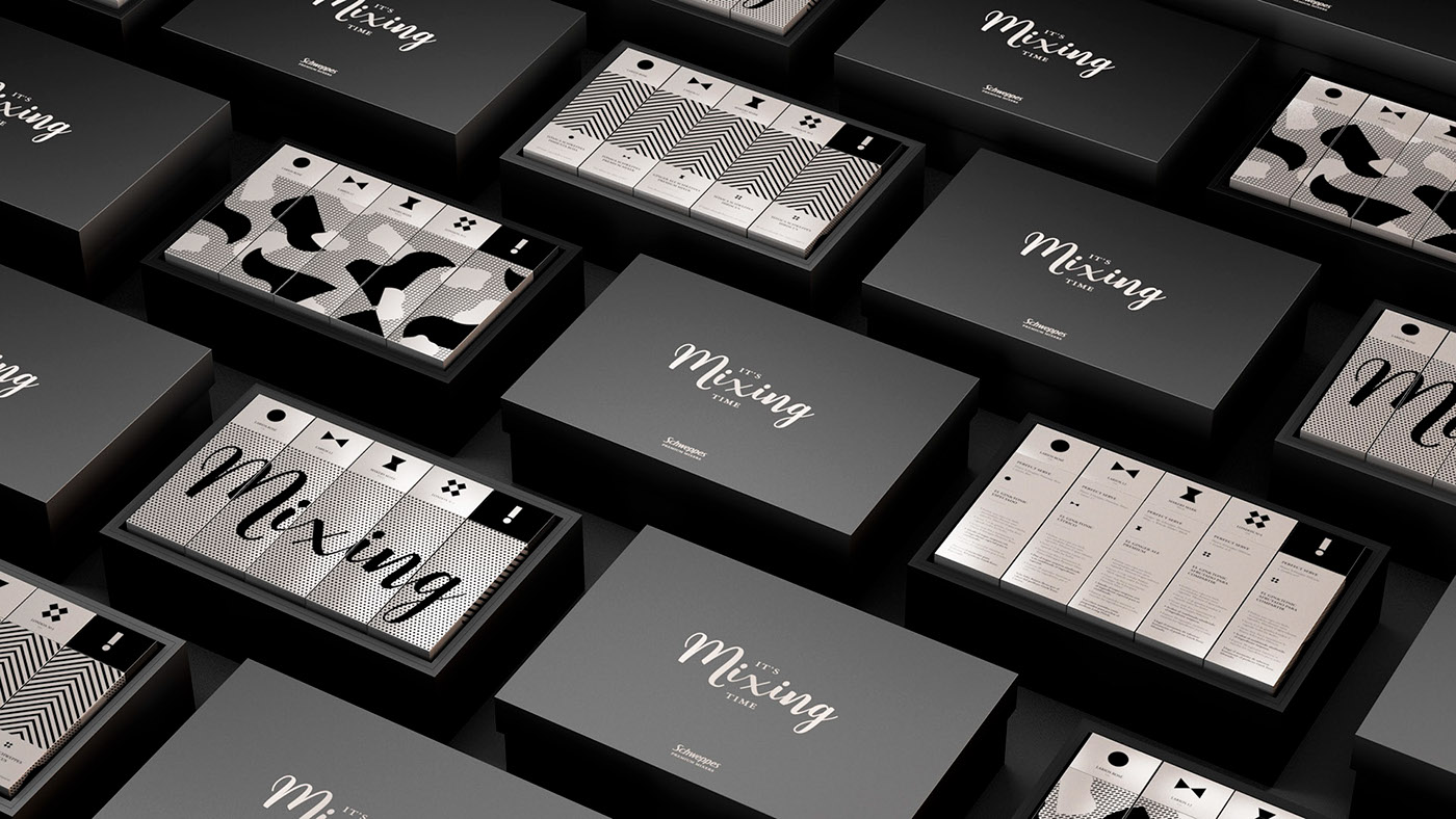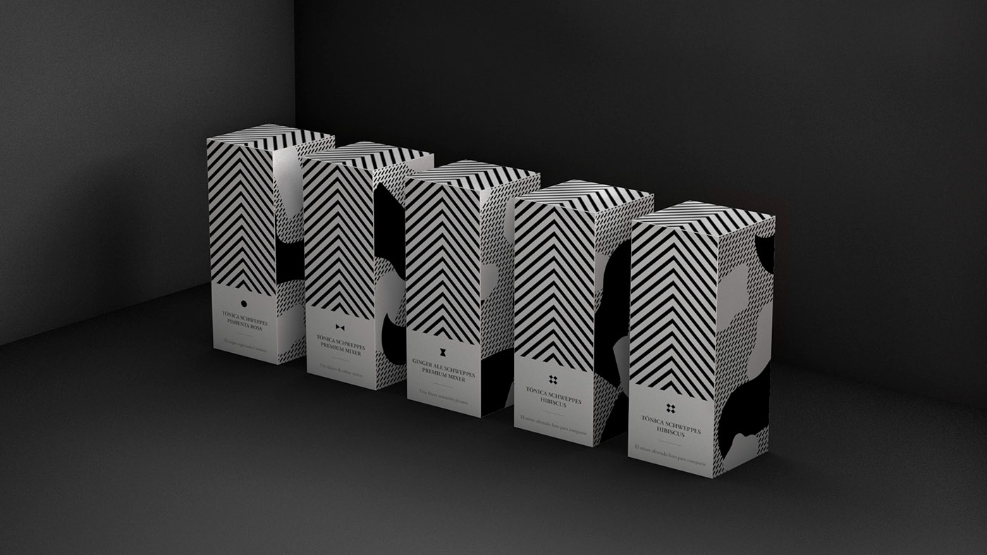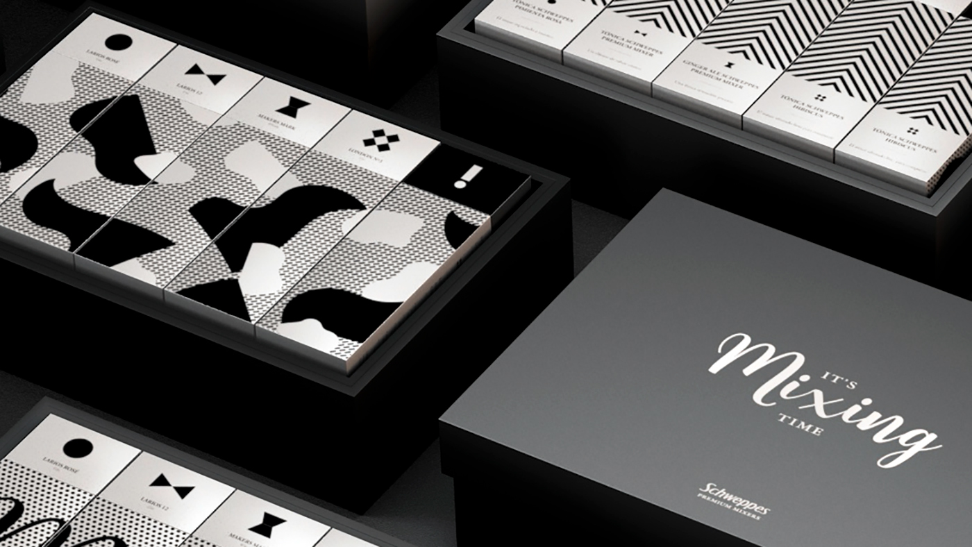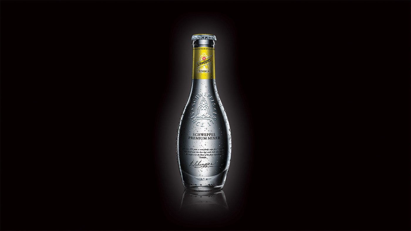
The project initially involved the design and art direction of a corporate box that contains five bottles of tonic and four mini-bottles of different gyns to send to a selected list of clients for christmas.
We wanted to go further with a more awe-inspiring product emphasizing the luxury and elegance that set the brand apart getting into the aspirational universe of the gyn&tonic.
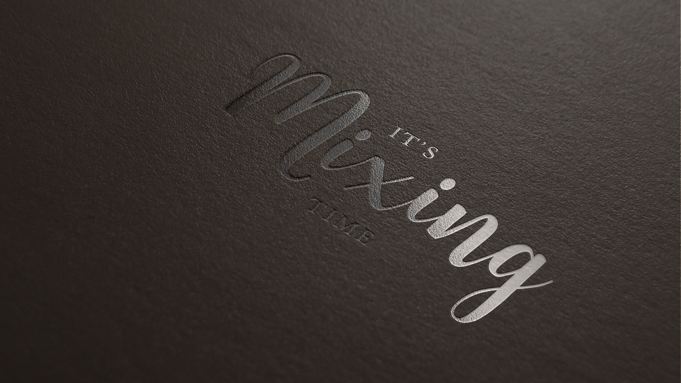
That´s why we tranformed the box into a unique experience called 'It´s mixing time'
That´s why we tranformed the box into a unique experience called 'It´s mixing time'
What´s the meaning of 'It´s mixing time'?
Schweppes wants to motivate the client to use the bottles inside the case to make the perfect mix between tonic&gyn.
As the main concept was the word 'mixing' we made a nod to the song 'It´s christmas time' creating a personal naming for the limited edition christmas case: 'It´s mixing time'
Schweppes wants to motivate the client to use the bottles inside the case to make the perfect mix between tonic&gyn.
As the main concept was the word 'mixing' we made a nod to the song 'It´s christmas time' creating a personal naming for the limited edition christmas case: 'It´s mixing time'

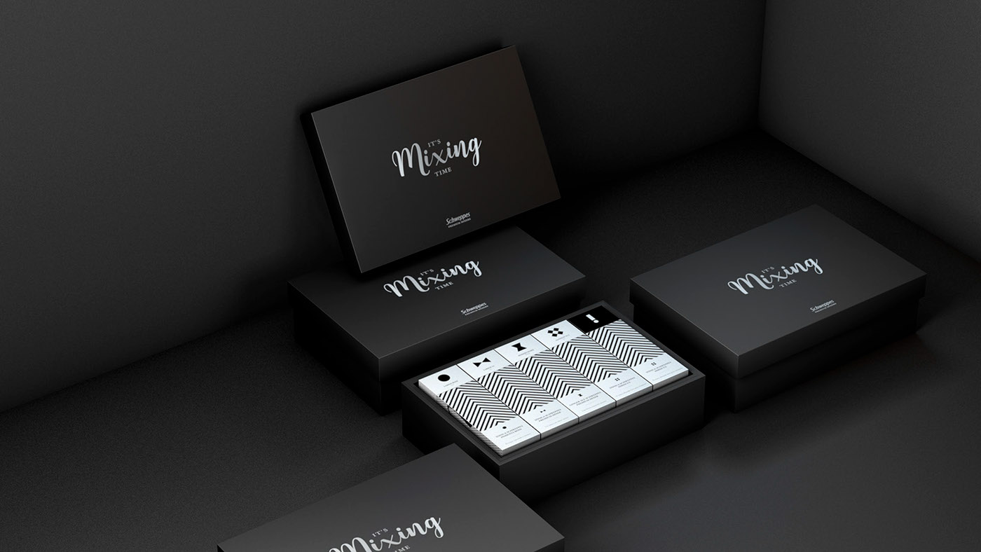
How did we translate into a visual solution the concept of 'mixing'?
When we open the black case we discover a playful experience of mixing: each bottle has a box with a different illustration on each box-side. You can switch the position of each side getting different constructions of abstract illustrations, words and geometric graphics.
When we open the black case we discover a playful experience of mixing: each bottle has a box with a different illustration on each box-side. You can switch the position of each side getting different constructions of abstract illustrations, words and geometric graphics.

We wanted to transmit the elegant spirit by the sober use of black & white, the simply and modern pattern-design and illustrations and the huge attention to detail in the manufacturing process of the kit-case.