City of Yangon Branding Guidelines
For this branding project, logo and visual system was created based on city of Yangon.
It reveals conceptual development of the brand along with final logo and brand application.
For this branding project, logo and visual system was created based on city of Yangon.
It reveals conceptual development of the brand along with final logo and brand application.
Concept
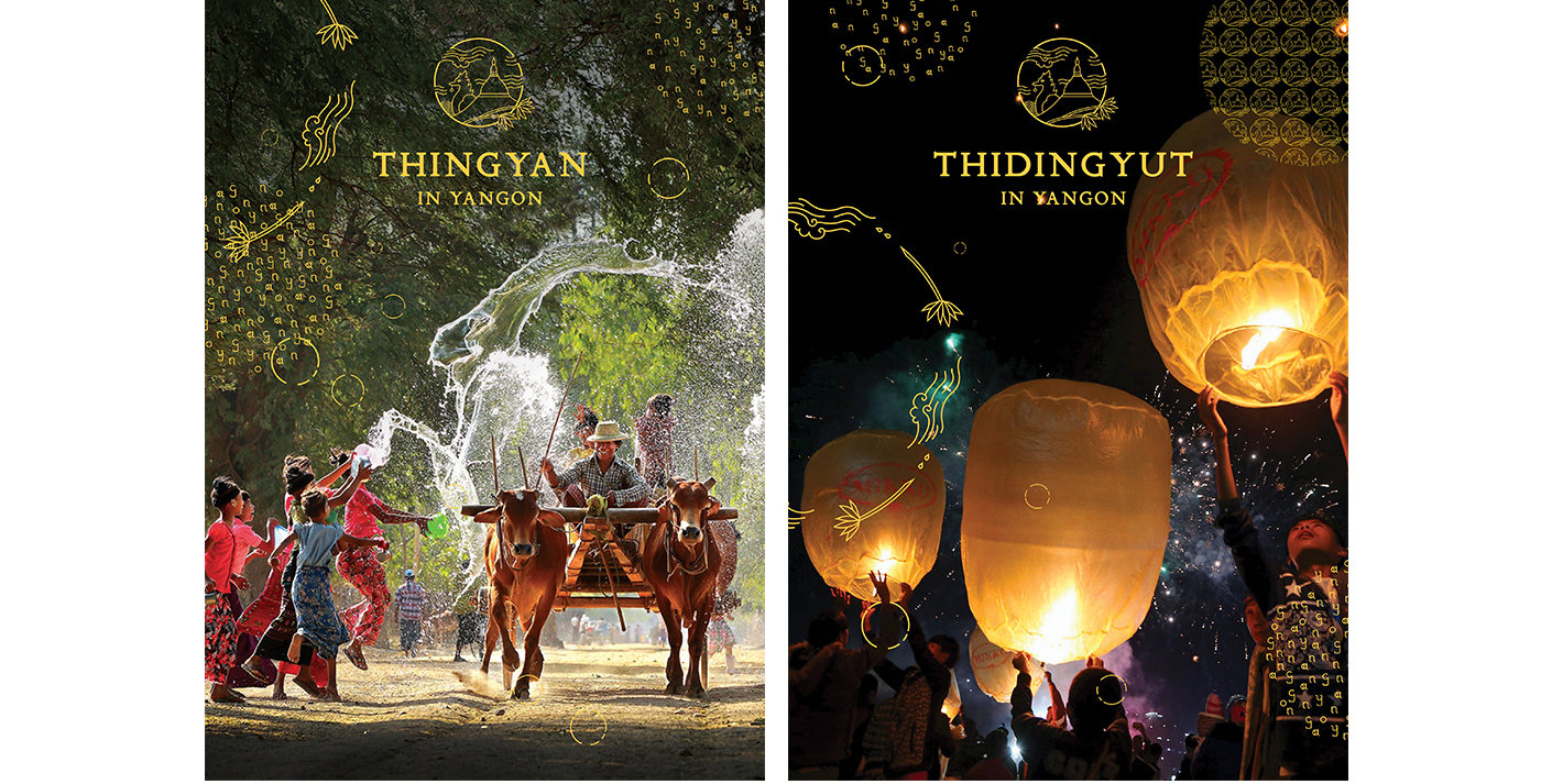
Yangon has been in an oppressive environment for long period of time due to military control. Fortunately, there is a brighter future for everyone in the current process of transitioning into democracy. Thus, concept of my branding is to revitalize the city through highlighting unique and positive characteristics of Yangon such as its architecture, people, religion, and culture.


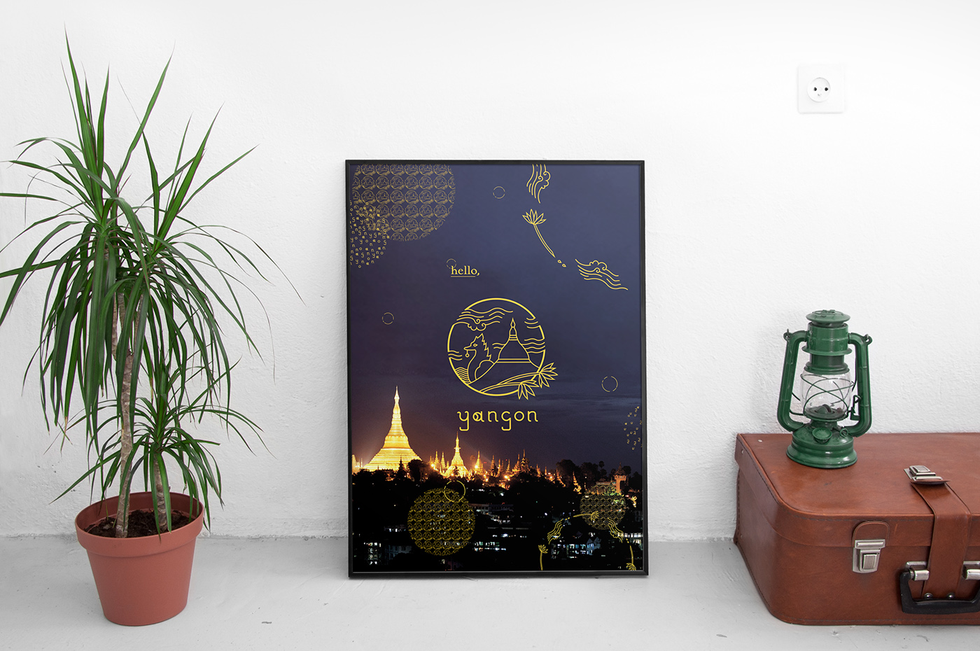
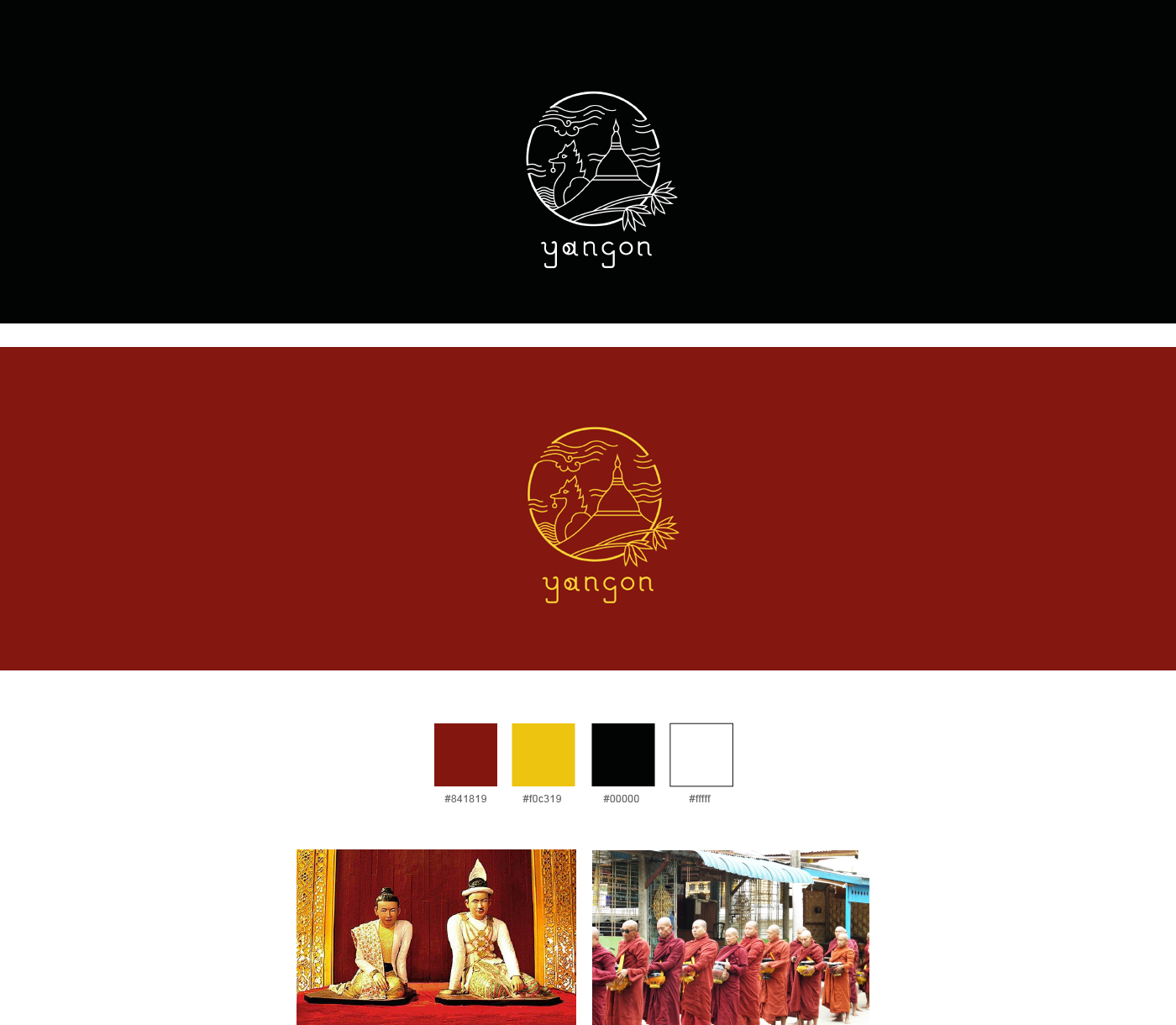
The Logo
Yangon is a city that balances tradition, culture and modernity.
The illustrative qualities involve intricate design to represent Burmese traditional artistic style.
The illustrative qualities involve intricate design to represent Burmese traditional artistic style.

Type Logo
Type logo was created through exploration of Burmese and English alphabets.
The letters that looked similar from each other was chosen to adopt a mixed combination of two different languages into a new form.
The letters that looked similar from each other was chosen to adopt a mixed combination of two different languages into a new form.


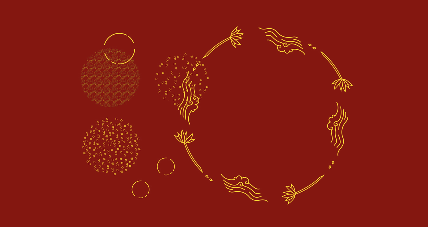
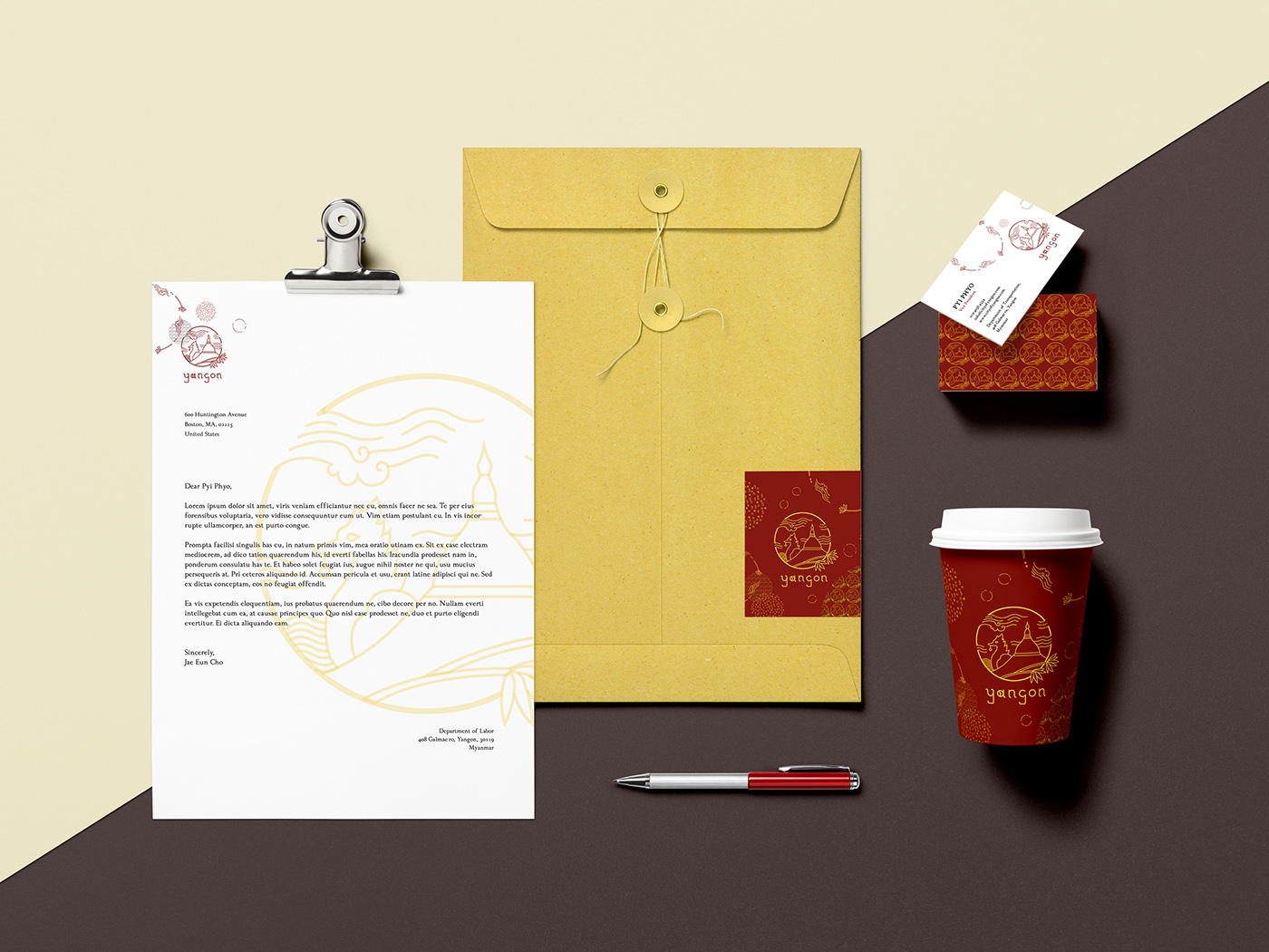
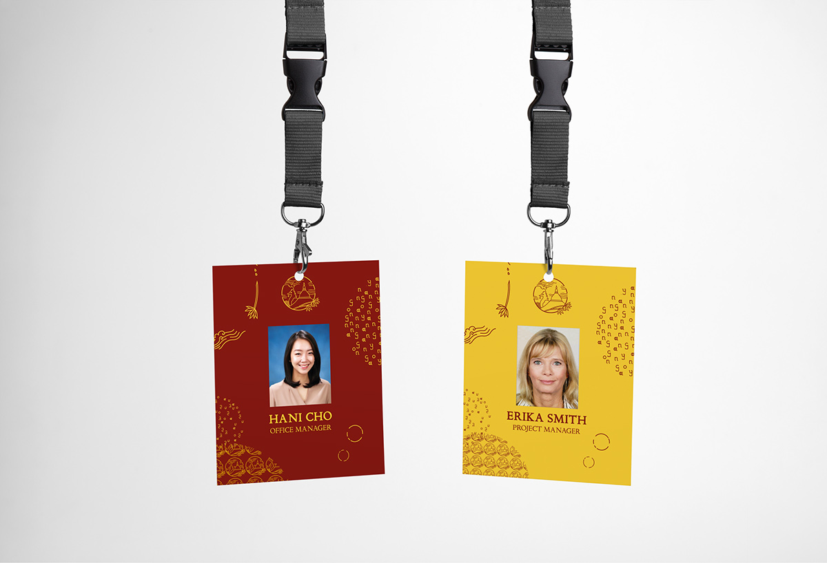
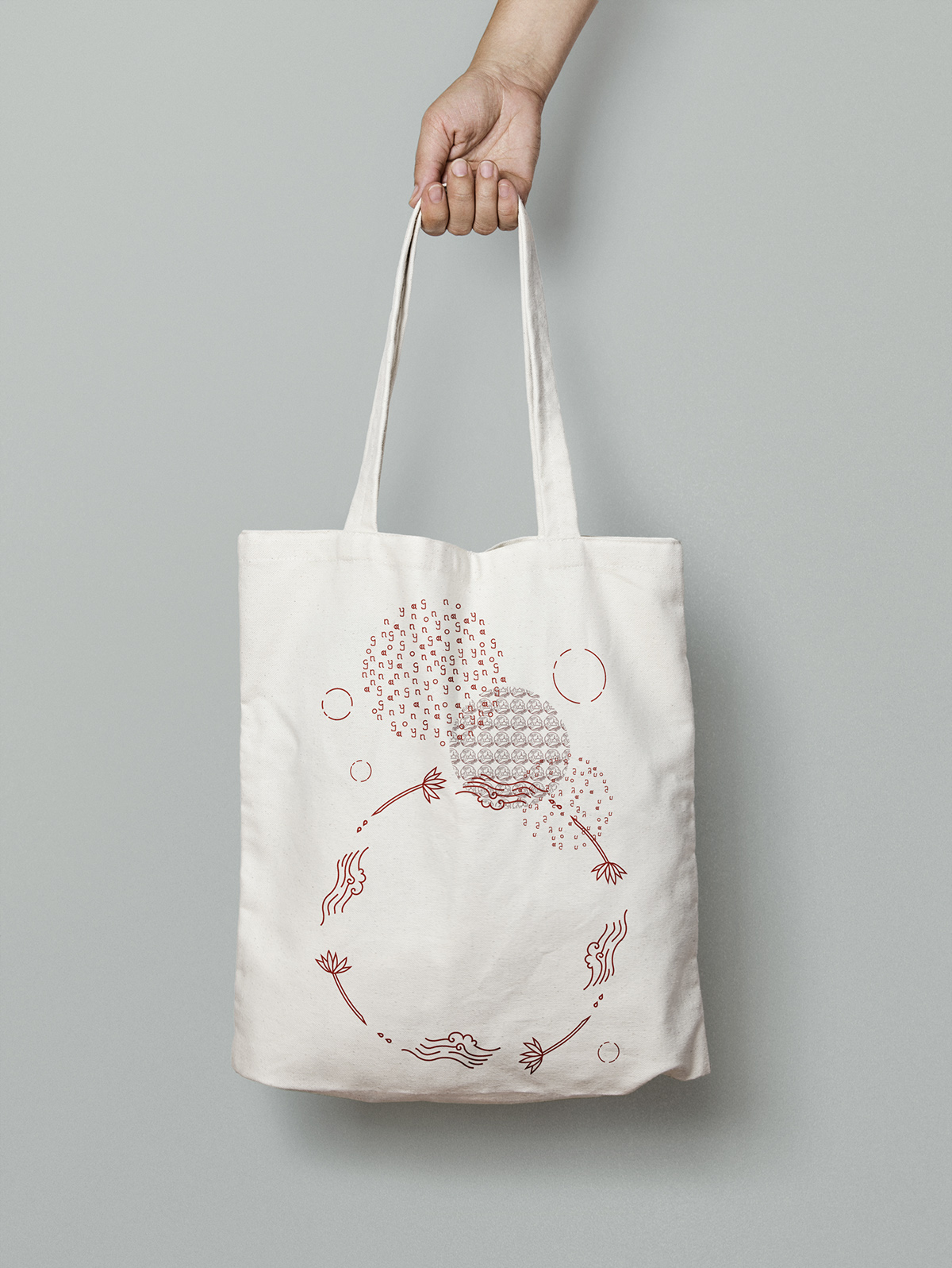
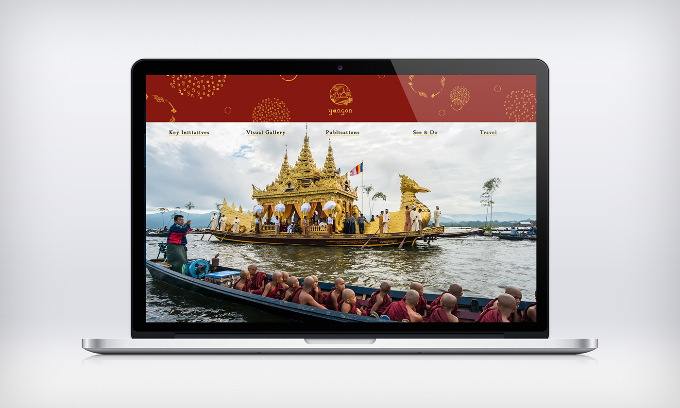
Brand Visual System
The illustrative qualities involve intricate design to represent Burmese traditional artistic style. Expanded a system for Yangon's branding, used visual features from the logo and created several patterns in shapes of circle.
The illustrative qualities involve intricate design to represent Burmese traditional artistic style. Expanded a system for Yangon's branding, used visual features from the logo and created several patterns in shapes of circle.