

ISTD 2016 // Student Project
Celebrate the life’s work of Adrian Frutiger.
Create a prestigious ‘publication’ that celebrates the life and work of Adrian Frutiger.
Research & Development
Sketchbook research of personal responses to the
uncovered information about Adrian Frutiger.

Concept
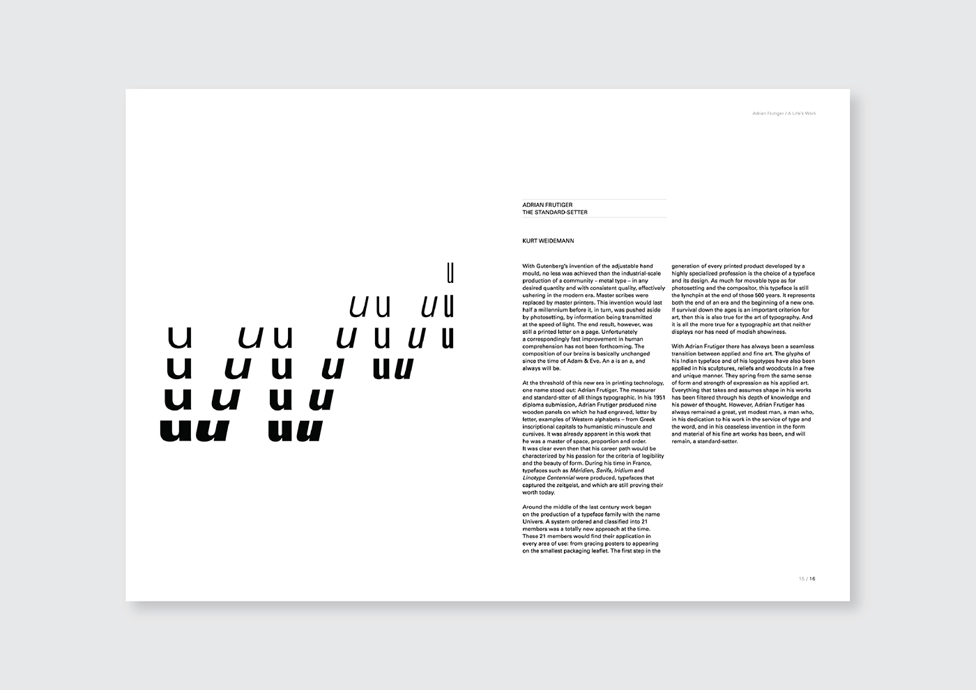
The quality of Frutiger’s typefaces is not found in superficial/formal criteria,
but in their structural, fundamental legibility. Discovering this exceptional DNA in his designs requires a trained eye.
•
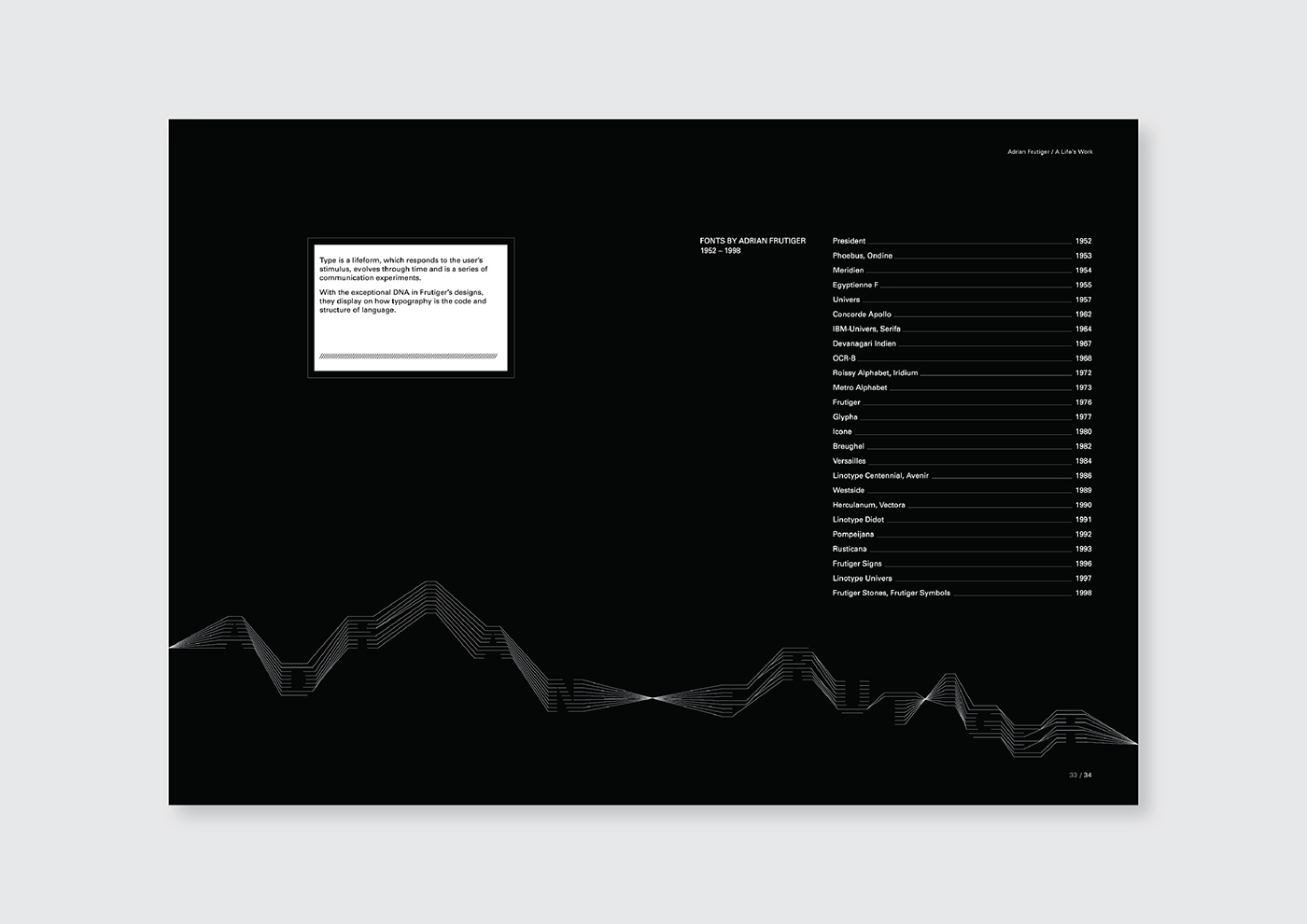
Inspired from the actual DNA structure & code of the human body: similar to how typography is the code & structure of language.
Univers Font
characteristic of the whole
•
present everywhere
•
all nature, or all existing things
•
universal joint (free movement in any direction)


Colour Palette
Black & White
•
Adrian Frutiger claims that he doesnt have a good colour sense, which is a dimension that he lacks and doesn’t attract him.
At 16, he knew that his work would be in B&W.

Poster Design – The Birth of the Univers

Publication Layout


Print Pictorial


