
Cambridge English is a world-wide recognized educational institute that provides English language assessments and qualifications. The institution focus on innovative methods to teach English in an engaging way.
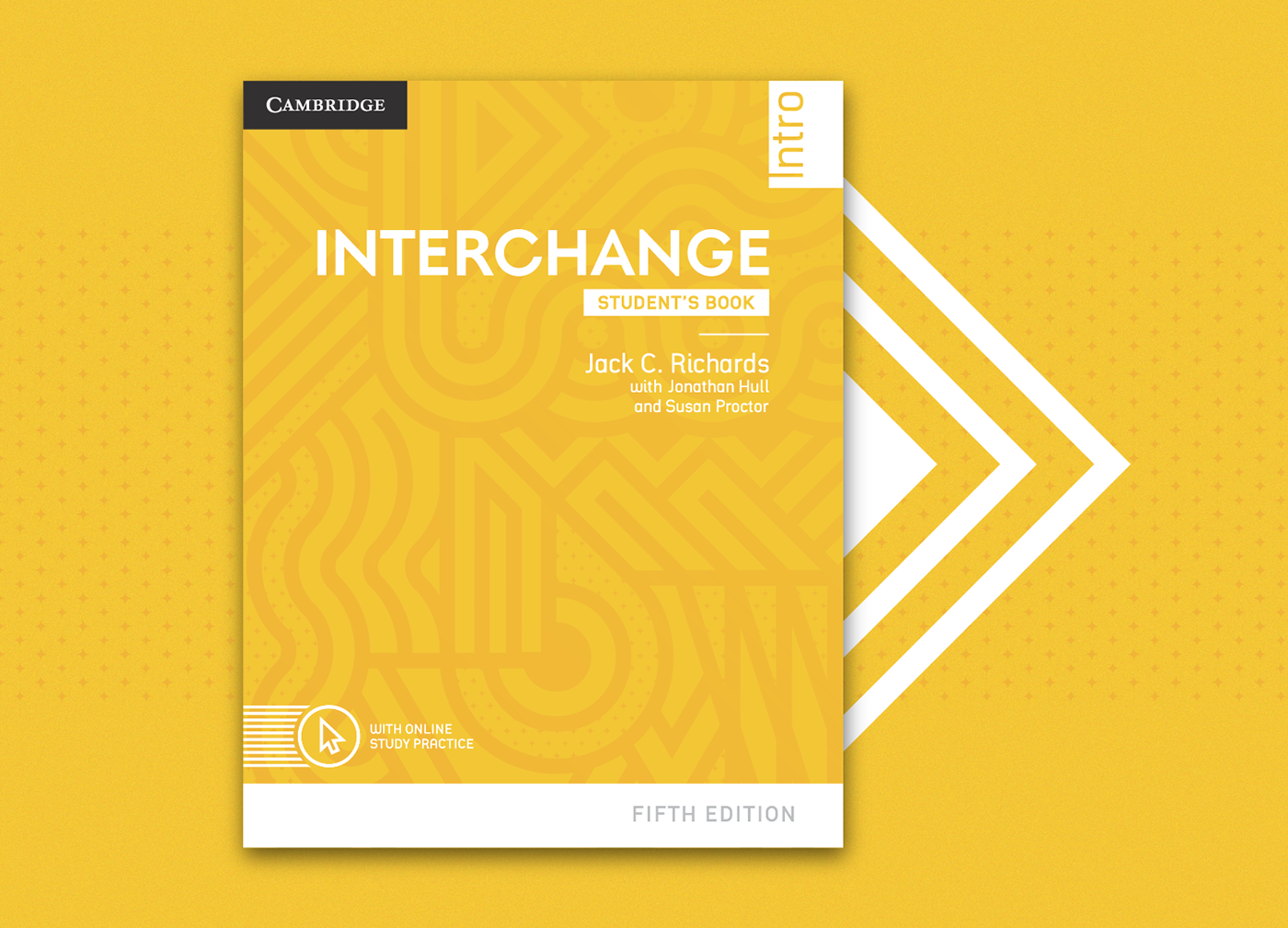
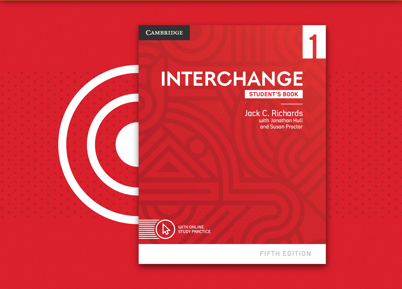
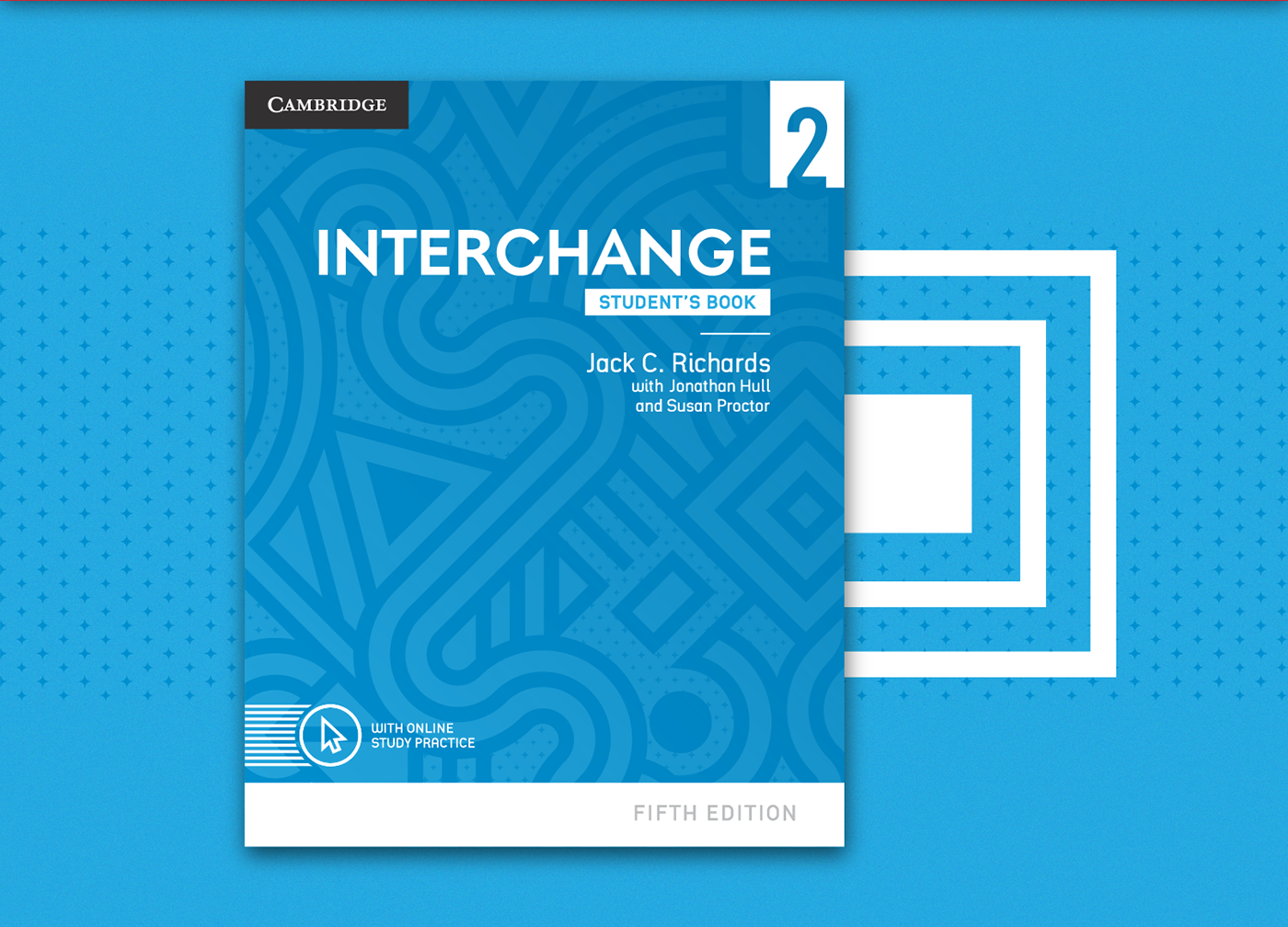
Among the many books Cambridge has developed there is the Interchange series. We proposed a new visual identity for the 5th edition's covers, which were made for young people and adults with intermediate or advanced levels of English. The main aspects to be solved were the dated design and legibility.
After analysing previous editions and the competition, we have developed a modern, vibrant and inviting proposal. Some concepts were created and amongst them we chose the one that best represented the essence of the series. The graphic elements symbolize the different journeys that learning allows. Each one of those paths leads to the next level, making all four covers come as one integrated single picture.
Since this type of book is commonly refered by its colour instead of its level, we chose bright and strong ones to make them easily identified by students and professors.
---
Cambridge English é um instituto de ensino, aprendizagem e avaliação de inglês com reconhecimento global. A instituição aposta em métodos inovadores, buscando ensinar inglês de forma atrativa aos estudantes.
Entre os vários livros produzidos pela Cambridge está a série Interchange. Propusemos o design das capas para a 5ª edição da coleção, voltada para o público jovem e adulto com nível intermediário/avançado de inglês. Dentre os pontos solicitados, deveríamos solucionar o aspecto datado e a legibilidade.
Após uma análise das edições anteriores e dos concorrentes, desenvolvemos uma proposta moderna, vibrante e convidativa. Criamos alguns conceitos e, dentro deles, elegemos o que melhor representasse a essência da coleção. Exploramos elementos gráficos que simbolizam as diversas trajetórias que a aprendizagem possibilita. Cada um desses caminhos leva ao nível seguinte, fazendo com que cada uma das quatro capas, juntas, criem uma figura única, integrada.
As cores fortes e alegres foram determinadas de maneira que cada livro seja facilmente identificado pelos alunos ou professores, já que esse tipo de livro costuma ser chamado pela cor e não pelo nível.


Direção de Criação: Daniel Edmundson
Design: Tomaz Alencar


