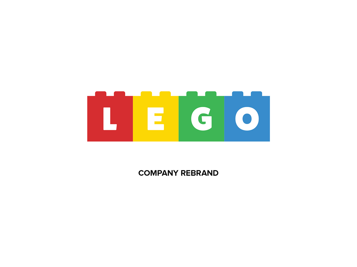
While examining the history of Lego’s logos, I noticed many similarities and reoccurrences throughout their different logo designs. They kept it simple, for the most part, using simple shapes like circles, squares and rectangles. They also only really used the primary colours, which brings the logo that sense of simplicity. However, another thing I noticed is that while the company believes in creativity and flexibility, their logo doesn’t allow for much of either. It’s very much “fixed”, wherein the logo is just that—a logo. I wanted to change that with my redesign. I wanted to make my logo flexible. With the current logo, the colours have stayed the same for about 40 years. The same yellow and red on every package and product. There should be an option of using different colours like orange, pink or turquoise. I wanted to have the ability to adapt the logo based on the product being sold. For example, having a pink, purple and sky blue logo to represent a Disney Frozen Lego kit. Also, I wanted to incorporate the blocks in a way that was simple while not feeling too forced. This gives me the ability to really play around with the positioning of the letters of the logo.


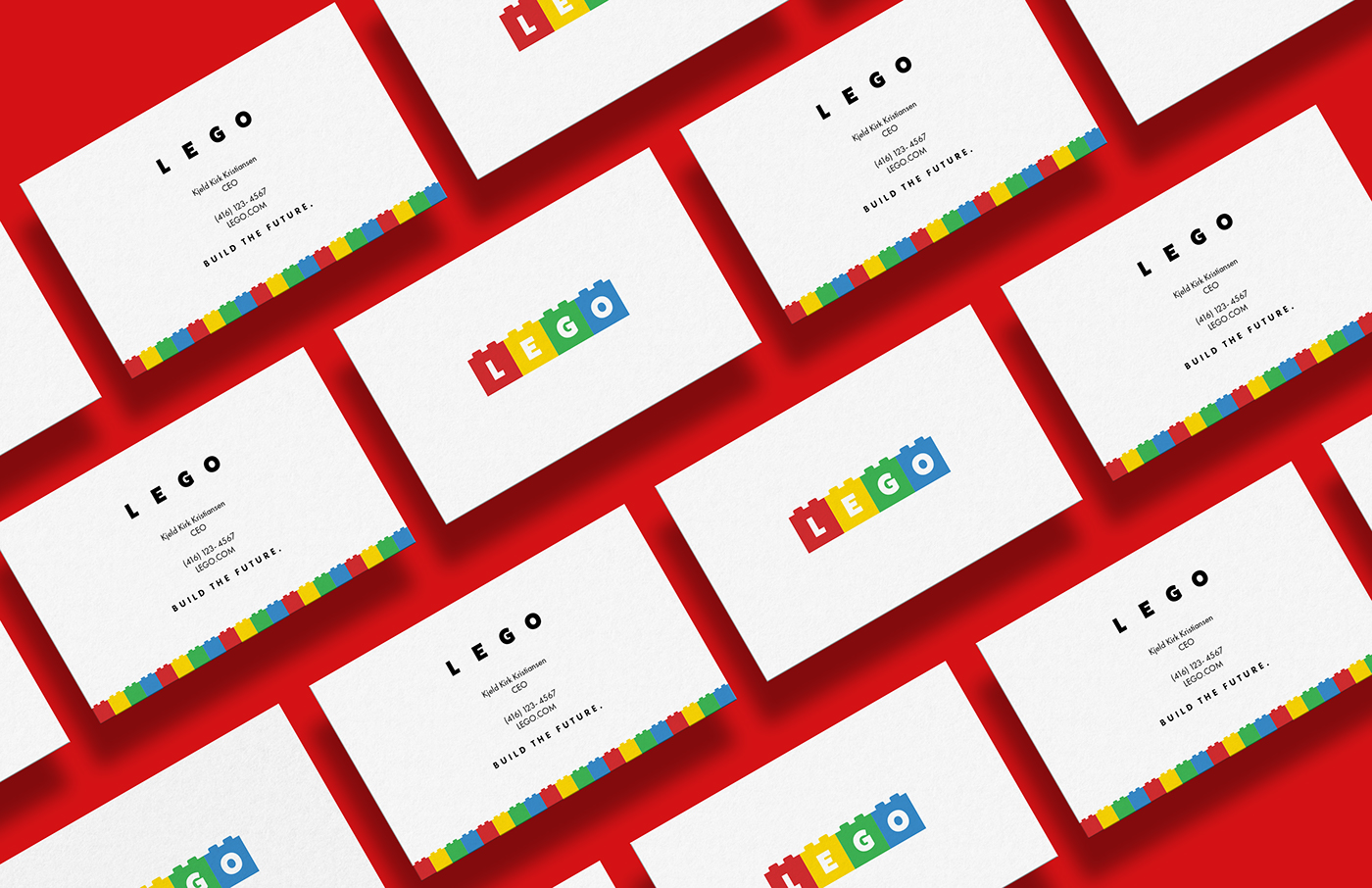
Business cards in perspective
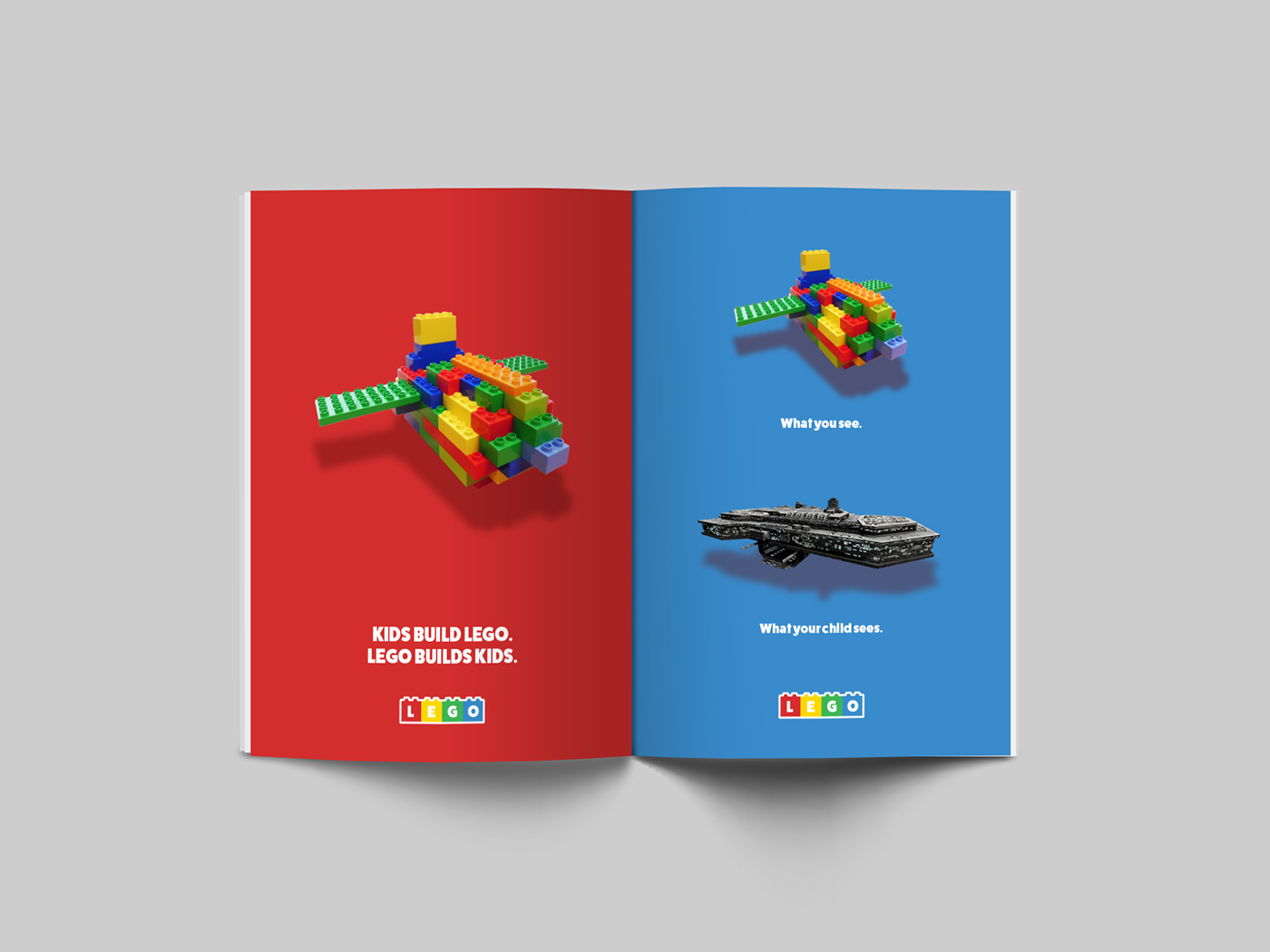
Magazine Advertisements

Billboard Advertisement

Sample Toy Boxes


