


Eyes Scream Brand Identity Inspired by "Monsters, Inc."
Overview
This project involved the development of a brand identity for an ice cream brand inspired by the "Monsters, Inc." cartoon. The brand name is "Eyes Scream". The goal was to create a fun, engaging, and visually appealing brand that would resonate with ice cream lovers of all ages.
Elements
✔ Naming: "Eyes Scream" is a playful and memorable name that ties into the Monsters, Inc. theme.
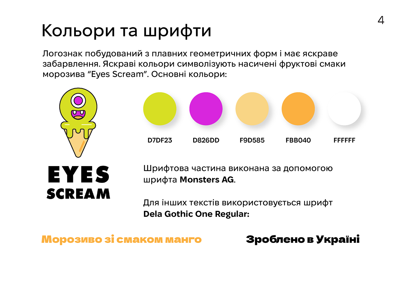
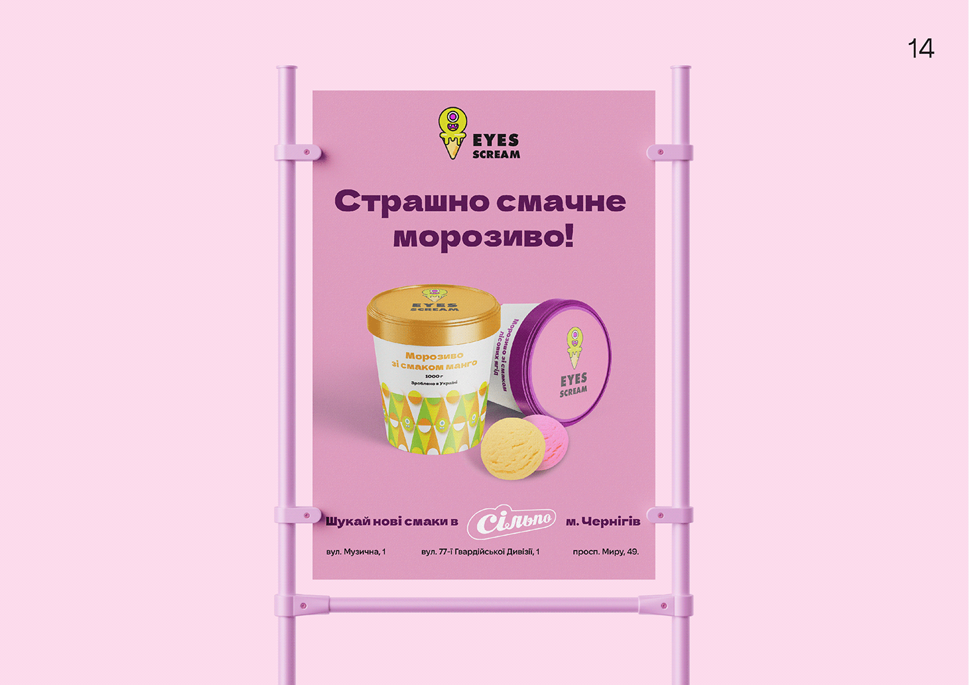
✔ Logo: The logo features a stylized ice cream cone with a friendly monster eye peeking out from the top. It's colorful, eye-catching, and conveys the brand's fun personality.
✔ Visual Identity: Inspired by Monsters, Inc.'s vibrant colors and whimsical shapes. Bright colors, playful patterns, and monsters create excitement, energy, and fun nostalgia.
✔ Print Design: Unique prints represent different ice cream flavors. Each print features a smiley face based on a Monsters, Inc. character, along with triangles and circles resembling ice cream cones. They're colorful, eye-catching, and convey the brand's playful personality.
✔ Brand Guidelines: A comprehensive guide ensures consistent brand identity across all touchpoints. It includes info on the logo, colors, typography, and imagery.
Impact
"Eyes Scream" brand successfully creates a fun, engaging, and visually appealing impression that resonates with consumers. Its playful identity appeal to ice cream lovers of all ages.


