How to package the entire Ukrainian pastry art and convey the true madness of flavors in a single identity?
Founded in 2013 with a basic identity, Honey, a Kyiv confectionery, has become renowned for its innovative dessert philosophy. By 2023, its initial honey-shaped logo and monochromatic yellow-white scheme did not reflect the sophistication of its culinary artistry, impeding the brand's evolution. Honey uncovers and fuses a kaleidoscope of exotic, local, and international ingredients, presenting unrivaled tastes, like candies with Ukrainian herbs and black chokeberry. The rebranding aims to embody that product complexity.
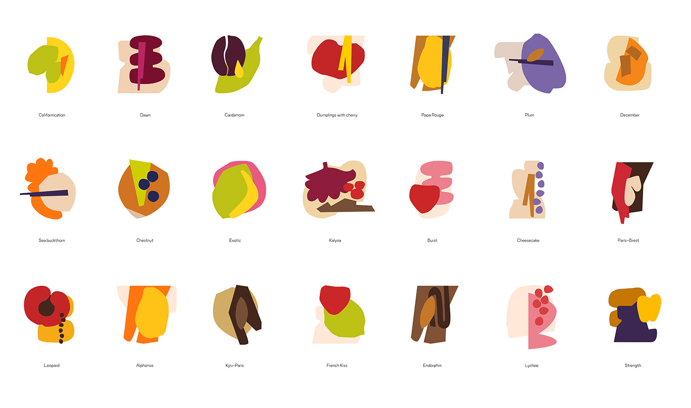
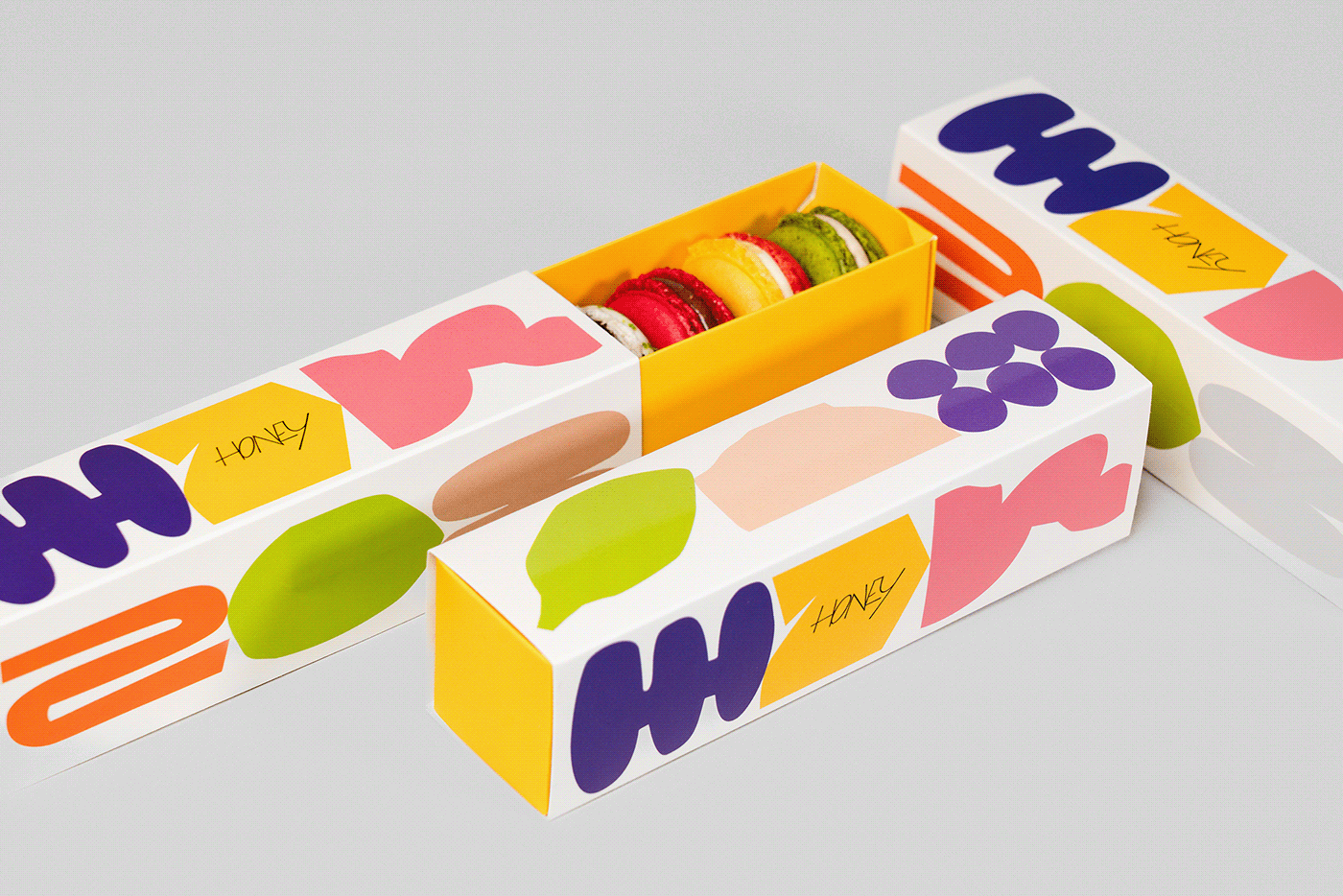
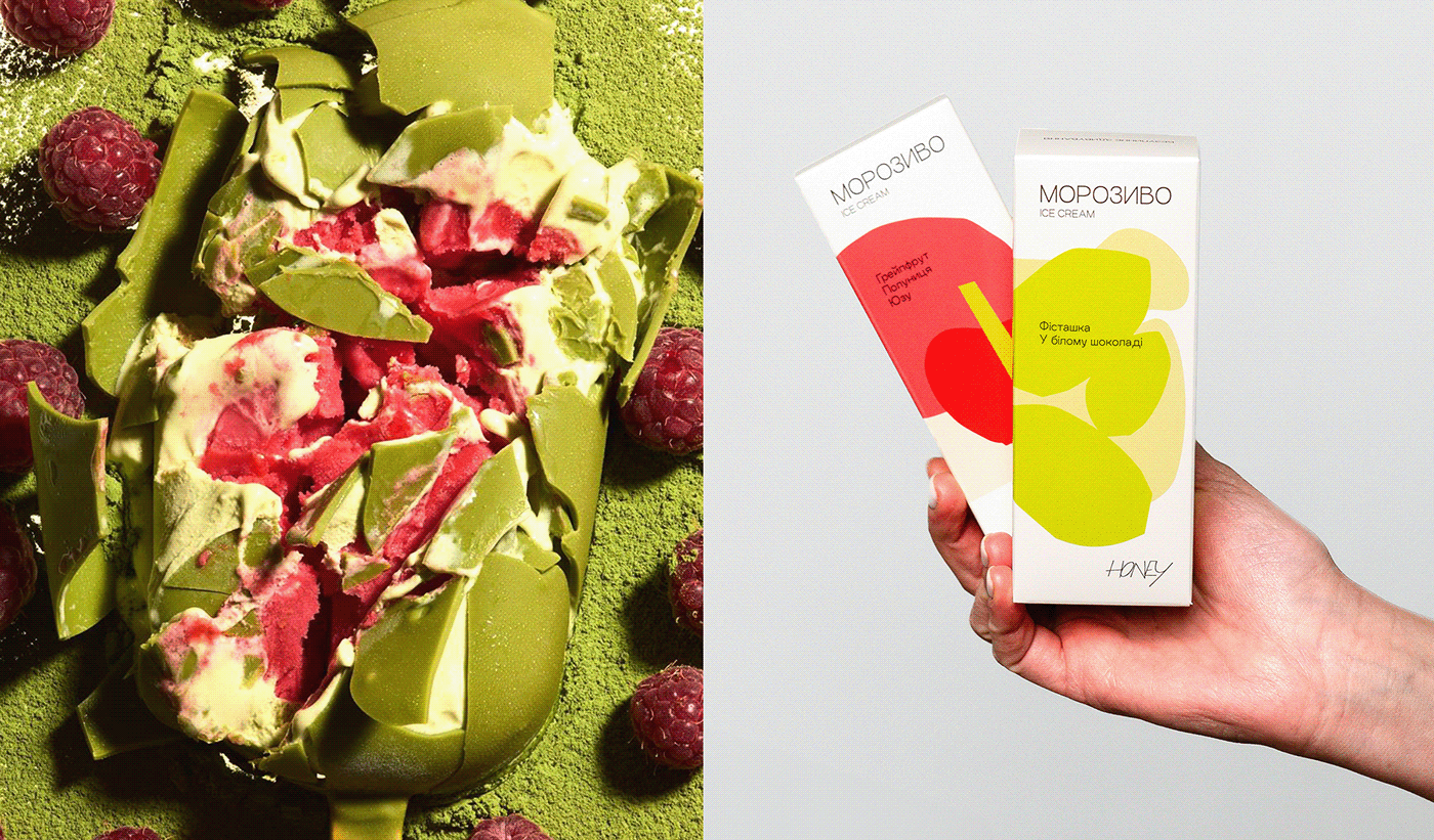
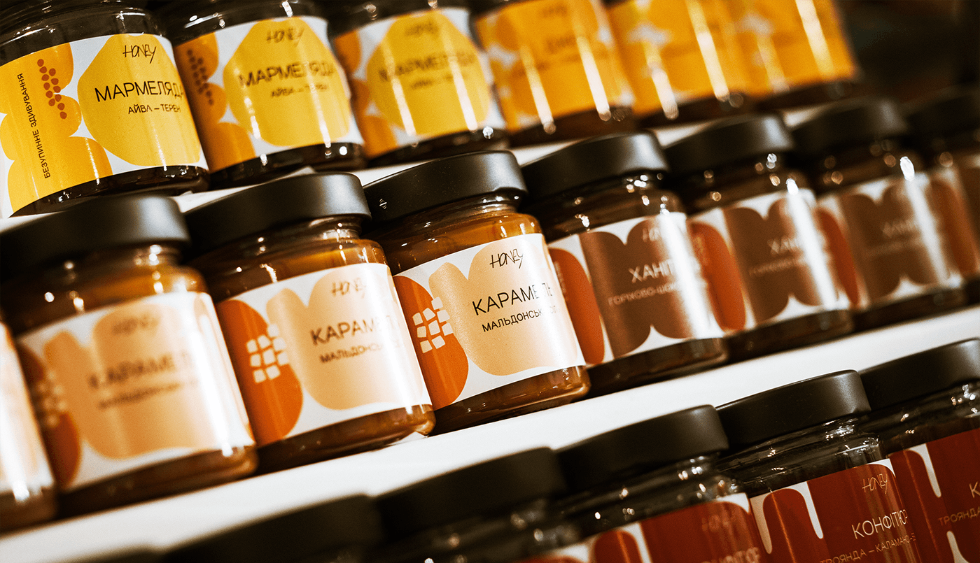
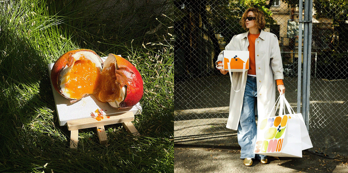
To help in exploring the variety of desserts (more than 100 items), we developed a "From Pleasure to Surprise'' scale. We reinvented Honey's identity to showcase the layered textures, scents, ingredients and artistry of each dessert, moving beyond mere taste. By deconstructing desserts into ingredients depicted in varied forms and colors, we uncover their core before customers experience it firsthand.


Credits:
Michael Traverse – Strategic Director, [Reiseplan]
Oksana Chumak – Strategist, [Reiseplan]
Marharyta Nazarenko – Strategist, [Reiseplan]
Maria Mishchenko – Strategist, [Reiseplan]
Viktor Shkurba – Creative Director, [isdgroup]
Iryna Lipavska – Lead Designer, [isdgroup]
Karina Kutsenko – Designer, [isdgroup]
Tasha Leus – Junior Designer, [isdgroup]
Yaroslava Kravets – Project Manager, [isdgroup]
Uliana Koinichenko – Copywriter, [isdgroup]
Vitalina Lopukhina – Сalligrapher, VikaVita
Natalia Azarkina — Photographer
Andrii Gorlov – 3D Artist
Stanislav Zavertailo – Сo-founder, CEO, Honey
Anna Zavertailo – Сo-founder, CBDO, Honey
Victoria Mular – COO, Honey
Maryna Frolova – Сreative and Brand Director, Honey
Eugenia Chabanova – Content Director, Honey
Svitlana Melnychenko – Packaging Production Manager, Honey


