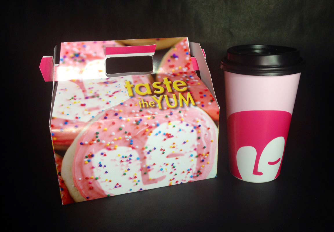
Marylou's Coffee is a chain of coffee shops established in 1986 in the United States. Through the redesign of their
brand identity I wanted to represent a bold, modern and fun, friendly coffee shop that is recognized by its mark in its packaging and ads.
brand identity I wanted to represent a bold, modern and fun, friendly coffee shop that is recognized by its mark in its packaging and ads.

The mark is designed to be clean and easily recognizable. The mark represents the foam when you look into a cup, that foam creates a face that represents Marylou. In the mark, the hair creates a "M" and the nose creates a "L." The face is shaped as a heart because every cup of Marylou's is made with LOVE.


Ads series give a sense of playfulness. fun and sassy headlines used to promote the uniqueness of Marylou's Coffee. The mark's presence is present in each ad. These images and headlines continues onto the direct mailers.

direct mailers


