

PROJECT OVERVIEW:
"The Naan" is an authentic Indian restaurant located in America, offering a genuine taste of India. It presents a diverse menu featuring dishes from both North and South India, each bursting with distinctive flavors.
Setting itself apart, "The Naan" seamlessly blends modernity with cultural heritage, creating an ambiance that reflects a harmonious fusion.
Our project is all about giving "The Naan" restaurant a fresh and inviting look.
We want it to be a modern, welcoming place where people can enjoy delicious Indian food, music, and relax.
WHAT WE DID:
•BRAND POSITIONING
•LOGO & VISUAL IDENTITY
•PACKAGING DESIGN
•STATIONERY DESIGN
•MENU DESIGN
•SOCIAL MEDIA POSTS
•LOGO & VISUAL IDENTITY
•PACKAGING DESIGN
•STATIONERY DESIGN
•MENU DESIGN
•SOCIAL MEDIA POSTS

MOODBOARD
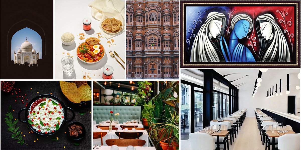
I drew inspiration from India's beautiful archways, food , paintings and simple, modern yet elegant imagery

DIRECTION:
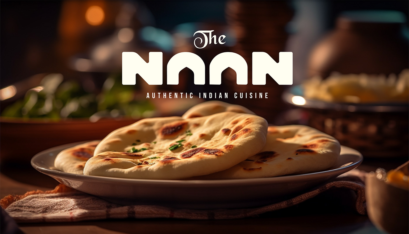
I went with a modern, Simple yet Dynamic direction. Since the type is the most important in the project, I custom designed a wordmark with bold letters in the shape of geometric forms.
However, the logo initially felt too rigid and tech-like, lacking an Indian touch.
To incorporate the cultural narrative, I used the negative space of the letter "A" to depict Indian archways.
Also, I rounded the corners of the letters slightly to create soft edges, adding to the friendly and inviting community feeling mentioned in the brief. As for the word "the," I gave it a traditional and culturally beautiful typeface.
MODERNITY AUTHENTICITY CULTURE


BEHIND THE SCENES


My client approached me with a rebranding project and I know you want to see the logo before and after so here you go:
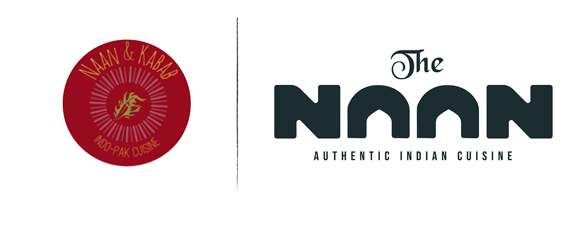
BEFORE AFTER


Bold Sans-Serif letters were custom designed for the wordmark, to evoke a sense of authenticity and modernity while subtly infusing an Indian touch. This design choice not only emphasizes the restaurant's authenticity but also aligns with its contemporary and culturally rich identity.

Social media post templates designed for The Naan.


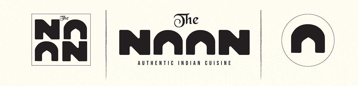
LOGO VARIATIONS:
Three logo variations were designed : the horizontal version and a stacked arrangement that takes advantage of the symmetry in the name, making it modern and effective, especially in smaller spaces. Additionally, the unique 'A' in 'Naan' can be used as a standalone favicon.


MENU DESIGN FOR THE NAAN


Design and Concept by zietadesigns
Do you have a project?


