IDENTITY FOR A COMPANY THAT DEFENDS THE RIGHTS OF PASSENGERS
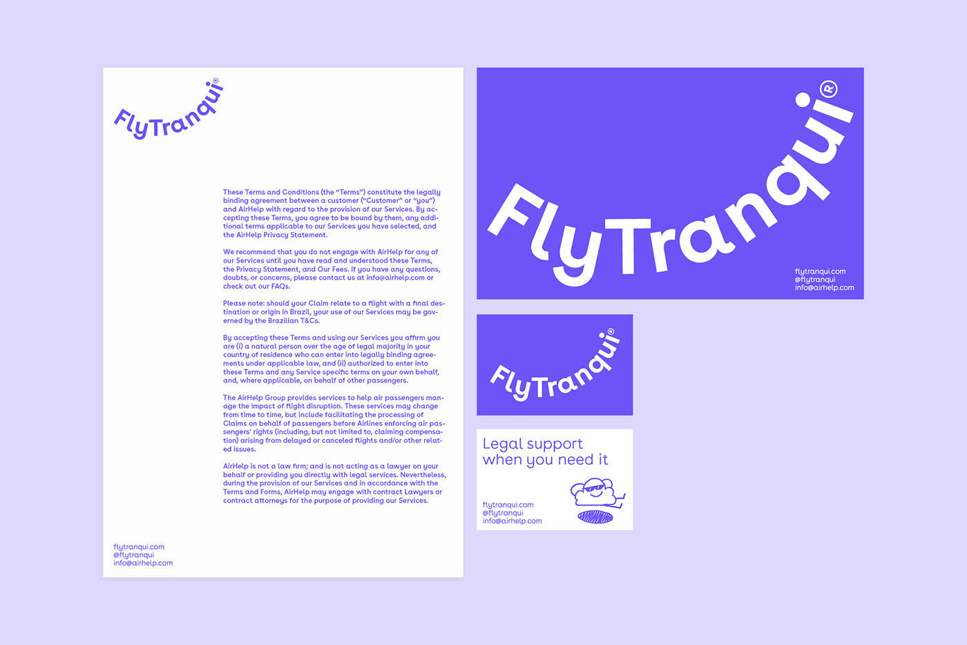
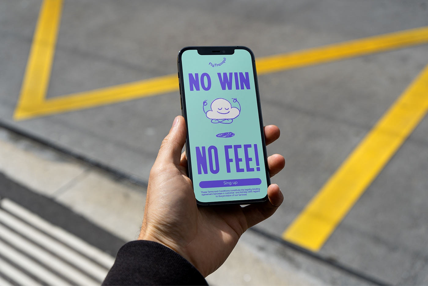
Flytranqui
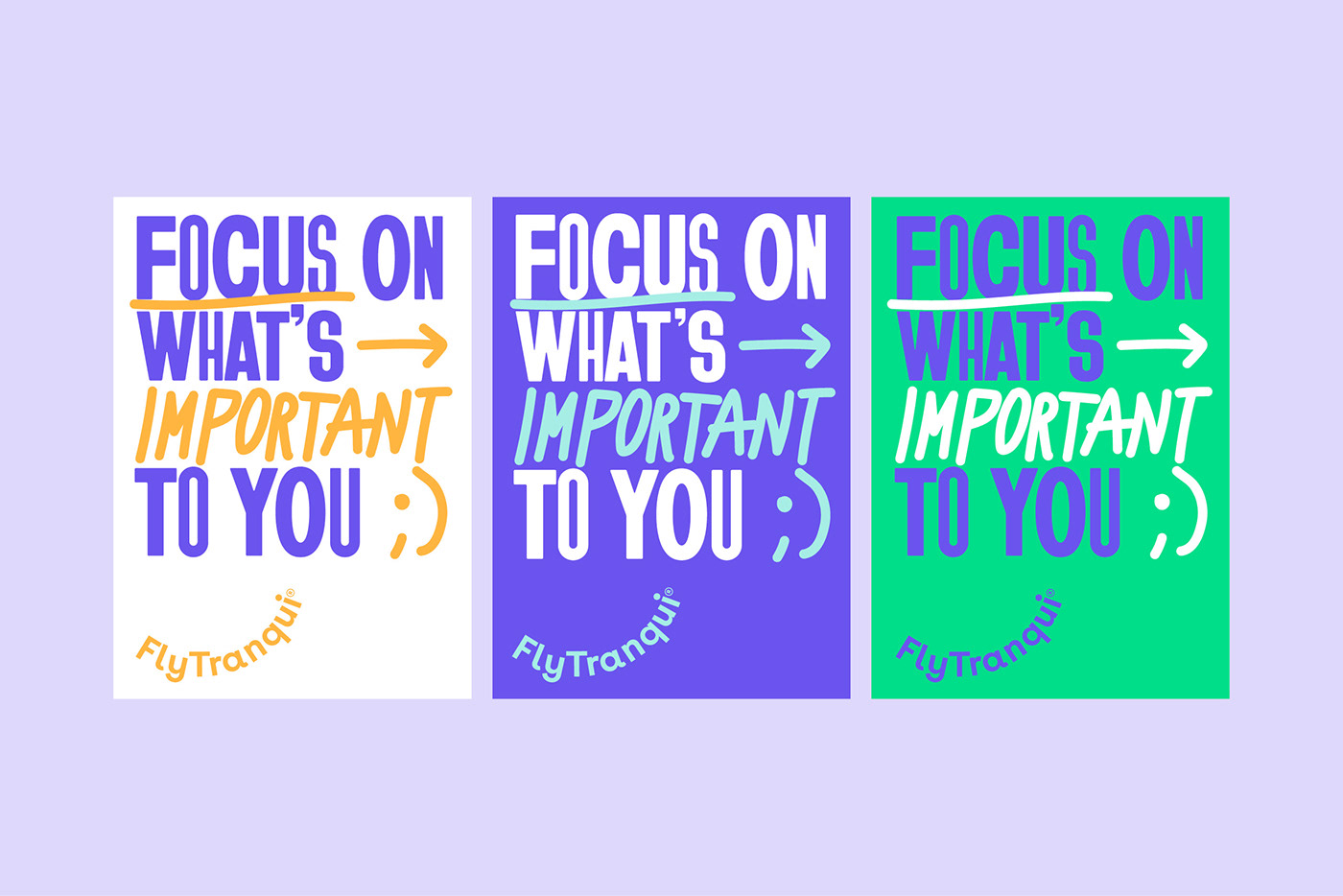
Flytranqui, a claims management company and protection of the rights of air passengers, addresses Toormix with the task of building a fresh and flexible identity that moves away from the “administrative” tone used by most existing brands in the claims sector. Flytranqui was born to address the young people of the state and with whom they want to connect through complicity.
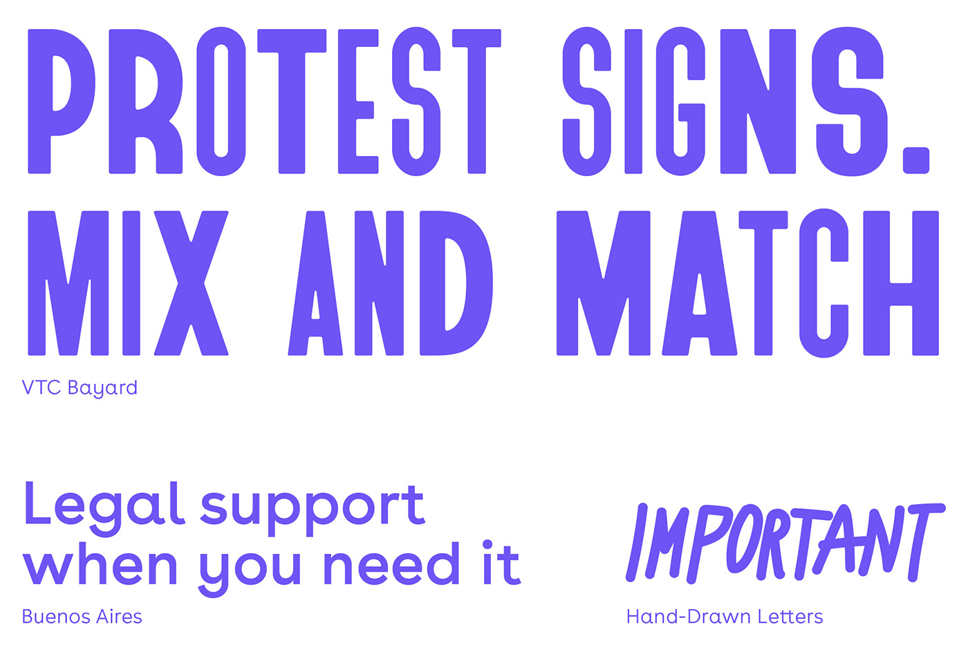
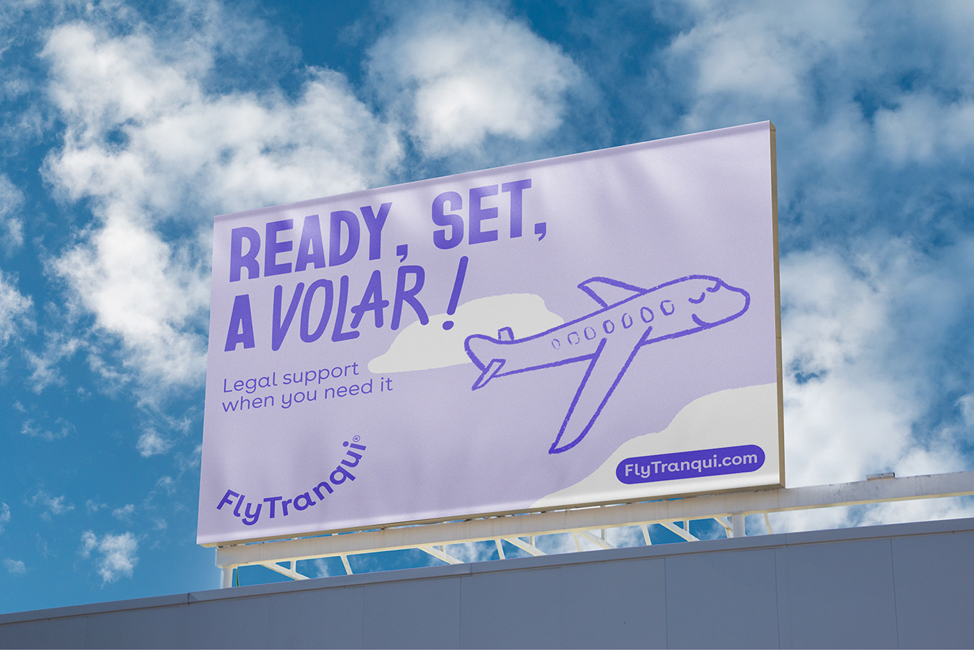
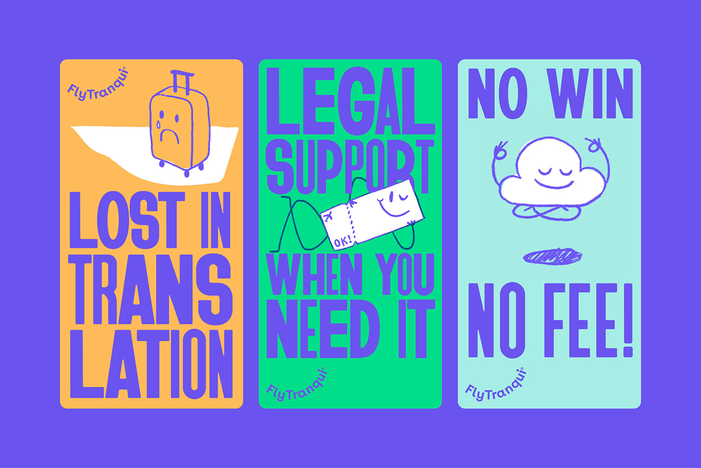
For the construction of the identity we propose a typographic logo in a curve (taking off) and the creation of a fresh visual language through illustrations of everything related to a plane trip: airports, planes, control towers, lost suitcases, clouds, rucksacks that are not invoiced… and we propose to put limbs and facial and expressive features with a sketched stroke. For the tone of the brand and the messages, we propose using expressions and relating the copies to current issues, using contemporary formats (and making visual reference to the demonstration posters): using memes, getting closer to the reality relevant to these people ( e.g. the separation of Rosalía and Rauw Alejandro), use a tone of voice that uses a “Spanglish” language in its development, all this to build a contemporary and recognizable brand system, which helps to connect with young people who do not want grayness in his life.