


Brand identity for the chain of pharmacies — Medstation
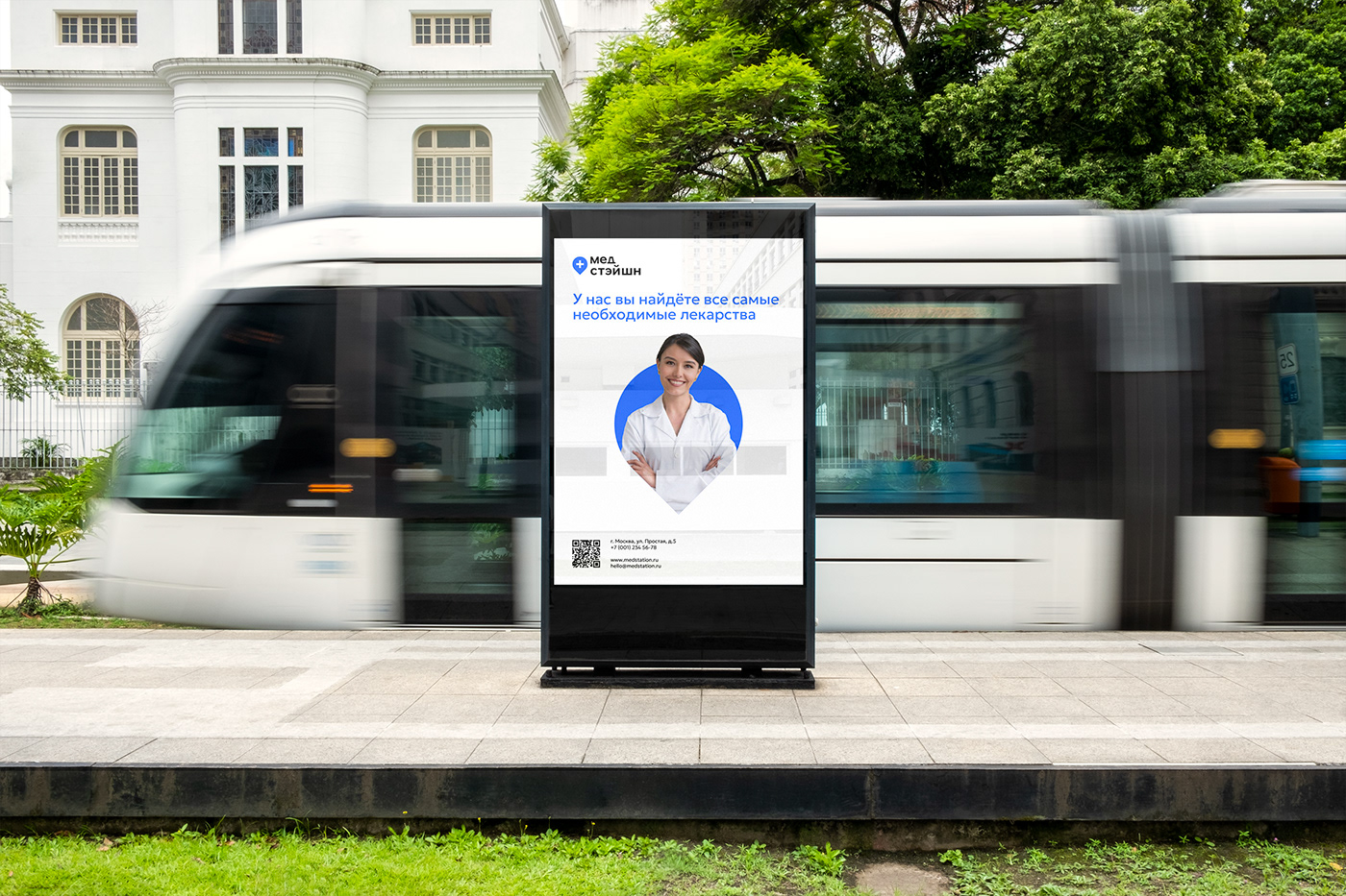
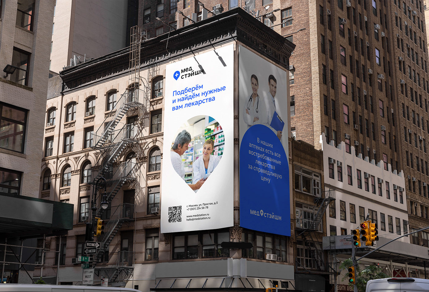
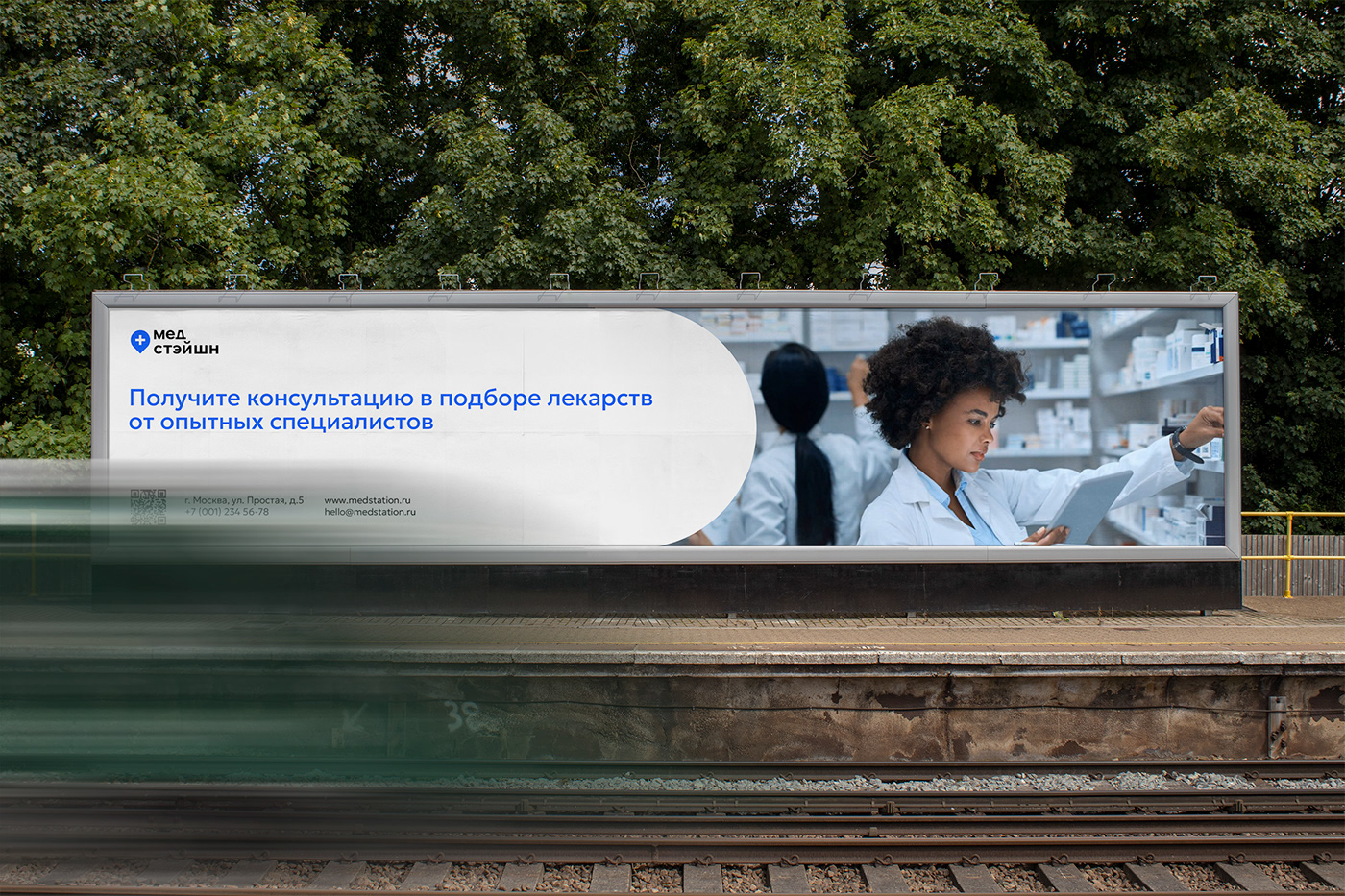
Medstation is a chain of pharmacies specialising in selling the most popular and high quality medicines. They offer their customers a wide range of medicines of different classes, as well as free consultation from specialists on the selection of medicines. Medstation is a medium-sized business and most of the pharmacies are located in Moscow, a large city, so one of the objectives was to distinguish the pharmacies from others, but at the same time keeping a modern style and medical atmosphere.
Medstation is a chain of pharmacies specialising in selling the most popular and high quality medicines. They offer their customers a wide range of medicines of different classes, as well as free consultation from specialists on the selection of medicines. Medstation is a medium-sized business and most of the pharmacies are located in Moscow, a large city, so one of the objectives was to distinguish the pharmacies from others, but at the same time keeping a modern style and medical atmosphere.


A logo, corporate identity, guideline (which includes guides for the use of the logo, corporate identity and media) and packaging design were developed for Medstation.
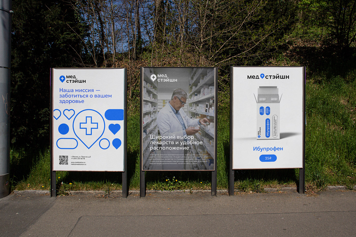
To make the identity modern, friendly and with a medical atmosphere, we chose blue, black and white colours, which are directly associated with medicine. Typography was the Geologica font family: a simple, easy to read and modern typeface.
To make the identity modern, friendly and with a medical atmosphere, we chose blue, black and white colours, which are directly associated with medicine. Typography was the Geologica font family: a simple, easy to read and modern typeface.
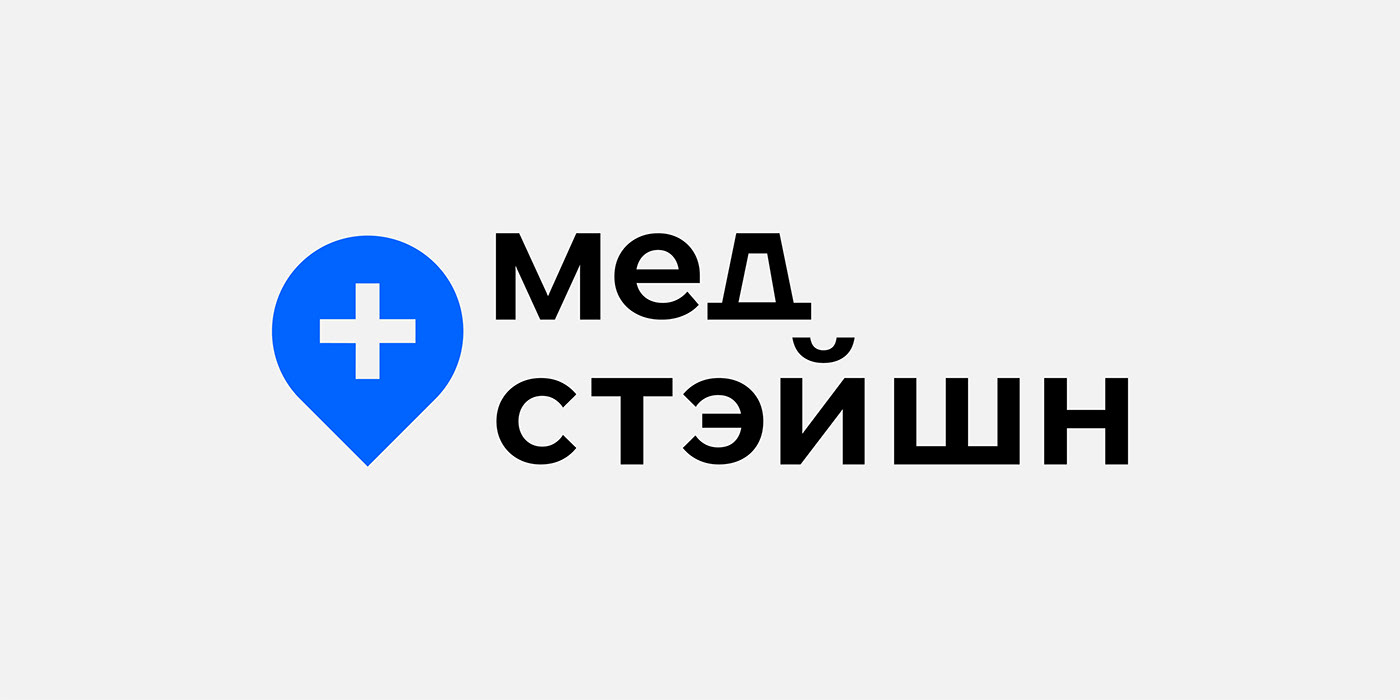
The logo consists of a brand mark featuring a location icon and a medicine + sign, as well as lettering consisting of a modified version of the Geologica Medium font.


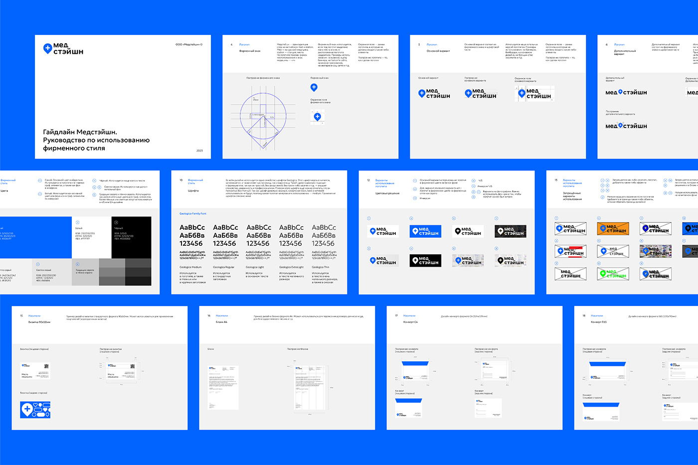
Straight lines without rounding, design alignment mainly on the left edge, evenly spaced objects. The main figure in the identity is a circle, on the basis of which the logo and graphic elements are made. Graphic elements are various medical and health-related figures stylised under the logo (in the form of a circle). The figures can be used as an independent pattern or as a background for photos, pictures and 3D objects.


Thanks for watching!
Got a task for an identity design? Write me and we will solve your task!
Maksim Nikolaev, graphic and brand designer


