Kurt Vonnegut's Slaughterhouse-Five is a classic fictional work I'd recommend any curious reader, because it's not far from the truth despite its very real (and often hilarious) proceeding. Published in 1969, the novel depicts the story of a WWII veteran who never seems to recover from what he had seen, and is caught up in delusions that prescribe him as an ideal abductee of an absurd alien race.


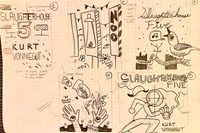
I approached the process in a similar "Hmmm!" method (i.e. initiating sketches, choosing favorites, and proceeding with 2nd drafts). The overall project is simple in its solution: the face of the story and its intention.
I was playing with Adobe Dimension to divvy up the book mockup (far-left, above).

Initially, I wanted to pursue something of a similar approach as I did with Through Deaf Eyes with brick walls and grit. However, I found the book more fluid and unpredictable (much more than the next post-WWII book), and the humor that transpires eventually pulled me into a more illustrative pursuit. I also wanted to mention that the graphic novel rendition of Slaughterhouse-Five was in the middle of its debut during this time. You could say this project hit the spot in a variety of ways.


The final bits are great. I love the colors. Green and red have always been a challenge (which one is darker?) for me, since I seem to gravitate towards cooler colors. I think playing with the typography and toying with the value on the greyscale helped tremendously, in this respect.
I want to make it clear, also the publisher's logo, ISBN, tagline, two-or-less various typefaces are imperative to include.