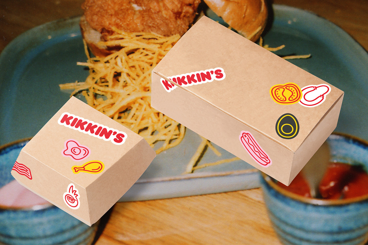
Branding project for a new fast food space focused on pork and chicken.
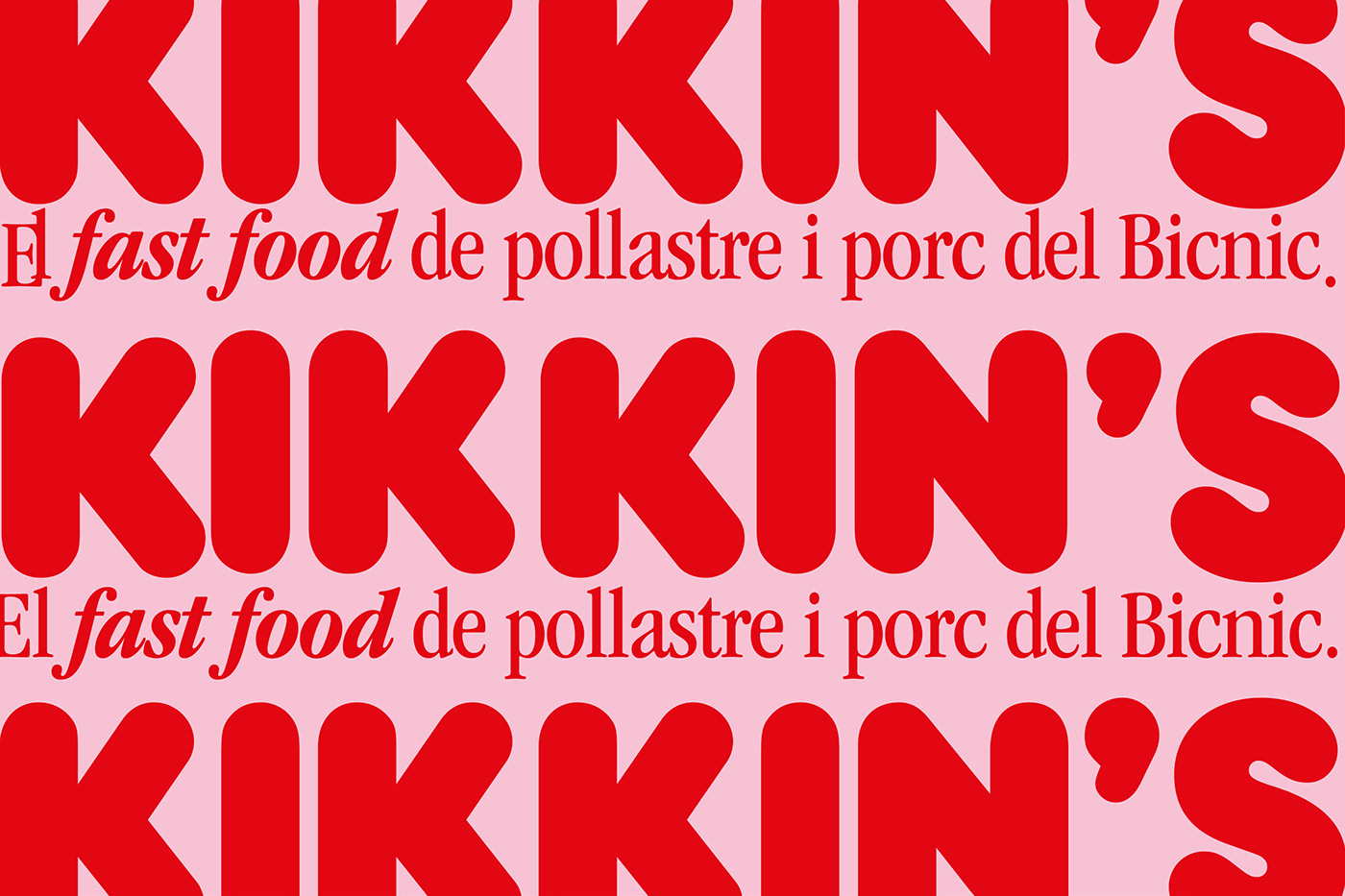
Kikkin's
Kikkin's
Branding project for a new fast food restaurant born from Bicnic, an existing restaurant in Barcelona, which wants to evolve its culinary offer to a fast food specialized in pork and chicken.
That’s why they commissioned us the conceptual and branding project and the various design elements to be implemented for its launch. A project that was developed, but finally did not see the light because of the pandemic, which closed this gastronomic space in the middle of the transformation process.
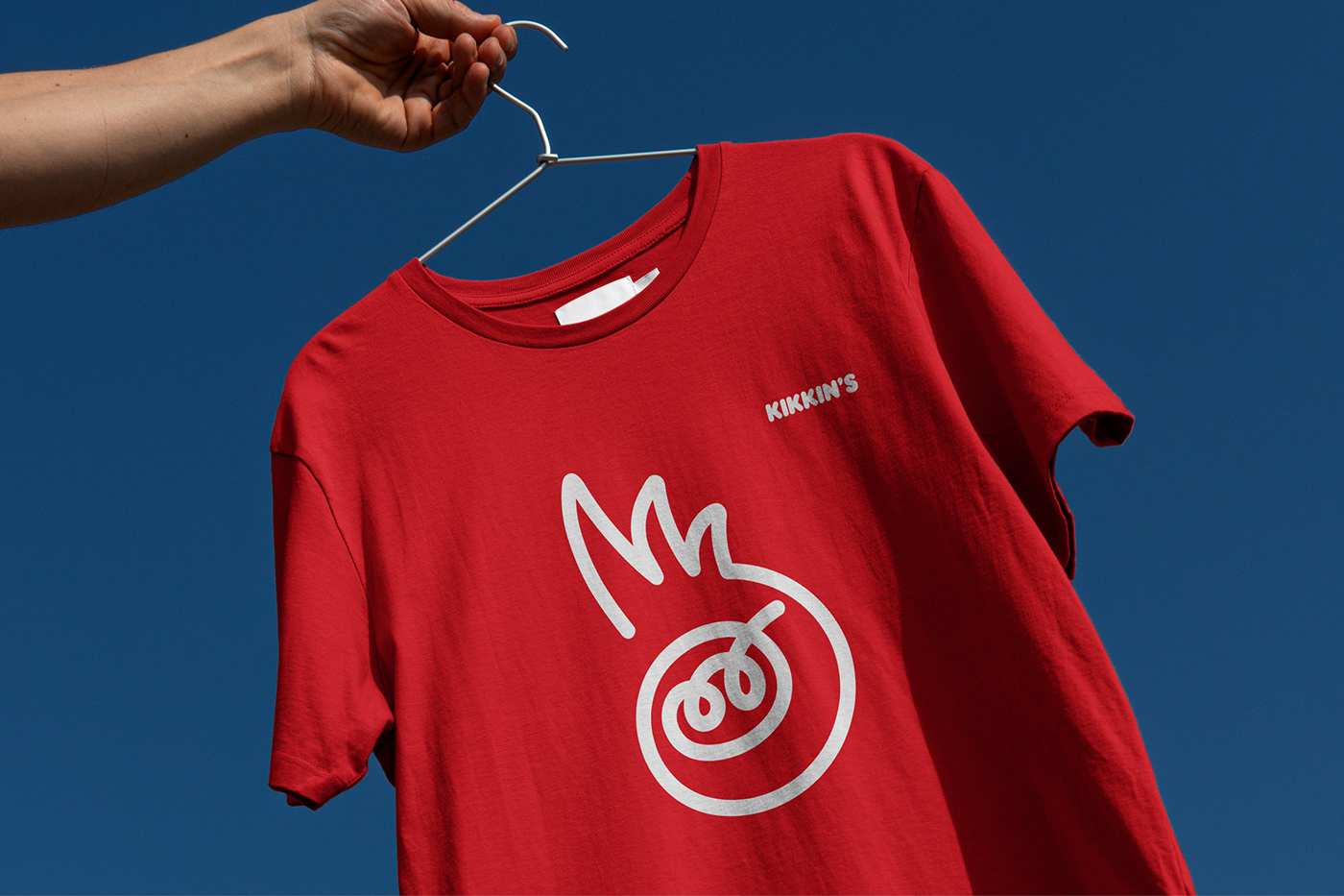
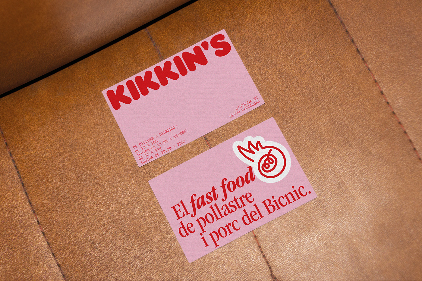
The name takes the reference of a well-known and groundbreaking fast food restaurant in Barcelona that opened its doors in 1979 and was very famous during the 80s and early 90s, under the name of POKIN’S. It was the fast food reference of the time. The naming for this new fast food space focused on pork and chicken takes this reference to create the name of the new restaurant: KiKKIN'S.
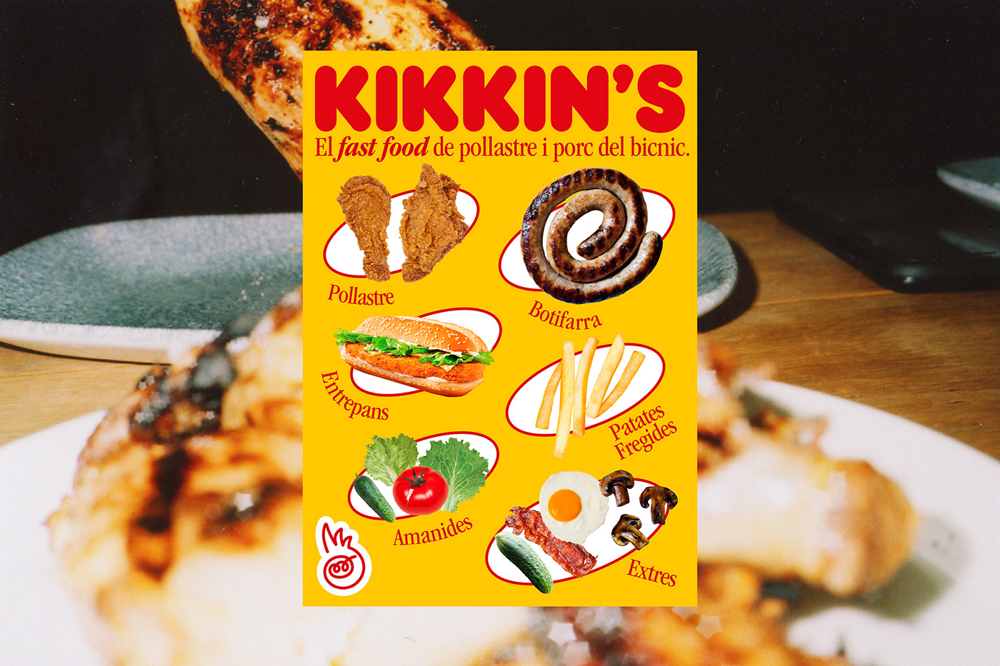
The symbol represents a pork with a crest and is complemented with several illustrations that explain the gastronomic offer along with graphic pieces, communication and the restaurant itself in coherence with the whole graphic universe.
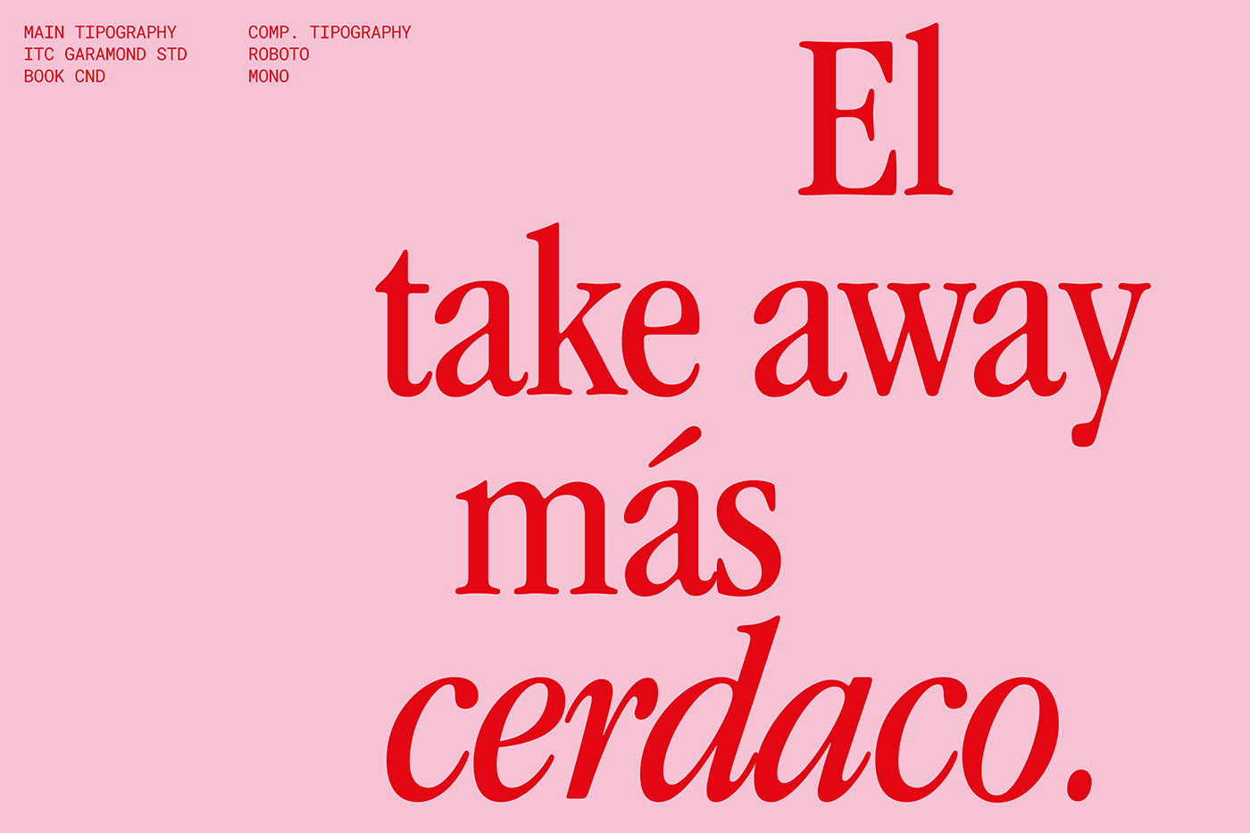
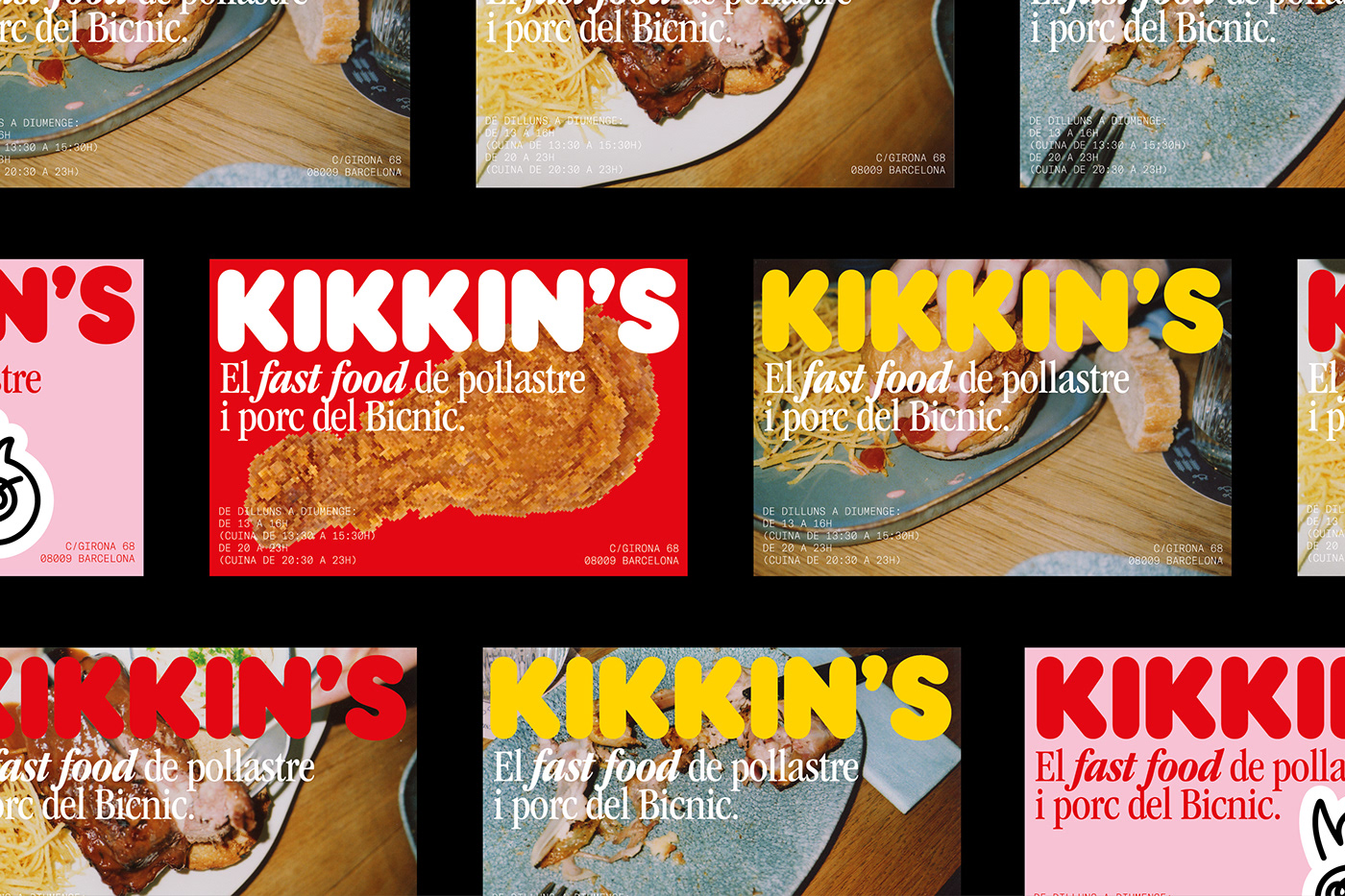
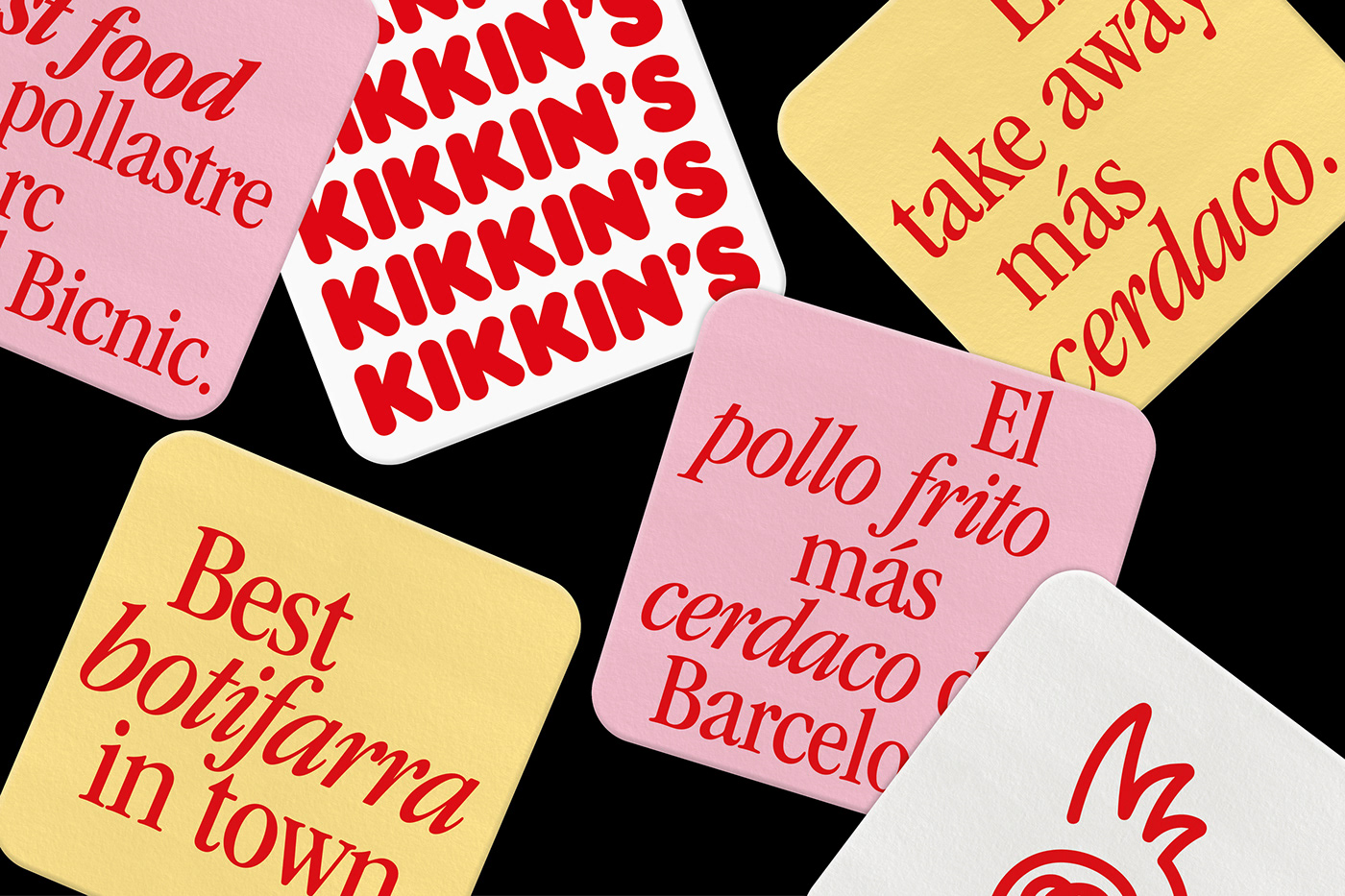
The different design elements take aesthetics of the most popular fast food and combines it with new typographic styles and very expressive photographs that create a very powerful universe, with personality and with the presence of the product, through images in the foreground and people consuming combined with a touch of humor at the same time.