
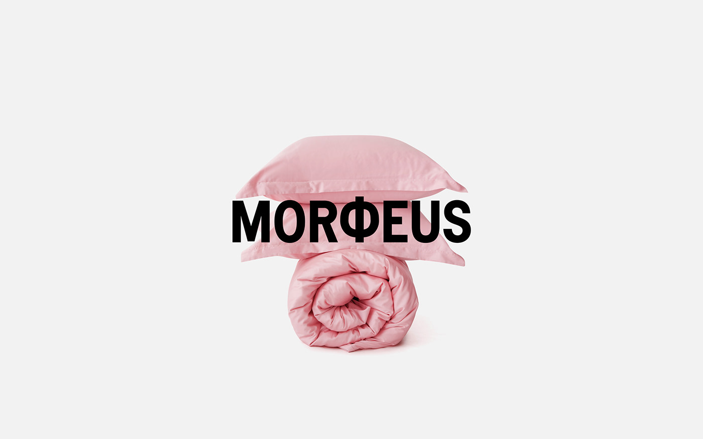










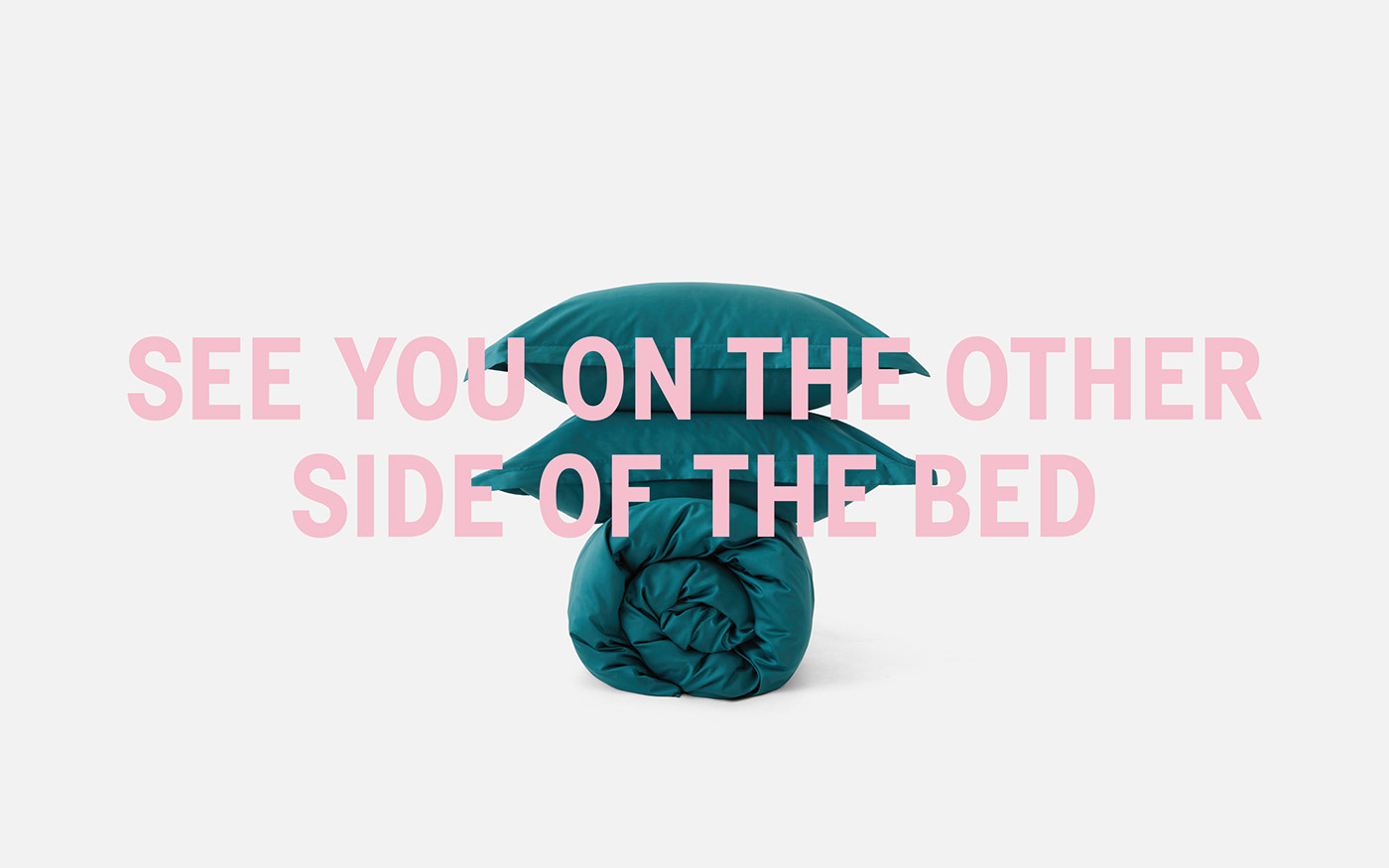
MORФEUS is a bed linen manufacturer with its own production and import of raw materials supply, who builds the brand with a high degree of audience involvement and shapes a community around its products.
Bed linen by MORFEUS is already a kind of communication way. This is an opportunity to express yourself through color, the quality of materials and the uniqueness of tucking in duvets technologies. This is how the brand speaks the language of aesthetics — this is the way of communication that unites all of their customers.
Ideas.
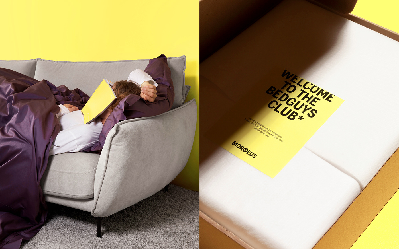
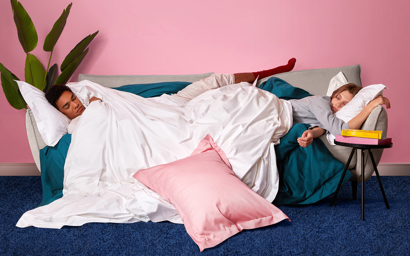
The bed is an important place for all people and their various feelings and emotions, actions and events. Not just for sleeping. But there is a space for it either.When it comes to bed as a place, we wanted to spotlight and emphasize the idea of bringing people together, despite all their possible differences. If you have a bed, you are already in the club, if you have MORФEUS bed linen, consider that you are a chosen one (like everyone else).
Goals of change.
We wanted to show that bedding in this case doesn't mean bed rest, peace and quiet like in a hospital and only pastel/"bed" colors in visual identity. Moreover, the brand’s palette consisted mainly of rich, bright colors that users choose to brighten up their home time especially during the covid and post-covid periods.
Along with the client our goal was to change the existing visual language towards greater emotionality, openness and variability. To show the nature of people interacting with the brand, to try to give depth through a graphic metaphor and a flexible layout system in its identity.
More individuality. More irony. Self-irony. Love. To yourself. And to thy neighbour (Yes, the one who always pulls the blanket over oneself)
What's done.
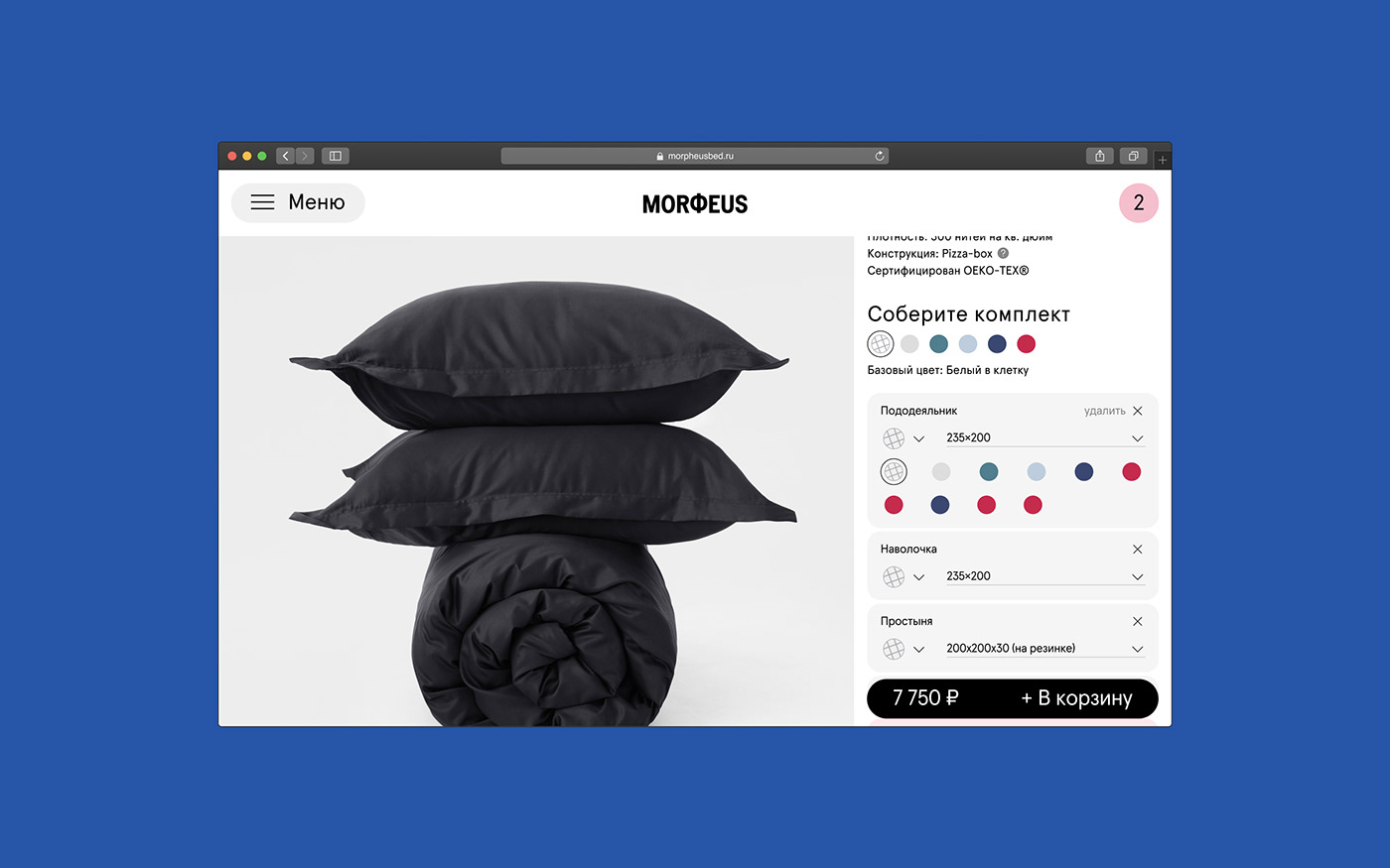
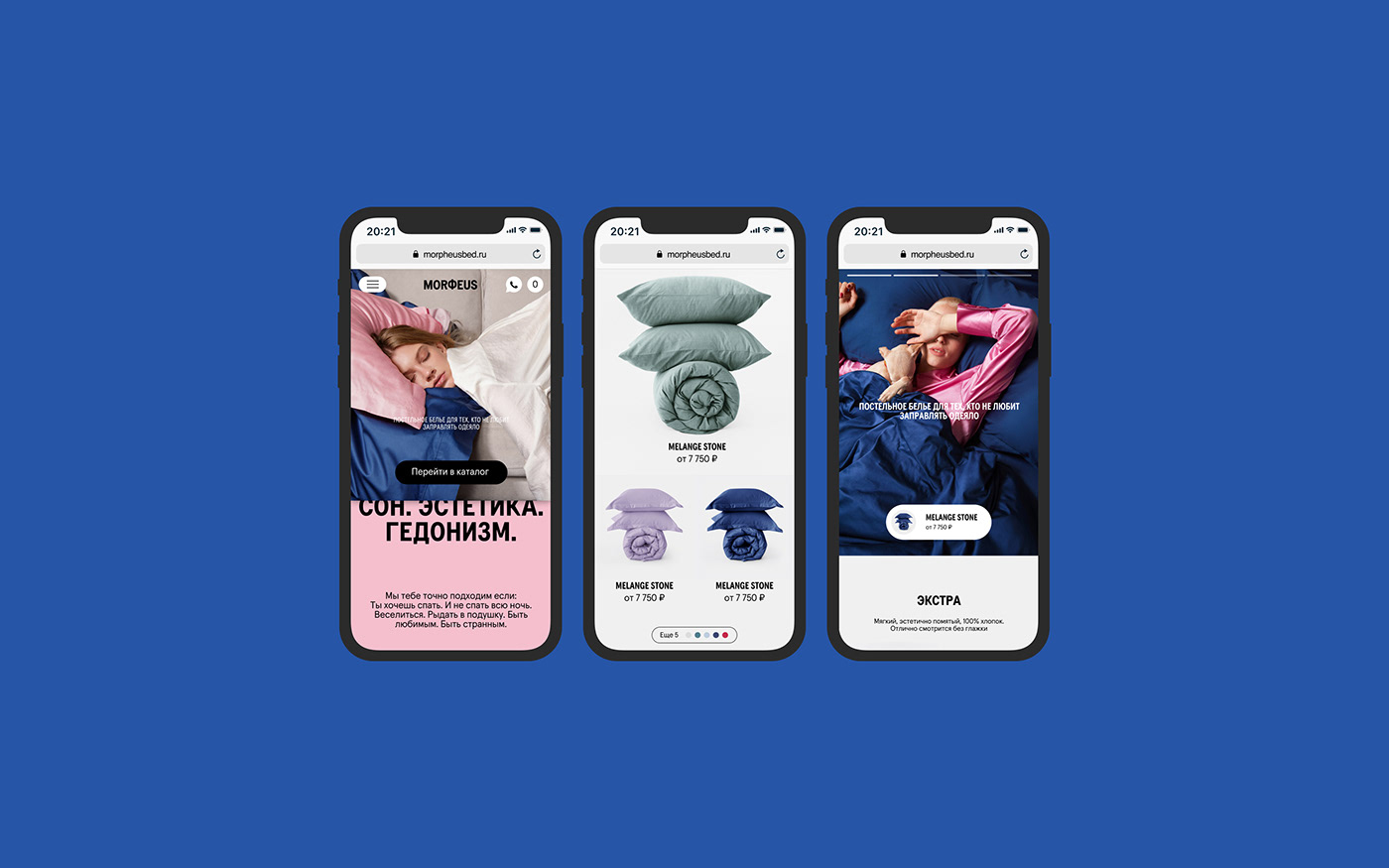
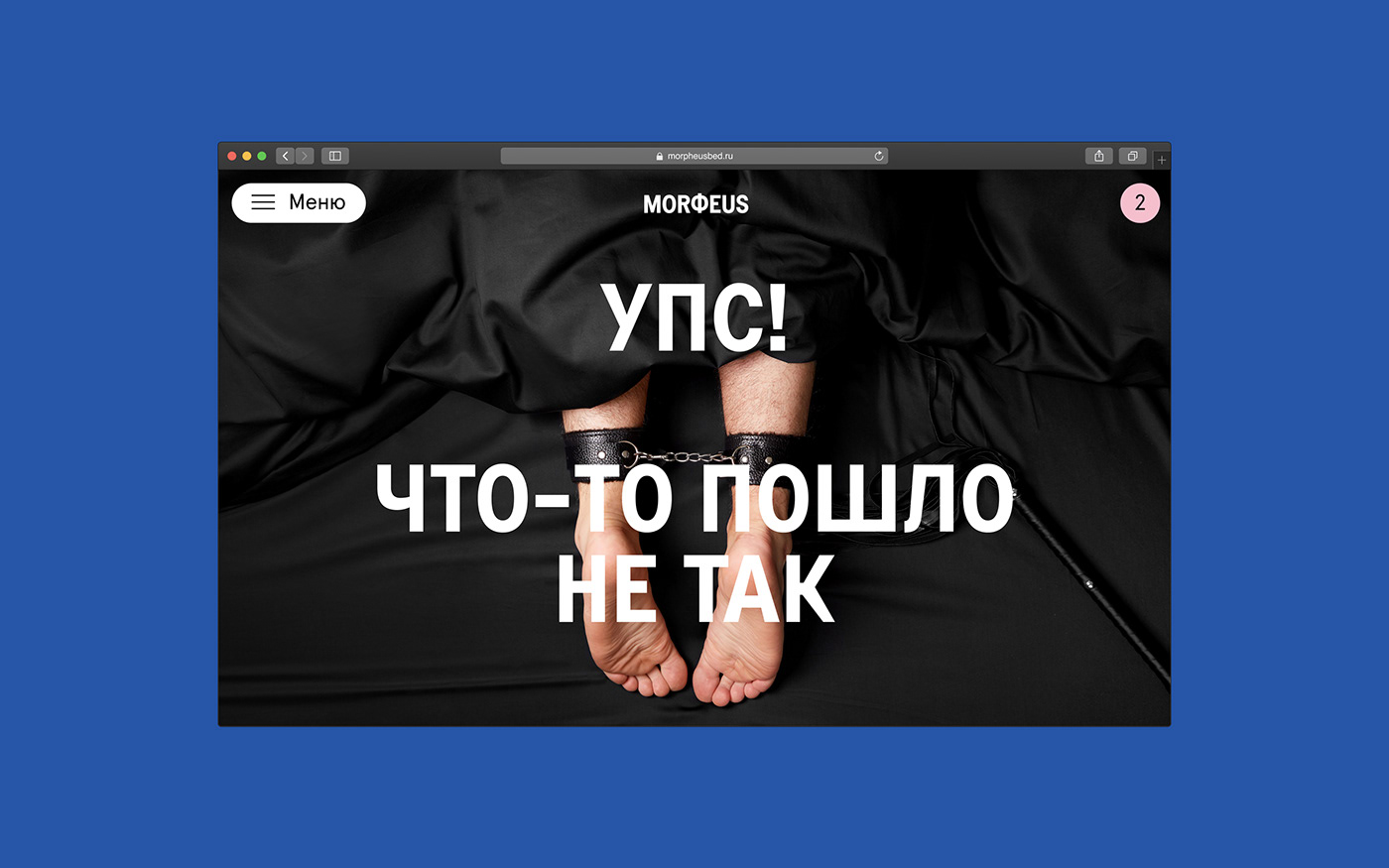
The graphic metaphor that we took as a basis in the identity is multilayering: organizing the layout space as a bed (sheet, pillows, blanket = typography, color, photo and other elements). One layer/element covers another, shifts, only partially shown, etc. Those who toss and turn in their sleep can understand well what we mean.
The original spelling of the brand's name MORPHEUS in the new version has changed to MORФEUS. On the one hand, we took letter Ф from the original spelling and mythology (Μορφεύς - the god of dreams in Ancient Greece), and on the other hand, we made it more compact and more memorable in terms of shape.
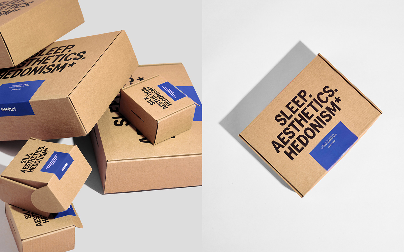
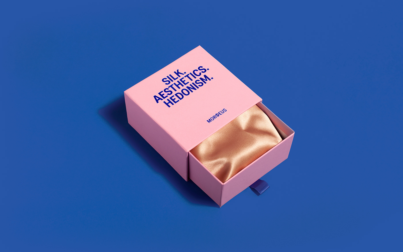
In addition to visual communications for social networks and for the website, packaging has become an important area of application of the new identity. Paper, initially used as a wrapping material, which was often damaged, we replaced with fabric bags and spunbond packaging without active printing it with graphics. We tried to make customers want to keep the packaging for themselves and reuse it. We used bright stickers as an identity element on spunbond, and universal branded patches on fabric bags.
Also, we helped the client reformat the Tone of Voice of their brand through copywriting. We tried to make the voice of the company brighter, more personalized, more first-person messages, like when you get the feeling when a store consultant or business owner who cares is talking to you, but who is also not alien to self-irony and individuality (without nerdiness).
Launching the visual identity update also required a new approach to photo content. Together with the client, we decided to make a shooting with our ideas and art direction, in order that everything we wanted to convey in the identity would be integrated into work with photos and videos. The task was to show different situations and characters of people who are united by one condition - a bed with MORФEUS bedding. We made the way from ideas and storyboards to organizing the process and presence on the set, and also made convenient guidelines for the client’s subsequent photo-shooting.
Credits:
MORPHEUS:
Project Manager — Evgeny Kozhin
Creative director of the brand — Evgeniya Naydenova
F61 AGENCY:
Art direction — Sergey Polukhin, Lana Lomakina
Designers — Sergey Polukhin, Lana Lomakina, Anastasia Smirnova, Mari Kirillova
Copywriting, ToV — Sergey Polukhin
Fonts — Colophon Foundry (Apercu, Transcript)
Photo campaign:
Art director — Svetlana Lomakina
Assistant — Sergey Polukhin, Anastasia Smirnova
Photographer - Yulia Plakhotnikova
Stylist — Anastasia Abdulina
MUA — Dasha May


