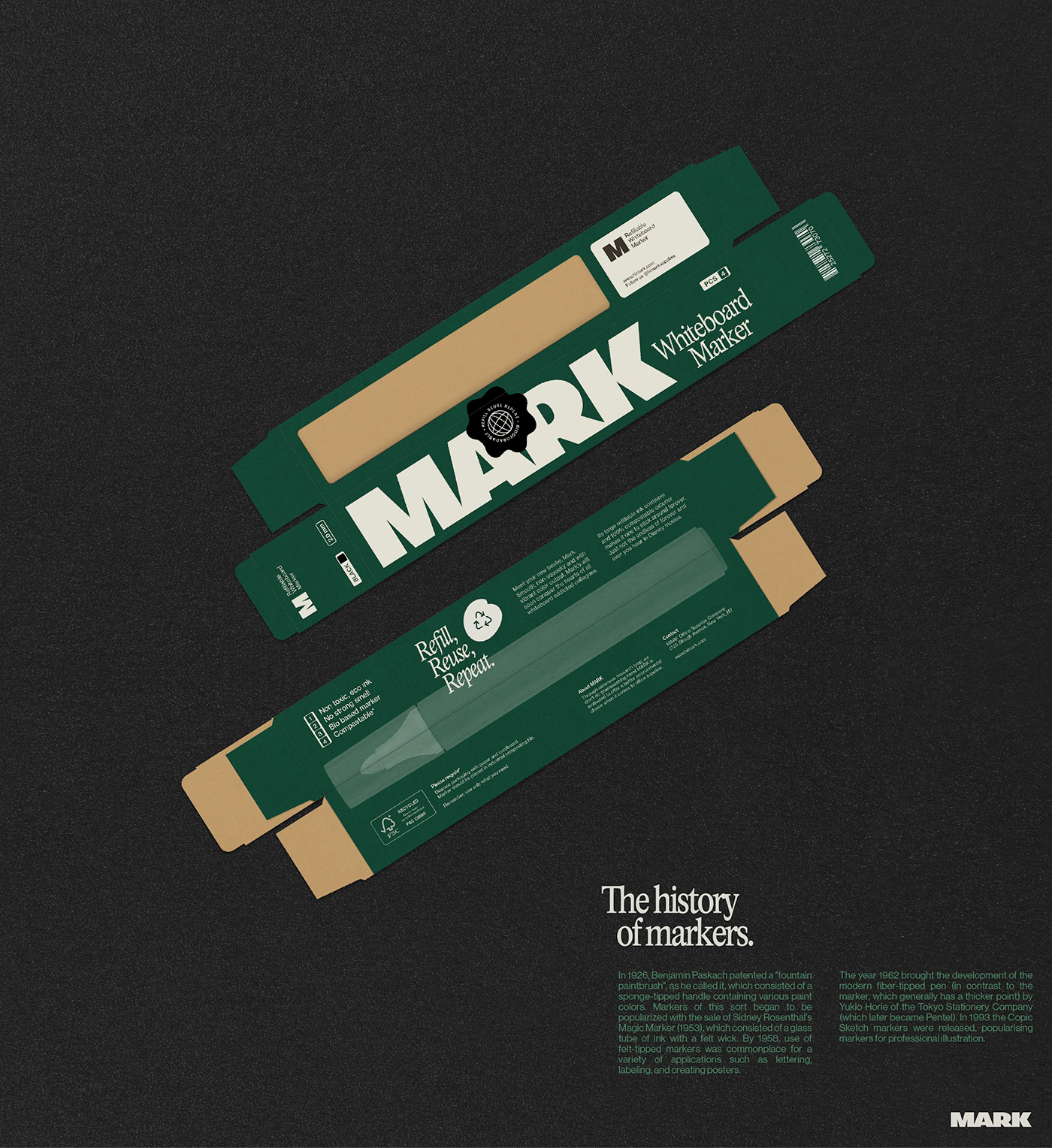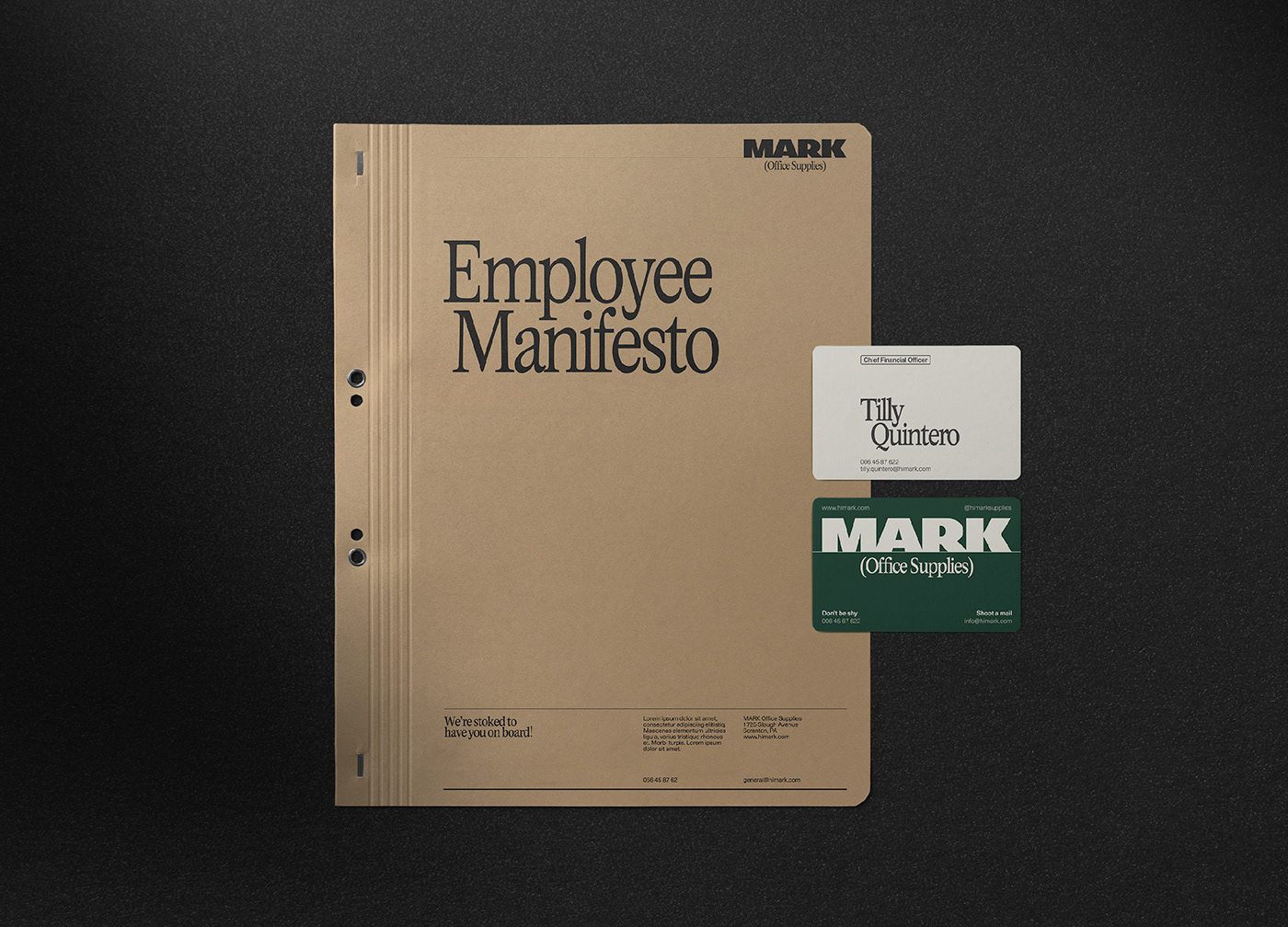

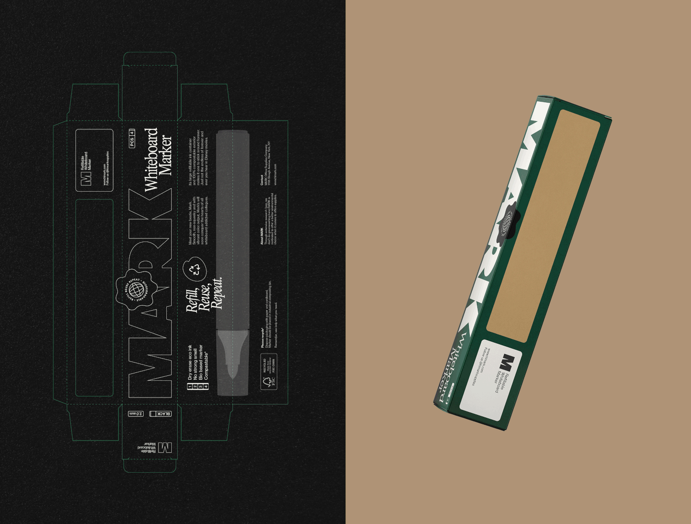
Mark is a (fictional) office supplies company that produces markers, notepads and other utilities you might find at your typical office. With their eco friendly and minimalistic mindset they want to inspire their customers both within and outside the work environment. Mark wants to bring back a human touch back to this industry.
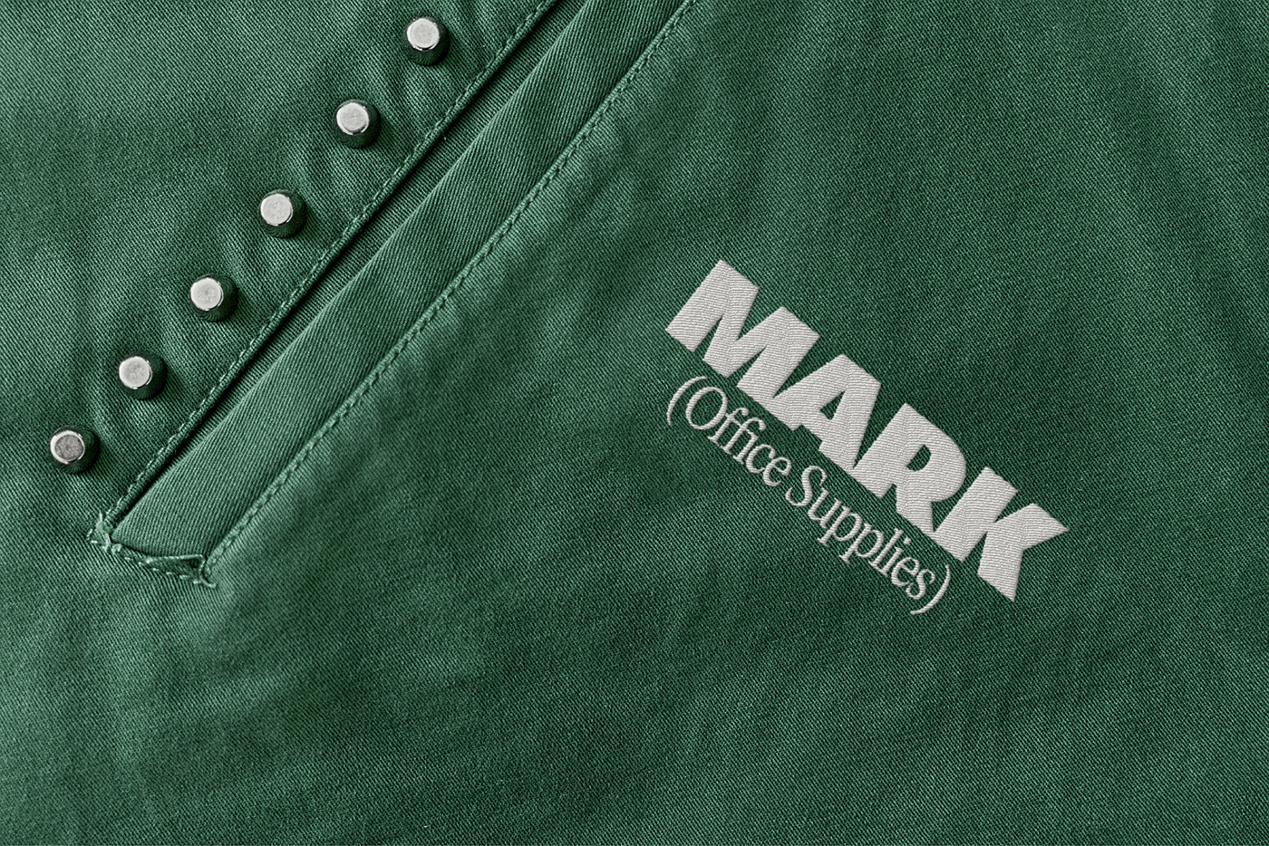
The brand identity's main goal was to convey the company's sustainable positioning and its rejection of the current office supply offering. The overall design strategy falls back on a retro style. Which reminds us of the times before digital technology became a major part in our lives. The green tone is a hint to this time period, as is the condensed serif typeface. Combined with a clean sans-serif typeface and modern shapes & compositions we combine both present and past into a contemporary brand with character.
Naming · Logo Design · Brand Identity · Packaging Design
Naming · Logo Design · Brand Identity · Packaging Design