More is a food court and a very popular type of arrangements for feeding, because it is fast, delicious, and diverse.
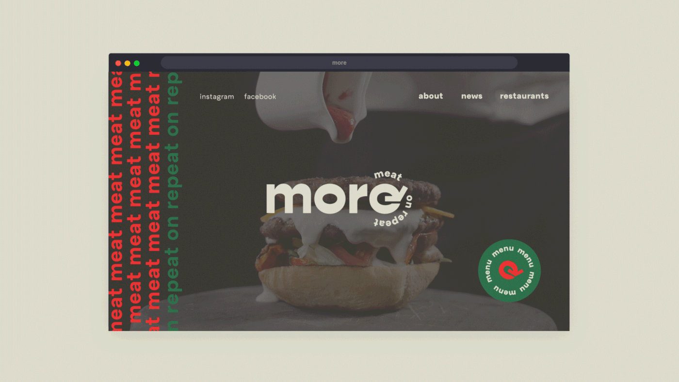
More options, more portions, more quality — naming is "more". Meat is never too much, so it's not just "more", but "Meat On Repeat", which has become the brand's slogan. The uniqueness of our Azerbaijani client's corner network lies in meat. It is Azerbaijani, and therefore halal, organic, and always of the highest quality.
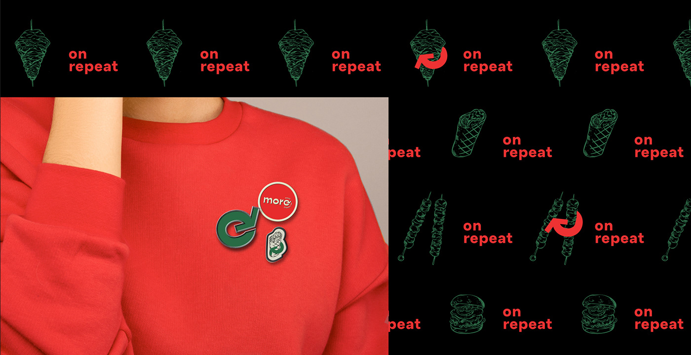
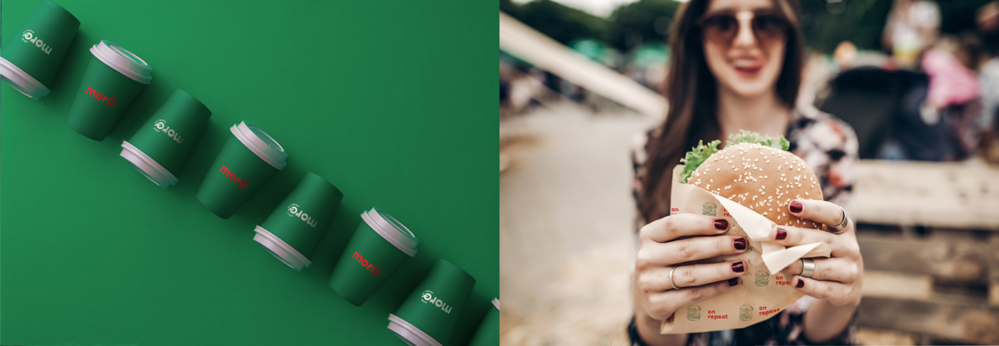
We've developed a modern and concise logo, a distinctive feature of which is the letter "e", stylized as a round arrow and symbolizing repetition. The green and red contrasting bright colors were chosen which are associated with pure meadows and the freshest meat. They were complemented with beige — the color of craft production. Green and red colors are present on the Azerbaijani flag.
To differentiate dishes, patterns have been developed that are combined with illustrations of the dish and the "on repeat" phrase.