
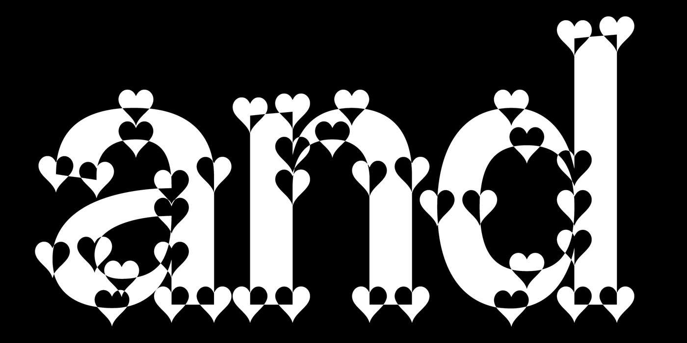
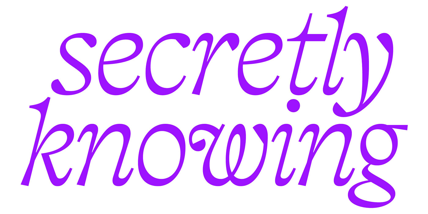
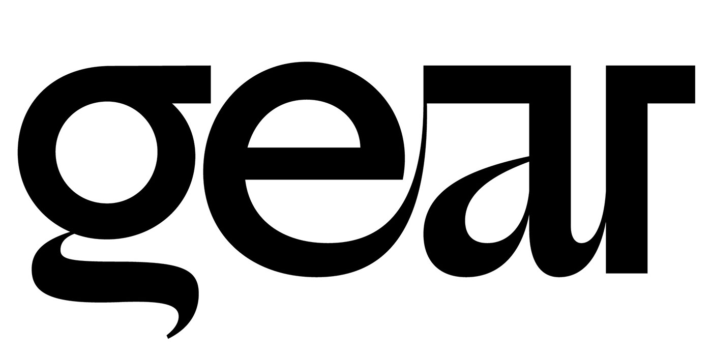
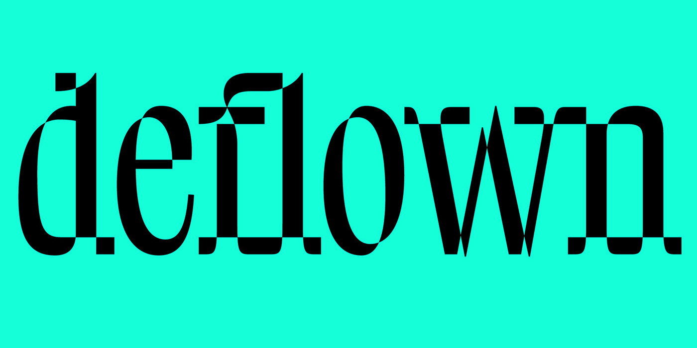
For the #36daysoftype challenge I decided to design a whole font every day and share it on my instagram page. Every day I woke up with a question—what haven’t I tried or seen before? Funky, weird, academic, coded, rule-breaking, rule-following, display, text… I had enough time to try all sorts of approaches. Each font took me about half a day, most of which was finding a good idea. Speaking of ideas, I thought I was running out of them on the day 5 or so, but now they seem pretty much endless to me.
The fonts are not ready for using / buying yet. They are all super sketchy, featuring only basic A–z with no kerning, etc. Your input on which ones you prefer is more than welcomed. In any case, stay tuned, work in progress.
This is part 3 of 3 (days 25–36).


More works
Let’s keep in touch
slobzheninov@gmail.com
Thanks for watching!


