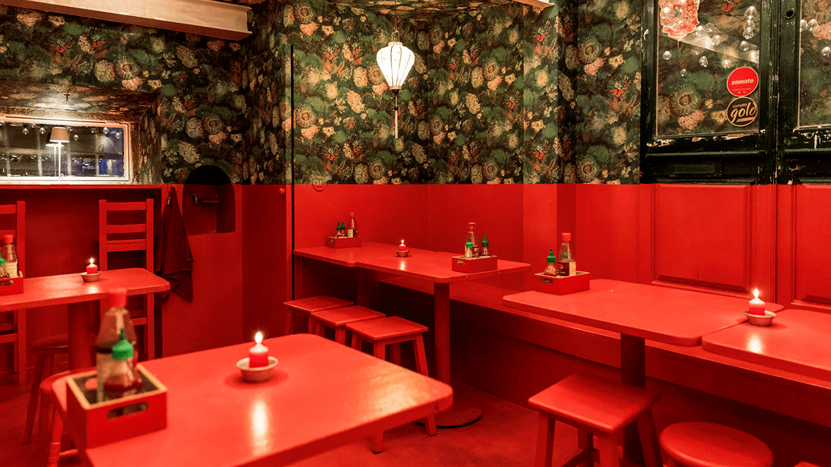
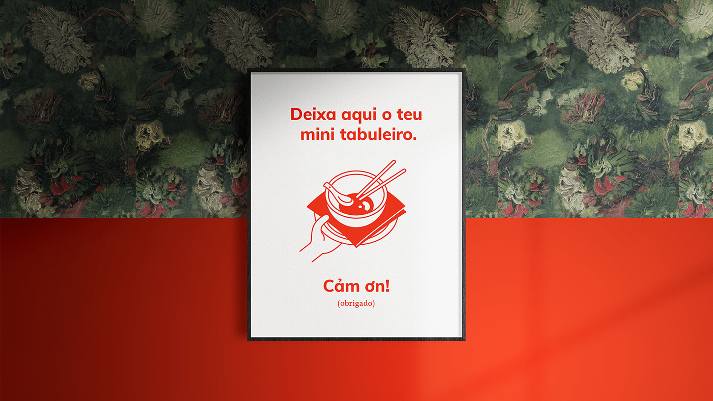
The restaurant had been open for about a year when the owner approach me to create its identity. There was no logo but the interior was very characteristic: the walls were covered with a wallpaper based on a detail of Van Gogh’s Vase with Chinese Asters and Gladioli and the entire restaurant seemed like someone had flooded the room with red paint up to the mid-height.
B R I E F
"Create a simple logo that looks like it could be a chain restaurant.
Use the restaurant’s tone of red as the main color."
Use the restaurant’s tone of red as the main color."

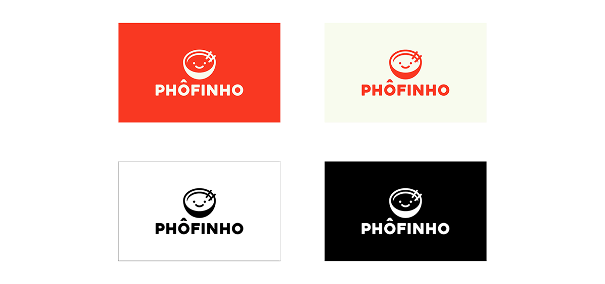
The idea behind Phôfinho’s identity is to balance the serious and reliable style of a chain restaurant with the trustworthy feel of an authentic local dining spot.
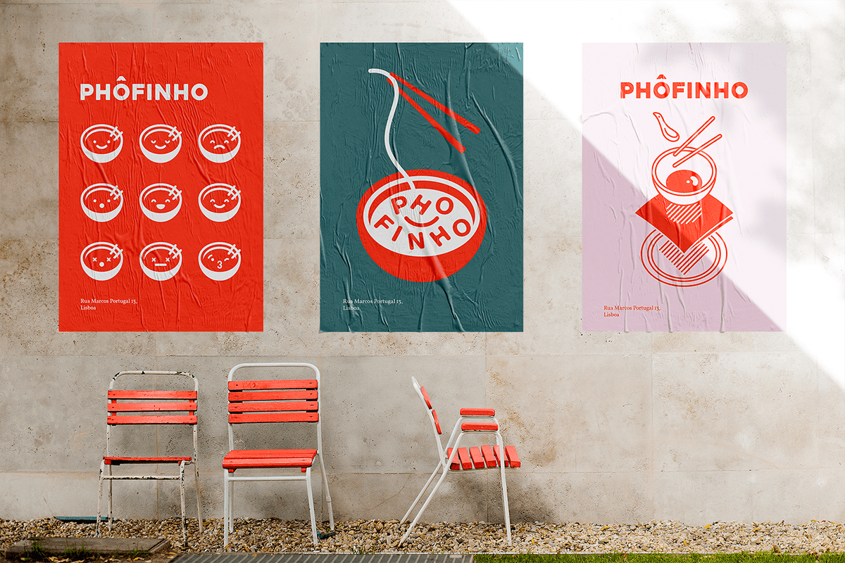
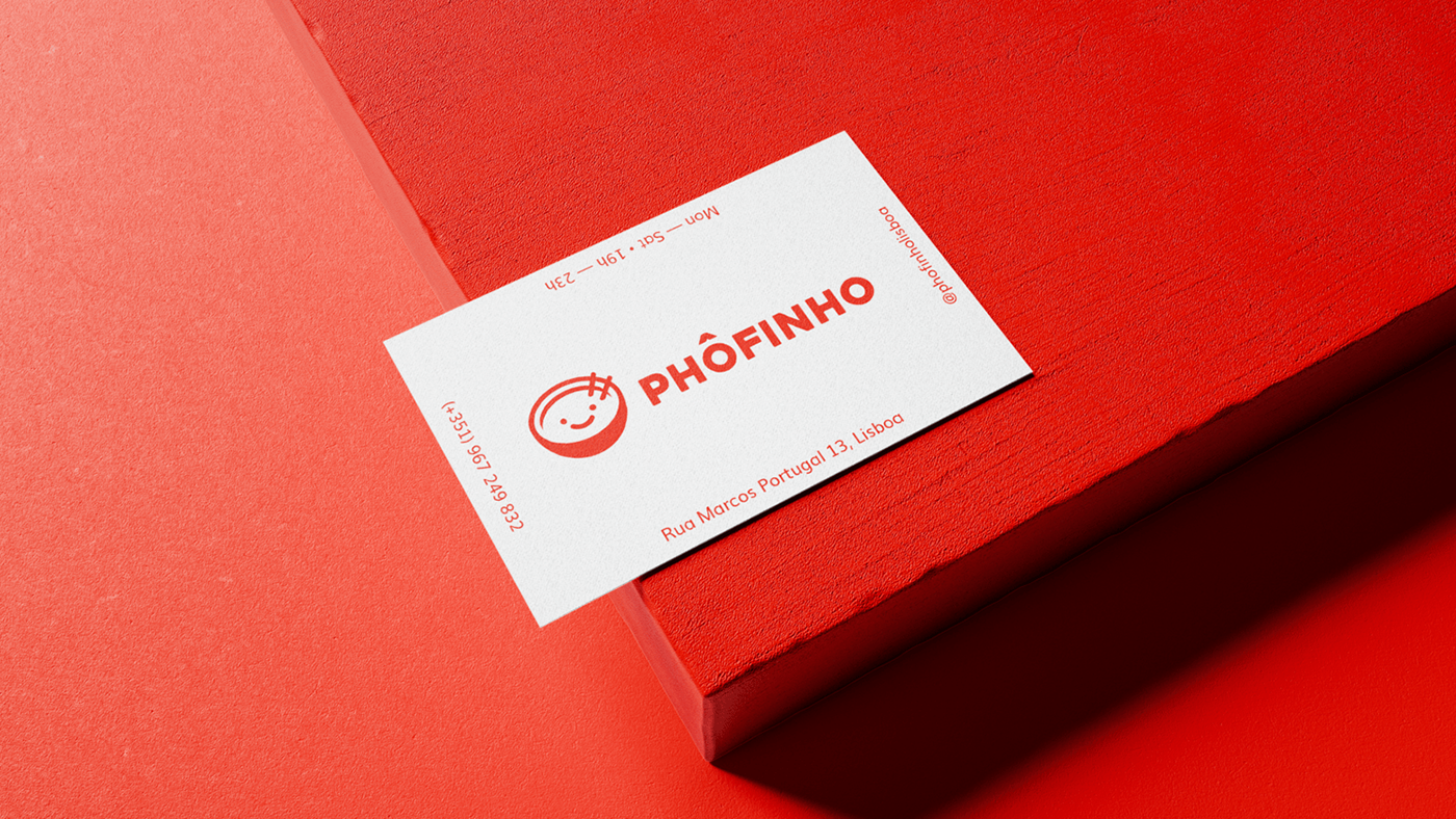
The lettering is bright red, bold and uppercase - a bit in your face to make sure it’s very visible and legible from pretty much any angle - with rounded corners making it a bit friendlier and muting the hard selling commercial aspect of it a bit.

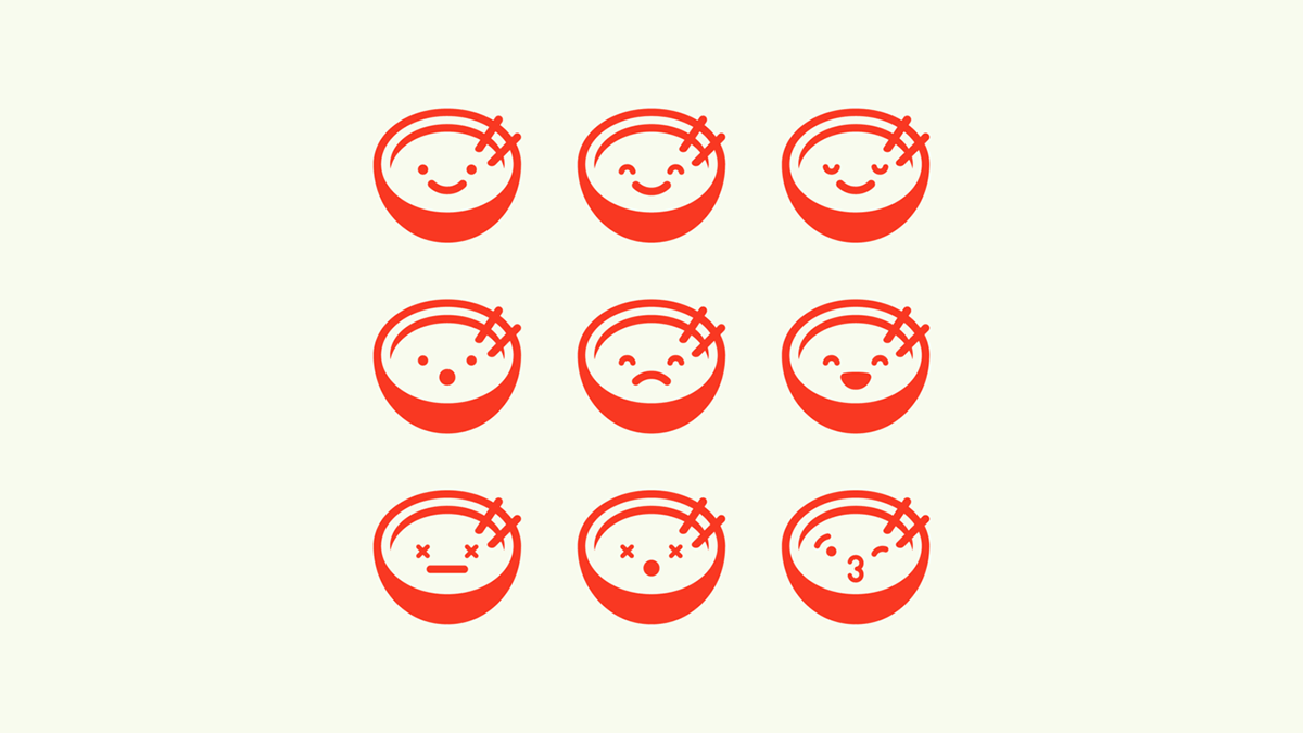
The mascot is a friendly phở bowl, inspired by the asian aesthetic kawaii. It manages to:
— create a very straight forward connection to the phở dish itself
— match the restaurant's brand concept — as the naming Phôfinho is a pun on the word fofinho (which is Portuguese for "cute") — by being, in fact, cute ;)
One of the advantages of having a mascot is the ability to explore its human side and use its facial expressions to communicate various emotions.
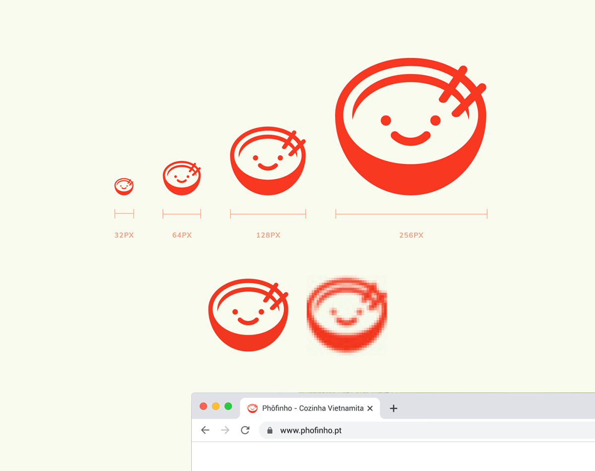
The bowl is complex enough to allow a certain detail but simple enough so it stays perceptible in reduced sizes, specially on screen — as the symbol gets smaller, so does the number of pixels, which deforms the image. Minimum size is 32 px wide (in retina display) as it is the size of favicons.
Headings — Muli Extrabold
Body Text — Vollkorn Regular

There are only three dishes on the menu:
Phở Bo (cow), Phở Ga (chicken) & Phở Chai (veggie).